Out and About: Steve in Las Vegas
I was in Las Vegas last week to kick off a new project. Here’s some of my pictures from my time there.


I was in Las Vegas last week to kick off a new project. Here’s some of my pictures from my time there.
I was in Houston a few weeks back to teach a user research workshop at a client’s site. I did get some time to take photos and here’s a few.

Welcome hackers

Spec’s liquor

Donut

GUNS

I encountered this box recently at my local medical office. It’s a squat white bin with a wide black opening near the top. It looks a lot like a trash bin. Obviously I’m not the only person that reacted that way, because they’ve tried desperately and ineffectively (with EXTRA SIGNS as they so love to do in healthcare) to communicate that. There are three signs (see the orange pointer) telling you what the box is for (dropping off sleep study equipment) and two signs (the purple pointer) telling you what it’s not for (it’s not for garbage).
That’s five different signs, only two of which even vaguely cohere with each other (the red tape), all requiring English. The net effect is chaotic. There’s no empathy here; each message acts as if it’s the only one, without awareness of the others.
And still – the thing looks like a garbage bin! That message is loud and clear and no amount of signage will get around that. But the staff who have to pick the garbage out of there have no control over the bin’s design and so they are left with their default tool: signage.
I wonder if they could do better if they went further, such as painting the white surface and/or the black flap to more strongly shift the meaning. Or by having a sleep study device (which comes in a little carrying case) or at least a large icon near the opening. And a garbage bin nearby. The tactic would be to communicate more visually and directly what stuff (sleep study devices, trash) goes where and not rely on words. Until then, they can expect more trash.
See previously Signs to Override Human Nature? as well as other writing about post-design.
I’m just back from a week in Barcelona for WebVisions, where I led a workshop on fieldwork, synthesis, and ideation, and gave a short talk about championing contextual research within your organization. I’ll be covering similar material coming up in a couple of months at WebVisions Chicago. Meanwhile, I had a bit of time to explore, and found Barcelona to be a beautiful and well-designed city. Here are some sample images, with more to follow in the next day or so (and the complete set on Flickr).

Bounty at La Boqueria market.

Pedestrian safety warning placed in context, as you step from the sidewalk into the street.

Obama British Africa Gin and Rum. Odd description here.


Stickers on the corrugated metal doors pulled down when a business is closed advertise what I assumed was a taxi services but in fact is for locksmiths. Why are locksmith services advertised with such verve?

Gaudi’s La Sagrada Fam??lia, under construction since 1882. Astonishing, even from the outside.

Known in the US as Ice Age: Continental Drift.

Marketing for something via Facebook.

A very modern cinema structure, down by the water, where all the buildings are new and ultra modern. While the whole place is a delicious mix of old and new, classic and modern, this area went just a bit too far into Mall. While this building is gorgeous, its siting and overall vibe is dehumanizing.
I visited the great city of Portland, Oregon over Thanksgiving week, and noticed some of the ways its denizens use surfaces to communicate and express. Like Steve did earlier in his recent post, Out and About: Steve in Boston, given our recent interactions article about noticing and documenting street art, Kilroy Was Here, I too wanted to share some snaps!

As elsewhere, the backs of city signage serve as canvas for quick-stick expression. The tiki-figure here is one I commonly see in the Mission neighborhood of San Francisco, where I live, which surprised me and gave me a little charge, a feeling of connection to home.

A City of Portland sanctioned sticker, which includes a number to call to report damage to this sign, sits alongside its renegade brethren.

Great juxtaposition of two messages about the dangers of inhaling alongside a DANGER sticker.


I appreciated the friendly, bubbly, colorful style against the rainy, grey backdrop of Portland. Contributors to the collective urban collage here seem respectful of each others boundaries – not much overlapping of images.

And, finally, bunnies!
After writing recently about managing the adoption of a new type of elevator UI, I found a particularly bad implementation of the norm at my hotel in Austin last weekend.
Unusually, there are two elevators on either side of two rooms.

Beside each elevator is this cautionary/alarmist admonishment:

“This button” refers to “these buttons – those ones down there” despite the horizontal arrow. But we can probably figure that out. The reason for this sign – an obvious afterthought is that there’s no place where you can stand and easily see both elevators at once. You must approach one elevator to press the button, and if you stand there and wait, you are likely to miss the arrival of the elevator if it doesn’t come to that door. There is a standard solution: a light near each elevator door that lights up just before the elevator arrives and the door opens. But (other than in the hotel lobby) they’ve neglected that and instead the hotel guest must be “alert” when doing a basic task like trying to get down for breakfast.
This is a well-known and long-solved situation; why the builders would choose to put the elevators around two rooms and then create such a poor experience would be interesting to explore. What were the design and other decision processes that led to this sub-optimal solution?

Lost Turtle, El Granada, CA

Beanie Baby Puppy, Santa Cruz, CA
Sometimes, even things that move very slowly – or not at all – can get away from us…
I’ve posted about 150 photos fo Flickr from our recent trip to London. Here’s a few favorites


See also:

Lunchroom Hannibal, Amsterdam, May 2009
Don’t order the fava beans with the chianti.

Challenger Copyprint, Amsterdam, May 2009
Not the most encouraging association.

Synergy Project Management, San Francisco, July 2009
Needs a better illustration of the concept of synergy besides a plain ol’ pipe!

we bring you a pizza, Amsterdam, May 2009

U-Wash Doggie, Los Angeles, February 2009
Some names tell you what the business does.

Hand Car Wash, Los Angeles, February 2009

Trashy Lingerie, Los Angeles, February 2009

Ethical Drugs, Los Angeles, February 2009
Some names tell you something about how they do it.
Photos from post-SARS Hong Kong, January 2006.


Affordances for hanging clothes suggested by the fire prevention sprinklers in this Iowa City hotel led to the creation and posting of “no hanging” signs.


Nicolas Nova discussed similar tensions between designed intentions and serendipitous affordances in a recent post on design exhibits.
The need to discourage some uses while encouraging others adds an interesting layer to the design problem space, especially in contexts where there are widely varying types of user.
Skateboard deterrent devices are a common “anti-affordance,” usually retrofit after skaters discover alternate uses for a structure (skaters are virtuosos at finding and exploiting all sorts of affordances).

This particular anti-skate hardware is sold by Grind2aHalt.com.
“The GrinderMinder is intended to maintain the integrity of your beautifully planned landscape design, without detracting from the overall effect of the landscape.”
Grind2aHalt’s product is designed not only to thwart unintended use (skating) but also to support the intentions of the original design — in this case, the aesthetic aspects of that design.
It’s a good reminder of how complex the dynamics of objects, context, and usage are. Even this outwardly simple product is actually operating on many levels.
NOTE: This is not an anti-skateboarding post. I offer this picture of myself, circa 1981 …

Related posts:
In November ’07, Nicolas and Steve had another go-round on anti-skating devices.

Books left on floor, Green Apple Books, San Francisco, CA

Notice in school bus window, Pacifica, CA

Sign, Bonny Doon, CA

Sign, San Jose, CA

Sign, San Francisco, CA

Posters, San Francisco, CA

6-panel strip on telephone pole, Chicago, IL
Related Posts:
Framed Framework/Conceptual Art
Words
The End of Things
Yes, more bathroom blogging! Core77 has just posted a quick video I made
In this video for Core77, Steve Portigal takes us into his company bathroom, uncovering examples of bad design and its consequences.
From signage to artifact and back, people are forever mistaking their cues for how to behave, how to use products and systems, and how different, often-conflicting indicators cause our expectations and realities to collide. This 2-minute video is a priceless example. What’s in your bathroom?
We see these in small retail all the time – handwritten signs exhorting the customer to follow some non-natural path of behavior in order to simplify the merchant-centered purchase process. Here’s a fun one, where the experience is pretty cool anyway, and the creativity and ineffectiveness of the signs is something to smile about, rather than grimace.

The setting certainly helps. In the town of Waimea, on Kauai, on your way to getting a sweet and cold treat – shave ice.

The cash register sits underneath the most awesomely diverse and interesting list of flavors. You approach the guy at the cash and of course you want to say how many you want, and what sizes, and (after having gaped open-mouthed at the display for a few minutes) the flavors.
The signs attempt to warn you off from doing that, but it’s human nature. And with each person that tries to ask for a flavor, the cash guy tells them ‘I don’t care about flavors. I just need to know what size you want.”
They are so dogged with their insistence, but they’ve designed an experience where it’s entirely natural to ask for the flavors right then. Nope.
He’ll go and get the plain shave ice (with ice cream, if you want it) and then at another counter they take your flavor order. It may end up being the same guy working the other counter, or someone else. But they don’t care about flavors, until you get to the flavor counter.
It’s not so terrible that they go through the same thing over and over again, it’s just a great example of design and human nature and the ever-present sign which purports to fix the whole thing by simply warning people what not to do!
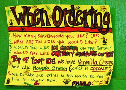
This sign is posted behind the cashier.
1. How many Shaved would you like (ice)?
2. What are the sizes you would like?
3. Would you like ice cream on the bottom?
4. Would you like our tasty creams on the top of your ice We have Vannilla Cream And also Haupia cream (which is coconut)
5. We do also sale extras so this would be the time to ask for them
Mahalo (thank you)

The cutaway detail of the Halo Halo Shave Ice is pretty neat. Nice combination of 2D and 3D presentation of the details:
Haupia cream topping
cocohut
Shave Ice
Haupia cream topping
Halo Halo
Ice cream opsional [sic] with Halo Halo
Two interesting signs from Salt Pond Beach on Kauai, Hawaii.


That’s some pretty impressive improvisation from the county. Sure, it looks like hell, and is a little embarrassing (these are “official” County signs?) but it fits right in Hawaii, especially the laid-back culture of Kauai. But mostly what I think about is the non-standard problem solving. What layers of bureaucracy would the park manager have to go through to get a new sign printed up? How long would it take? Meanwhile, they’ve taken some initiative to get their problem solved (including some non-standard mounting solutions).
Here’s an amusing but important official sign.

And an even more official sign that is pretty confusing. Who takes a bath in the restroom? And what is a rubber balloon and why is there a problem?

One more improvised sign, slightly more visually appealing (but with a much simpler message).
