Posts tagged “out and about”

Out and About: Steve in New York

Last week I was in New York to speak with two groups at SVA and at IxDA (also to see the city, eat desserts and hang with friends). Here’s some of the pictures I took during my trip.

photo1
“I Know A Guy, Inc.”

photo2
The New Colossus by the Bruce High Quality Foundation, public art at Lever House that references the ubiquitous labor action inflatable rats.

photo3
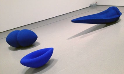
Blue by Anish Kapoor at MOMA, chock full of subtlety.

photo4
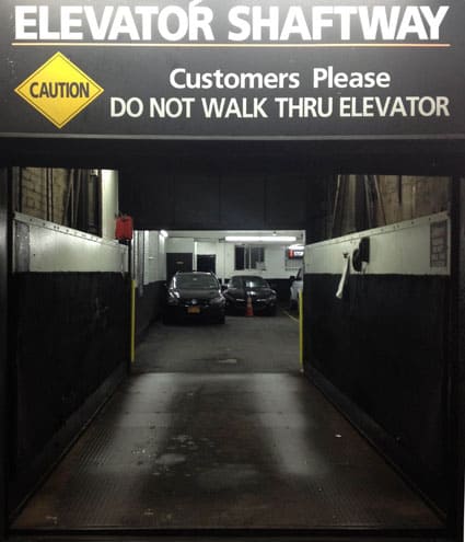
DO NOT WALK THRU ELEVATOR.

photo5
The Strand Book Store unloading some similar titles about the women behind the men of the sea.

photo6
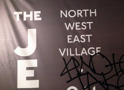
Hyperlocal.

photo7
Papa Moozi

photo9
A mini-Jurassic Park seen as street art around sidewalk greenspace.

New York previously: Summer 2013, 2011

Out and About: Steve in New York

I spent a few days in New York last week for the book launch event, also just taking some time to explore, walk around the streets, take pictures, meet with folks, eat interesting food, go to the museum, and so on. Here’s some of my observations from the trip.

IMG_2451
I posted about this hippo truck one of the last times I was in New York. I thought it was a tremendous coincidence or just that way that noticing something helps you notice it again (and taking a picture helps you notice it again even more); indeed I saw the same truck in the background of an indie film I watched right after I got back. Well, I’m told by my New Yorker friends that this company’s trucks are extremely common.

IMG_2510
Party supply trucks, hippo or clown, are common in Manhattan.

IMG_2480
Tomáš Gabzdil Libertíny’s The Honeycomb Vase “Made by Bees” – what he calls “slow manufacturing”, he built a scaffolding in the shape of the base and then had the bees build, over the course of a week, the vase, finally removing the frame and leaving behind a vase, made by bees.

IMG_2483
The typographical conventions brands have to deal with when associating their own brand with those of social networks. I’m not sure it’s entirely successful here to have the Gothic-style typefaces with the contemporary supporting brands of Facebook and Twitter.

IMG_2487
I like the very clear description of the equipment requirements, except for the strange use of the acronym “PPE” (I’m assuming personal protection equipment). I guess all industries are subject to their insider shorthands.

IMG_2496
A scene from the future?

IMG_2500
A really awful piece of “public art” juxtaposed with the much more appealing and authentic graffiti, seemingly an inspiration for the forms used by the “art.”

IMG_2502
IMG_2508
IMG_1397
IMG_1398
IMG_2492

Out and About: Steve in Baltimore

During last week’s trip to Baltimore, I had just a little bit of time to explore. Here’s what I saw:

IMG_1272
I had a really delicious meal at The Food Market in the hip neighborhood of Hampden, but I did snort with laughter when they brought over what I thought was going to be a beet salad.

IMG_1276

IMG_1277

photo1
Have we hit Peak Experience (and not in the Maslovian sense) when donuts are reframed as experiences? Closing the loop on my last visit to the area, this was a total disappointment. Disappointing donuts and a weird experience. Fractured Prune was located in an Italian restaurant but I could not figure out where the donut counter was. It turned out to be shared with the restaurant. I had to ask two people once I was actually in this little restaurant where the donuts were. There’s no familiar visual cue of shelves of donuts, since all are made-to-order. I did have nice chat with a fellow patron who told me they were great donuts. I didn’t let him see me leave the half-eaten ones sitting in the bag on the picnic table outside. Not good.

photo2
Street art in Hampden.

Out and About: Steve in Melbourne

Here is the last post with highlights of my trip to Australia (see parts 1, 2 and 3, previously). Meanwhile, all my pictures are making their way to Flickr.


At the tram stop for the Children’s Hospital, the platform is filled with various cute “Dr. Jake” signs. I especially like transforming the transformer box into a height chart. Someone is thinking broadly about reframing the hospital from scary into welcoming and using the first point of entry – the tram stop – as the place to begin doing that.


Patience is a virtue. A post-design attempt to mollify confused users.


I could not figure out what the heck “Teady” referred to on this first truck. It wouldn’t be my first time encountering a word I didn’t understand (see “showbag” in an earlier post, say). But no, the adjacent truck says “Steady.” I went back and checked – did the initial S wear off? No, it was never there to begin with. The design – sans S – fits perfectly in the designated area on the first truck.


Bold language boldly presented.


Once again, weird people sculptures.


Free WiFi at the train station. Nice visual reference to many memes (e.g., Star Wars kid, the dancing baby, keyboard cat) as well as Facebook and Twitter.


ACDC lane. Yes, the official City of Melbourne lane commemorating ACDC.


Reminded me of a similar sign in San Francisco.


The menu at this restaurant offered beer in a pot or a beaker. I was further charmed by the use of familiar words with shifted meanings, as part of my foreigner’s journey. But no, the beaker is exactly what you’d think: a beaker.


More 8-bit-videogame streetart, although Mario instead of Space Invaders; stickers instead of tiles.


Many many flavors of hot chocolate at Chokolait. I must go back!


Indoor nighttime climbing wall.

Out and About: Steve in Brisbane

I got back last week from two weeks in Australia, traveling around as well as speaking at UX Australia in Brisbane and Service Design Melbourne. Here is the third of four posts with some of the highlights (see 1 and 2 previously). All my pictures are making their way to Flickr, as well.


Hmm. Update: Golden Casket is a lottery company, not the store itself. And “casket” more typically refers to something like a treasure chest than a coffin. The language discontinuities wonderfully surprising!


Brilliant idea to highlight a positive so specifically.


Burger King, in some parts of Australia, is Hungry Jack’s.


While the text and icon evoke the fleeing-immigrants signs seen in Southern California and Arizona, this supposedly refers to a traffic island in the middle of the street where pedestrians can wait if they are caught in the road when the light changes. However, this location had no such island.


Dolphin attendance. What can we infer about the dolphins with the dashes in place of checks? Or the dolphins with a line through the week?


Jelly.


Peanut butter.


From the Gallery of Modern Art (or, if you prefer, GOMA), biomorphic scooters.


“I never stopped loving you” reminded me of the iconic “I love you so much” graffiti-cum-icon in Austin. One is in an art museum, and the other is on the side of a building.


The piece is called Distillery: Waveforming. It uses biofeedback, as you clip a pulse oximeter to your earlobe and the iPad display starts to play mellow music and visually echo your heartbeat. It was like a digitally-induced high. I hope we all get one soon.

Out and About: Steve in Sydney (2 of 2)

I got back last week from two weeks in Australia, traveling around as well as speaking at UX Australia and Service Design Melbourne. Here is the second of four posts with some of the highlights. Part 1 is here.

All my pictures are making their way to Flickr, as well.


Nice combination of cultural iconography.


I liked seeing the range of medical services laid out like this. Not very confidence inspiring, however.


Manners poster.


Asian preferred.


A really awful brand name and sign. What does crocodile have to do with thai? And what is added by making him or it senior? It’s a puzzle.


Father’s Day is September 2.


Milk for the workplace. At last.


360Àö Self-Portrait at the Museum of Contemporary Art. Although there are no visual cues, the artist is in some contraption that moves her around, through a complete circle. As she moves, gravity deforms her face slightly while she essentially remains expressionless. The net effect is compelling and disorienting.


The 18th Biennale of Sydney was chock full of astonishing spectacle. Really wonderful. And I only heard about it because I checked in (via Foursquare) at the museum and a kindly person on Twitter suggested I head over to the island and see it.


A crushed car was on display and yet needed to be marked before and after with warning signs so that traffic going by would not be alarmed. Are the signs part of the work or something that is imposed on the artist in order to allow their work to proceed? And what does it mean to have a sign announcing “End Artwork” anyway? Is that an observation or an imperative?

Out and About: Steve in Sydney (1 of 2)

I got back last week from two weeks in Australia, traveling around as well as speaking at UX Australia and Service Design Melbourne. Here is the first of four posts with some of the highlights. All my pictures are making their way to Flickr, as well.


The diminutive is a common Australian form. Toasted sandwich becomes toastie. Football is footy. Breakfast is breaky/brekkie. Motorcycle gang member is bikie. Slot machine = pokie. Self-portrait is selfie. I saw this in advertising, building signage and the newspaper.


I’m certainly impressed to know that Sol Levy is such an esteemed tobacconist. What related line of business does he offer that requires one to be over 18 in order to take a trip down memory lane and reveal treasures? Some sort of vintage tobacco porn? The mind boggles.


The savory pie is an Australian dish, sold in all sorts of stores including the ubiquitous Pie Face, where their pies are decorated with, well you guessed it, faces.


Yet another example of personas (or the aesthetics of personas) turned into customer-facing messaging: “Hi, I’m James. I’m a freelance TV producer. But before you write me off as some sort of knob who owns a fancy European car, think again. I don’t even own a car! Instead, I just use GoGet Cars whenever I need one. So when I’m on a shoot and I’ve got expensive equipment to transport, I’ll use this van.”


I was astonished at how foreign I felt in Australia. Despite a common language, there are so many disconnects around vocabulary. This ad on the back of a bus reads “Grab an iinet Combo. It’s like a showbag for grown-ups.” Sure, I can read that, but what the heck are they talking about? Some Aussies clued me in that showbags are gift bags from the equivalent of state fairs. Whatever – that feeling of cluelessness was a particularly wonderful aspect of the whole trip.


Whether you say please or not, the option of opting out at the mailbox is something I’ve seen in Europe as well.


Prohibited clothing.


And more prohibitions.

Out and About: Tamara in Phoenix

I spent some hot days in the 106 degree heat of Phoenix last week facilitating for social good at the Phoenix Design Summit. Even though we were crazy busy, I still found some time to capture the local flavor and ponder my surroundings.

The side of this truck reads “Tree Frog Treks” and has a phone number to call. I never would have thought of hiring someone to take me out on a tree frog trek, especially in Phoenix (which, admittedly does not have a climate or environment that I associate with trees or frogs). I like the BooWoop! on the door. Is this what tree frogs sound like? Or what we tourists would exclaim upon seeing them?

We had lunch at the Food Truck Fridays court held in the Phoenix Downtown Market on Friday afternoon. I appreciated the clever humor from Hey Joe’s Filipino food truck but most of all I loved their specialty drink: a whole young coconut that they served with the top cracked off and oversized straw.

We visited an exhibit at the ASU Art Museum titled Miracle Report. The gallery was filled with many screens of various sizes. Each piece included audio of interviews with people about a miracle they had experienced while the video showed only their hands. Hauntingly beautiful and startlingly expressive. I’d like to try this approach for capturing video during research interviews.

Also had the chance to visit Emerge: Redesigning the Future, an exhibit that followed the recent crossdisciplinary summit dedicated to design fiction and playing with the future. In this exhibit, you enter your name and a word on an iPad and then a phrase from the future appears on the screen in the bubble.

I have no idea why this onion was sitting on a mailbox. But it got me curious about how many stamps it would take to send an onion. It would probably depend upon weight, right? Would the USPS deliver an onion if it had the correct postage and an address on it?

This guy must really love hamburgers because this is not a uniform (as I initially presumed when I saw it). There were no logos or other elements on the front of the shirt. This made me wonder if there is any food item I love so much that I would wear a shirt of it like this one. Maybe kale. Or fresh young coconuts with a straw.

Out and About: Steve at SXSW

I recently spent a while in Austin attending SXSW. Part work, part vacation, it was all fun and all inspiration (see, I’m now posting in rhyme???!!!). Here’s some of my observations and experiences.


Austin’s independence and weirdness are fairly unique and always enjoyable.


While there was a national uproar over an ad agency hiring homeless folks to circulate as wireless hotspots, FedEx hired non-homeless folks (we talked to them and yes, despite the cool outfit, they are not regular FedEx employees) to circulate as human phone chargers. No one raised a peep over this. It’s okay to to turn people into device support as long as they have sufficient income such that we don’t feel awkward?


A typical bewildering promotional scene. I’m unsure specifically what was happening here. Pose with this Grinch (I guess?) and tweet the photo with a hashtag for chance to win something? Anne posed for the picture but we never bothered to determine exactly what it was about. This sort of exchange and promotion was very common.


This was the moment I realized how much my localized norms had shifted. Over the course of a few days, we ate and drank and snacked for free. Wwe got delicious ice cream sandwiches for free; all we had to do was tweet something. We got a free lunch from FedEx, although they asked that we check in Foursquare. Moments before taking this picture we followed the trail of Ben-and-Jerry’s-eating-folks to find out where the cart was, asking of course for some tweet action in exchange. By the time I came upon this popsicle stand. I looked up and down to figure out what I had to do, or if they were just going to give me a frozen treat without any action. We were a little chatty, reading their sign out loud, but no one was initiating a transaction, finally the woman asks us “Do you work for Twitter?” (I guess since we had mentioned tweeting). Finally, the penny drops. “Oh,” she explains, “right now these are $2.50.” It was just a regular frozen-good-for-money cart! No special SXSW promotion or anything! And she’s located herself right across from the Convention Center – ground zero for crazy promotions (the spot where Kobayashi ate 13 grilled cheeses in one minute was just feet away)! Well! I walked away grumbling at the nerve of this person to try and ask for money for their food product!


Making new friends.


What does this mean? Kony went from viral slacktivism to stencil-art in a matter of days. Is this anti-Kony? It seems to be iconifying him with Che-like kitsch. That was fast!


Attention-grabbing scumbaags put realistic paper “clamps” on parked cars. Haw haw! Fooled ya! You didn’t really get clamped, just wanted to tell you about our great service! Ummmm, no, no, no. That moment – be it one second or 90 seconds – of angst and despair upon seeing your car clamped is not okay. You should not do business by upsetting people and then telling them that it was just a joke. I realize that’s the premise for prank television, but this is simply not acceptable for marketers to be doing. You can make me feel good, but you must not make me feel bad.


I’m intrigued by the proliferation of these backdrops in publicly accessible places, so that we too can play at doing a red carpet appearance. The opening party had an actively-posed-with backdrop that was not intended to see any of its traditional star usage. These backdrops were also throughout the Convention Center. Certainly the appeal is understandable (we made good use of a similar opportunity last year in Florence); perhaps this starts to replace the stick-your-head-through-a-painting-of-a-character; now it’s red carpet for the rest of us.


These folks in the yellow skinsuits were promoting SceneTap but found themselves seduced by a street hustler more skilled than themselves, doing some kind of of three-card-Monty meets card trick. And those onlookers wearing “MYSPACE IS DEAD” shirts are actually promoting Myspace,


Fun with The Daisies, or the unexpected pleasure of following a titanic sound down a back street only to find ourselves feet away from a young, skinny, long-haired rock-n-roll band kicking out the jams.

Other highlights

See also:

Out and About: Julie in NYC

There’s no better place than New York for the casual wandering photog. And no better way to unwind between interviews than wandering casually. Tamara shared her observations from last week’s trip; here are a few of mine.


An ambitious seeker-of-companionship slipped this onto the subway; an attempt at old-school social networking, ironic in its particular placement. It’s author provides a few interesting and wholesome-sounding options (library, the zoo, coffee date) to entice people to respond to this rather salacious-seeming invitation. Who calls, I wonder? And don’t they know that with Google Voice they can link those two numbers?


Surprisingly lifelike and expressive, for mini-robots cobbled out of plastic scraps.

A few of my pictures wound up revealing accidental compositional synchronicity. That’s one of the joys of taking photos – along with being obvious documentations of what I ran across, I often discover something new when I get them back and reflect on them:


When I took this, I only saw the blue face. And yes, this is the correct orientation of the photo!


The colors in this juxtapostion of the utilitarian and the ephermeral echo each other.


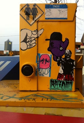
I like taking pictures of poles for the way they can surprisingly and dramatically bisect a scene. And because people put stickers on them. The little face sticker here is obviously a product of the same person/people who slapped up a little sticker I snapped on the other side of the country, at Venice Beach, just two weeks prior – the LA one reads, “Enjoy You” rather than, “Gain You.” Interstate sticker-art pattern! Theories?


Red, yellow and blue syncopate in a Brooklyn subway entrance, in a way that put me in the mind of Mondrian’s Broadway Boogie Woogie. Jazzy patterns abound, waiting for us to notice them.

Series

About Steve