Posts tagged “graffiti”

Out and About: Steve in Barcelona (2 of 2)

More observations from the trip to Barcelona. See part 1 here (and the complete set on Flickr).


Graffiti scarification. At Park Guell, people mark the cactus so future tourists can see that they were there and they were douchebags.


I’m sure I’ve never seen a sign for a detective agency before. But within days of seeing this, I come across a New Yorker article excerpting Mavis Gallant’s diary from Spain, in 1952. She mentions the ubiquity of signs for detective agencies in Barcelona! Who knew?


Gaudi’s Casa Batll??.


Delicious pinxtos.


Recycling depot with a book-exchange rack and a used-clothing-for-charity collection box.


The presentation and form factor of the Jam??n ibérico is sufficiently iconic that you can buy an inflatable non-meat version.


Gestural guidance.

Curating Consumption #2

We’re back with another round of some curious, provocative, amusing, and frightening observations that come from our daily experiences as researchers and as consumers.

Our second guest post of Curating Consumption came out last week over at Johnny Holland. In case you missed it over there, you can sit back and relax and enjoy it right here on our blog! In our first digest (Curating Consumtpion #1) we featured images from our travels to Austin, New York City and Dublin. This month we are looking much closer to home and finding ponderous interactions and objects within a few miles (and sometimes feet) of our front doors.

My local cafe offers a small selection of lovely creams and lotions on the back of the toilet tank. I react thusly: “Ewwwww.” It’s one thing to put this in your home bathroom, or maybe in your office, where there’s a known and finite set of users. But this is a cafe along the highway. You don’t know who else has been using it, touching it, or not-washing-their-hands-and-touching-it! Or worse, I’ve seen some of the people that come in there and I do know who’s been touching it. Suffice to say that I do not want to be sharing cosmeceuticals with them! It’s the tragedy of the commons in the coffeeshop toilet. /SP


The fitting rooms in Old Navy have labelled hooks to assist you in categorizing your prospective purchases. It’s what we do when trying on clothes anyway, and while it’s not a complete solution (e.g., where’s the place to put the clothes you are already wearing?), there’s something charming about how it acknowledges your process. Also, those arrows bring a real dynamic energy to a static aspect of the task. Small details, but fun. /SP

There is not a lot of graffiti in the tiny town of Pacifica, CA where Portigal Consulting calls home. I passed this while walking from the office to the ocean one day and felt annoyed, but not because of the graffiti itself. I like to think I am an enlightened urbanite who appreciates the aesthetic enhancement, self-expression, and community color that street art affords. In this case, however, I was pissed off by the placement. See that ugly grey brick wall RIGHT BEHIND the fence? Yes, that’s the one; the unadorned, badly-in-need-of-anything-to-bring-it-to-life one. I can’t for the life of me figure out why the artist tagged the pretty white picket fence instead of the menacingly misfortunate wall. /TC

I spotted this sad scene on the sidewalk in front of our office. First I thought of the little girl who lost her shoe and would be upset, perhaps even scolded by her mom. And then I thought about the mother, recalling my own mothering moments of frustration realizing that my son or I had lost something of his along the way. And then I thought of the 6 word story penned by Hemingway, “For Sale: baby shoes, never worn.” And then I waxed anthropomorphically about the shoe and her point of view. Yes, that little shoe looks like a lonely lady; one who has lost her sole mate. /TC

Out and About: Julie in LA

Despite my relative proximity to it, LA is not a city I’ve had much occasion to visit. But I was there last week, with Tamara! Here are a few snaps I took in-between fieldwork interviews and client pow-wows. Most of these are from Venice Beach, with the exception of the last shot, which was taken in Burbank.

Napping Aliens
Clad in familiar brands (LA Lakers, Spongebob Squarepants, USA), this pile of patriotic aliens comes across as just another family of worn-out tourists.

Faces
The face, three ways.

Stickers in your face
Upper left is a riff on Shepard Fairey’s original Andre The Giant Has A Posse sticker. This one reads “Chopstick Charlie has one crazy posse,” then lists Chopstick Charlie’s dimensions at 5′ 11″ 150 lbs. (Note: If you are easily offended definitely do not look too closely at the nose and lips stickers).

Shapes and figures
I discovered a moment of serenity and geometry in the midst of the madness.

Something surreal
Magritte and the Surrealists are clear influences here.

Retail guillotine
It’s all about the body.

Environmentally friendly
The neon juxtaposed with this message of environmental consciousness comes off as deliberate irony! See Tamara’s Out and About: LA for her shot of this unique dry-cleaning establishment.

ChittahChattah Quickies

Who Arted? Framing a Curatorial Intervention [Core77] – Steve and I talked about how great it is when street artists build on each others’ work in our Interactions article, Kilroy was Here. The “Who Arted” group has really formalized this idea in parts of Brooklyn, serially framing, thereby curating street art.

But what are we to take away? Is this some counter-establishment commentary? Some kind Dadaism reincarnated or an art project born of a lazy Saturday evening “potluck” that comes in little plastic baggies? Ha! Is it some conservative attempt to contain and sterilize an otherwise loose and “free” art form? Are these frames meant to control and connote a more sanctioned museum-like quality? -OR- More intriguingly, is this a fun, yet purposeful recommendation towards a comfortable middle ground; a less combustible space between tension and expression?

ComScore Study Confirms What We Already Knew: You’re Wasting Money on Ads No One Sees [AdAge Digital] – Many, many apps and web-based services (and concepts we encounter on projects regularly!) are predicated on an advertising-based revenue model, but (as we all know from our own behavior – this study is in the category of things-we-really-didn’t-need-a-study-to-know) these ads are very rarely even glimpsed. If a banner ad falls in a forest, etc…what are the implications to our virtual-economy?

ComScore announced it has developed measurement software it’s calling Validated Campaign Essentials, which includes at its core an analysis of which ads in an online campaign were in-view (50% of the ad must be viewable for at least one second.) The company said at an event this morning that it tested out the software over the last two months on campaigns for 12 big brands, including Kraft Foods, Ford, and Sprint. One of the key findings: 31% of the 1.7 billion ad impressions were never in view.

Buying the Body of Christ [Killing the Buddha] – This is a pretty thorough history of the Cavanagh Company, a 69-year old business that provides a product believed by many to transmogrify into the body of Christ: altar bread. A wide variety of influences cultural, logistical, ritualistic, theological and economic have driven innovation over the years. The company is now faced with bitter bested competitors (nuns!), niche-products (gluten-free wafers) and Polish knock-offs, all of which threaten their 80% market share.

Had production remained the exclusive bailiwick of monastic communities, it is likely that the findings of Vatican II would have prompted some minor changes in Communion-wafer production. Among the guidelines issued by the Church was a directive to “make the bread look more breadlike,” head of production Dan Cavanagh told me. It is a change whose significance may yet be lost on the millions of churchgoers who continue to think of hosts as a form of Styrofoam. Nevertheless, Cavanagh’s more “breadlike” whole-wheat wafer caught on. It became the industry standard, and forced the Poor Clare nuns to follow suit. In fact, the doctrinal changes of Vatican II were only a starting point for innovation. The Cavanagh Co. soon led the way to wholly aesthetic alterations in the host, to marketing campaigns and 1-800 numbers. The ethos of the altar bread industry changed profoundly, which is precisely what the Sisters of St. Clare found so unjust: ‘And they had the audacity to send samples and a price list to every parish in the United States! We were doomed. Priests started calling to say they preferred the “other” breads. Orders dropped. Our spirits drooped.’

Out and About: Julie in Portland

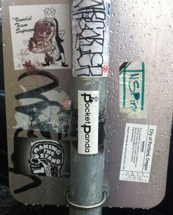
I visited the great city of Portland, Oregon over Thanksgiving week, and noticed some of the ways its denizens use surfaces to communicate and express. Like Steve did earlier in his recent post, Out and About: Steve in Boston, given our recent interactions article about noticing and documenting street art, Kilroy Was Here, I too wanted to share some snaps!


As elsewhere, the backs of city signage serve as canvas for quick-stick expression. The tiki-figure here is one I commonly see in the Mission neighborhood of San Francisco, where I live, which surprised me and gave me a little charge, a feeling of connection to home.


A City of Portland sanctioned sticker, which includes a number to call to report damage to this sign, sits alongside its renegade brethren.


Great juxtaposition of two messages about the dangers of inhaling alongside a DANGER sticker.


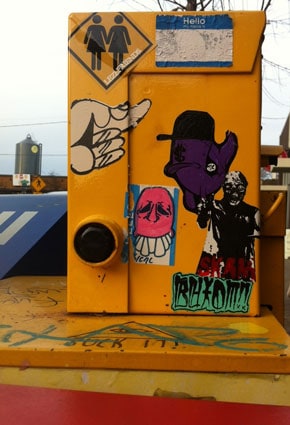
I appreciated the friendly, bubbly, colorful style against the rainy, grey backdrop of Portland. Contributors to the collective urban collage here seem respectful of each others boundaries – not much overlapping of images.


And, finally, bunnies!

Out and About: Steve in Boston

I was in Boston earlier this week to speak at UI16. During a bit of downtime, I went for a walk and of course, started taking pictures. Given our recent interactions article about noticing and document street art, I wanted to share some of what I saw.

One tag (bundtcake? budcloth? badclam?) and stickers for a cutesy-brand pet waste removal service, a skater magazine, a web/movement/thingy, and a beer label that seems to be fake and actually points to a local art collective.


There’s that tag again, the Eye of Providence (a local reference?), and a DJ promoting himself with an homage to the locally dominant Dunkin’ Donuts branding.


Some buffing of previous stickers, that same beer cum art sticker, and the random and hilarious Vonnegut and crossbones (I found a better one here).


Much larger pieces, including Andre. I like how you can see a little bit about how these were done, as they emanate from the fire escape.


A number of streetlights near here had these colored plastic blocks in letter-like forms. I felt like it was probably “official” since it was in a vaguely design-y district and consistently placed on city infrastructure, but there was no information about it and so it was hard to be sure. And that moment – trying to determine if this is “legit art” or “street art” or one masquerading as the other – was delicious. I passed by here with my local friend Joe and asked him about this. While he didn’t know, for him it evoked the 2007 incident when 8-bit-graphics promoting Aqua Teen Hunger Force caused a bomb scare in Boston.


Under the bridge. Just a more familiar graffiti scene, one that seemed to typical, unremarkable, and even slightly comforting (despite the broken glass I had to step around to take this picture).

Our latest article: Kilroy Was Here


Our latest interactions column (written by Steve Portigal and Julie Norvaisas) Kilroy Was Here has just been published.

Reviled or celebrated, graffiti is ubiquitous in even the least-urban environments. With roots in the wall-scrawled slogans of ancient Greece, it is a physical yet ephemeral expression of the personality of a neighborhood. It allows us to see a colorful trail of inhabitants’ interactions with public spaces. Graffiti (or street art, or urban art) has been displayed in (and arguably corrupted by) art exhibitions, influenced fashion and pop culture, and generated revenue for municipalities and the paint-removal industry alike. Of course, it’s largely illegal. It’s everywhere, and we are grateful. Perhaps we are drawn to the element of danger that feeds street art, and the rebellion implicit in its enjoyment (probably the same reasons we loved the Fonz!)…We find ourselves considering the street art of one city, or neighborhood, or corner, as a whole, compared to what we know from other cities, neighborhoods, and corners. What elements make them visually distinct? What might these observations say about the culture or history of the location? How does one graffito fit into the larger context of surrounding graffiti? We can channel our inner visual anthropologist, uncovering signs not only of the times but also of the place.

Get the PDF here and let us know what you think. Do you follow street art? What do you like about it? Share your pictures with us!

And, here are some photos to supplement the article

Previous articles also available:

ChittahChattah Quickies

Take Care of Your Little Notebook [nybooks.com] – This piece reflects on (and gently romanticizes) the instant, tangible, temporal act of jotting down a note. Jotting does validate a thought, document the moment and capture it for future reflection by self or others. The writer suggests that ink on paper is somehow more permanent, or at least more accessible, than similarly documented digital thoughts. The piece relies on the conceit that analogue note-jotting is perilously endangered; this seems exaggerated to me.

Writing with a pen or pencil on a piece of paper is becoming an infrequent activity, even for those who were once taught the rigorous rules of penmanship in grade school and hardly saw a day go by without jotting down a telephone number or a list of food items to buy at the market on the way home, and for that purpose carried with them something to write with and something to write on…No question, one can use a smart phone as an aid to memory, and I do use one myself for that purpose. But I don’t find them a congenial repository for anything more complicated than reminding myself to pick up a pair of pants from the cleaners or make an appointment with the cat doctor. If one has the urge to write down a complete thought, a handsome notebook gives it more class. Even a scrap of paper and a stub of a pencil are more preferable for philosophizing than typing the same words down, since writing a word out, letter by letter, is a more self-conscious process and one more likely to inspire further revisions and elaborations of that thought…Just think, if you preserve them, your grandchildren will be able to read your jewels of wisdom fifty years from now, which may prove exceedingly difficult, should you decide to confine them solely to a smart phone you purchased yesterday.

Revolution in a Can [foreignpolicy.com] – Has Western graffiti standardized itself into a visual language that is easily exportable, a global commodity? I disagree with some of his assertions – that Western graffiti is merely aesthetic, that graffiti expressions are cliched and “tired” – but the idea that graffiti has been appropriated by Middle Eastern and other very different cultures around the world as a visual form to communicate back to us on recognizable cultural terms is provocative.

…it does seem clear that the stylistic clichés of graffiti in the West — the huge loopy letters, the exaggerated shadows dropped behind a word — have become an international language that can be read almost transparently, for the content those clichés transmit. Look at New York-style graffiti letters spelling “Free Libya” on a wall in Benghazi or proclaiming “revolution” in Tahrir Square: Rather than aiming at a new aesthetic effect, they take advantage of an old one that’s so well-known it barely registers. That thing called “art” in the West is essentially an insider’s game, thrilling to play but without much purchase on the larger reality outside. We have to look at societies that are truly in crisis to be reminded that images — even images we have sometimes counted as art — can be used for much more than game-playing.

The Dolores Park graffiti artist story

Here’s a photo I took in San Francisco during the Summer of 2010, my first summer living here. The image now appears on my business cards in our “What’s Your Story?” series.

I don’t know who this man is. Where he is, that’s easier: Dolores Park is a small park, two blocks by one block, in the middle of the city. It serves as a gathering place for a variety of inhabitants hailing from the colorful neighborhoods the park borders and defines: the always festive LGBTIQQ contingent from the Castro, picnicking families from Noe Valley, Old Style-sipping hipsters and slouching Hispanic teens from the Mission, and drumming hippies from the nearby Haight…and various intersections of the aforementioned. On this day, a festival sprung up on the hill involving DJs and street artists.

The angle of the sun was just right to catch this artist in a reflection of his own process.

Here’s a broader shot of the scene.

Street art, which usually happens under cloak of darkness, had a light shining on it that day.

ChittahChattah Quickies

  • [from julienorvaisas] Posters Promoting Non-Events, Everyday Life [DesignTAXI.com] – [Delightful celebrations of the stuff of everyday life!] These posters don’t advertise a gig, a club night or any worthwhile event. They’re for the mundane things: enjoying a sunny day, singing in the shower, or anything that we do everyday but don’t realize. Created as part of the EDPED (Each Day Posters Every Day) project, the posters are designed to highlight how 'no activity in your life is too boring or mundane.The idea is to take trivial activities and promote them with posters to give them a sense of importance they ordinarily would not have.'
  • [from julienorvaisas] Customizable Stencil Lets Anyone Make Street Art Infographics [GOOD] – [Pretty cool idea, but we all know that the power of statistics in the wrong hands can be dangerous. I can't help but notice that the kit doesn't include a spot for a citation of source! I imagine this kit being mostly used for humorous imaginary statistics ala thisisindexed.com rather than political commentary.] With the help of a new pie chart stencil by interactive media artist Golan Levin, creating politically charged graffiti just got a bit easier. The fully customizable "Infoviz Graffiti" toolkit allows users to quickly swap out the numbers and letters and adjust the slice of the pie. 

Series

About Steve