Posts tagged “design”

Snark about Bark

I’m rolling my eyes at this article about successful dog toy company, Bark. Specifically:

Bark’s design process begins with research. Packed in every BarkBox sent to 600,000 subscribers is a survey questioning dog parents about their beloved canine’s playing styles. The design team also gets anecdotal data from their Ohio-based customer service team who chat with with BarkBox loyalists about how toys were received. Based on user insights, Jensen and his team creates goofy toys that heighten a dog’s natural play style—chewing, fetching, or even destruction play.

“We know what a golden retriever in Kansas will like compared to a chihuahua in Seattle,” claims Jensen.

Some of what is grating is simply due to sloppy writing, but I am bothered by the hollow virtue-signalling around user research. Their methods are surveys – sent only to people who have purchased their product, and customer service reps – who are probably doing more troubleshooting than chatting with loyalists. The quote, then, implies a Big Data-style sense of insight across geography and breed, which is just untrue. They haven’t met any pet owners and they haven’t met with any pets!

I realize it’s expedient for PR to anchor your genius in customer-centricity, and I guess that’s a win. The founders are industrial designers and there would once have been a day when their innate brilliance would have been sufficient. But really, don’t cloak yourself in shallow methodologies and then claim you are doing everything based on research!

Designing the Problem, my keynote from ISA14

Although we couldn’t make it down to Buenos Aires for Interaction South America, thanks to the magic of Skype I was able to present Designing the Problem at over the weekend.

Too often we assume that doing research with users means checking in with them to get feedback on the solution we’ve already outlined. But the biggest value from research is in uncovering the crucial details of the problem that people have; the problem that we should be solving.

As the design practices mature within companies, they need to play an active role in driving the creation of new and innovative solutions to the real unmet needs that people have. In part, driving towards this maturity means looking at one’s own culture and realizing the value of being open-minded and curious, not simply confident. This is a challenge to each of us personally and as leaders within our teams and communities.

Below you’ll find slides, audio and sketchnotes. I’ll repost when the video go up. Update: it’s here.

The talk is just over 40 minutes and there are two questions (which you can’t hear but which should be obvious enough from my response).


To download the audio Right-Click and Save As… (Windows) or Ctrl-Click (Mac)

Here is my huge head during the Q&A segment (image via Juan Marcos Ortiz)

juan marcos ortiz B3EU_zyIYAAXKue_425

Sketchnote by Kat Davis (click for full size)

Kat-Davis-B3KkgEsCcAE2Jjo

Sketchnote by Thiago Esser

Take pictures (of food that) lasts longer

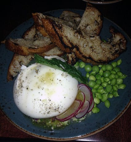
burrata

Insanely delicious burrata small plate, from Alden and Harlow in Cambridge, MA

On one hand this is just another article about the hype that social media more easily enables, but on the other hand, it draws the (perhaps spurious) conclusion that since so many diners are taking pictures of restaurant food (and posting the pictures online), that restaurants are designing food for photographic appeal first and for taste a noticeable second.

Cameras that can capture and transmit images in an instant are being used to photograph food that is meant to hang out indefinitely in suspended animation. Parceled out on a slate tile and pitilessly accessorized with leaves, crumbles, froths and sauces (set with emulsifiers so they never break down), even a charcoal-grilled steak would be as cold as a bologna sandwich. And this is what now passes for great, or at least significant, cooking. But great food is rarely static. As soon as it leaves the kitchen, it’s changing. In general, it’s getting worse. The soufflé is sinking. The arugula is wilting. The color of the steak excites us because it’s deeply browned, and we know that toasted, roasted, seared and caramelized surfaces mean deep flavors. But cameras hate brown food.

Again, I’ll suggest this is not necessarily true, but it serves to remind us of unintended consequences, and at the scale of social media, we are seeing more of this special type of unintended consequences, where we create with the consumption in mind. The media consumption used to be a consequence, but perhaps it’s becoming the primary design target. As consumers, we learn how to participate in experiences so that they can be documented and shared (and earn those addictive likes) and as producers, those that create those experiences, we are learning how to stage them so that they can be more easily shared and earn addictive likes (and valuable cash rewards as well). Public speaking in easily-tweetable soundbites or food-plating in easily-instagrammable bites; either way it all feeds the beast.

Advice for early-career designers

Last week I spoke at a fundraising event (Let’s talk design and help a kid with cancer) organized by Jorge Baltazar.

Glen Lipka, employee #1 of Marketo gave the first presentation, with advice about interviewing for a job in UX. In many ways, it was an object lesson in empathy, as he illustrated many ways that applicants fail to understand the mindset, goals or expectations of the person interviewing them. He described reviewing a portfolio with illegible yellow text over a gray background – but that he’s more focused on what transpires when he asks the applicant about it. A bad design choice is something he might expect in a less-experienced designer but the ability to explain a design choice and especially to acknowledge that a design decision could be improved was really what he was looking for. Some of his points are well-captured in How to Pass My UX Designer Phone Screen and his deck is here.

Aynne Valencia is a design strategist. She presented a “field report” from a number of conferences she’d been at in the last while (I remember IxD14, SXSW and some others in Europe), looking at the trends in interaction design that were here now, coming soon, and further out. Some examples included Brad the emotional toaster, and Berg’s Cloudwash. I couldn’t find her slide deck, either, but she continues to document the things she’s seeing on her blog.

Christian Crumlish, the Director of Product at CloudOn, spoke about what makes a great designer, acknowledging that he’s not a designer at the moment and further unpacking the challenging nature of trying to speak to such a big topic from one person’s biased point of view. Meanwhile, he identified three qualities

  • Breadth: Having creative pursuits outside of design that you can uses as sources of inspiration. His ukelele is an example of something he does for fun but will occasionally provide a surprising new perspective or framework. You can read a bit more on this same theme in my review of Debbie Millman’s How To Think Like A Great Graphic Designer
  • Passion: Apply everything to your work, or refocus on new work if your passions leads you there.
  • Restlessness: Never being fully satisfied and always looking for something new or better.

Finally, with some prompting from Glen, he played and sang a bit of “Satellite of Love” on his ukelele.
photo1_425

I was the last presenter. I gave an overview of my own crazy career path (see Disciplinarity and Rigour? My keynote from the 2008 Design Research Society conference and then offered the following thoughts and suggestions

  • Network. Do it online, but do it in person as well. LinkedIn is good for a soft intro, but find people and talk to them. Take a long view about your career and your relationships that are part of that career. Be authentic. Be interested. Don’t think about what people can do for you or you can push people away.
  • As you go out and speak to people, take the approach of prototype and iterate. Figure out your story, your objectives, what you have to offer and your strengths by talking them through. Use informational interviews to live practice of what you have to say and how you want to say it.
  • I can’t really back this up but I suspect that in one era, you’d be told to get a job in an agency because that’s where the good design was happening; and then in a subsequent era you’d be told to get a job inside a corporation because that’s where the design work really was, and then people might be telling you to work in a startup because (although not always the case) startups were really making design part of their thing, and now it doesn’t seem like terrible advice to do your own startup. Given the tools that are available for small teams to design, develop, build and deploy significant pieces of technology whether it’s the App sSore or AWS or whatever, it seems open to almost anyone now. Personally, I never really wanted to make a thing once I discovered facilitating others to be making a thing.
  • Look for your advantage in moments of upheaval. Design is changing; industrial design is really suffering, firms and agencies are suffering, teams are downsizing; UX is increasingly important but where the jobs are and what they entail keeps shifting.
  • There’s also something with increasingly alternative forms of education. Jon Kolko used to teach at SCAD and then he went and started his own school – the Austin Center for Design. Jared Spool is in the process of starting a school in Chattanooga – the Unicorn Institute. These people are seeing the gaps between the jobs that need to be filled and the people that are trained to do them and they are trying to address that. Even if you aren’t seeking education yourself, there are patterns emerging and it’s worth your while to keep an eye on it, keep trying to make sense of it, and keep trying to connect what you are passionate to do with what the opportunities are
  • For me, career has been struggle in various forms all the way along. It’s great to have the benefit of time because then you can have hindsight. Struggle might be another way of saying that it’s about finding the next challenge and pursuing it, because the ground doesn’t stay still beneath your feet. There are plenty of rewards along the way; and the struggle sucks the most in the early days; it is suckiest when you are at the bottom of the Maslow pyramid and are concerned with survival not spiritual fulfillment. Over and over again I keep being reminded that no one will come and hand it to you. I keep waiting to be discovered and given a magic solution but really it’s about moving forward in small ways.

Thanks to Jorge for organizing this and the speakers for some really compelling talks.

Steve quoted in “Digital Products Flunking User Test”

I was interviewed by CruxialCIO about how companies can design and redesign digital and mobile products that engage rather than frustrate. The article (Digital Products Flunking User Test) is broken across three tabs (SituationSolutionsTakeaways) and the quotes from me appear on the second two tabs. FYI, the pages are a bit slow to load.

Remember the precedents. While copying competitors isn’t necessarily advisable, it doesn’t make sense to design, for example, a fly swatter that you use by swinging a string around with the flat swatter piece attached to it. People expect a stick at the end. “You can’t fail to acknowledge that there are precedents out there,” says Portigal.

“There’s some history about how customers are going to expect something to work. Everyone is a consumer so in an enterprise situation, we bring in expectations about how something should work.” If people expect that swiping left or right, double clicking, or other gestures will have a certain outcome, the lack of that outcome will be confusing. After Apple came out with the iPhone, for example, it became quickly clear that when consumers wanted a smartphone, they expected something fairly similar in form factor and function to the iPhone.

The Shape of Food and Other Things (To Come)

A provocative survey article on Edible Geography explores the form that food (specifically Chicken McNuggets and cheese) is presented in.

It’s a safe bet that McNugget morphology tells us something important about the sensory framework through which we experience the world. Within the constraint of basic economic considerations (shapes that can be made on the same line and ship well), the bell, bow-tie, ball, and boot are sculptures made by our mouths-ubiquitous, finely-tuned artifacts that reflect by our increasingly sophisticated understanding of human sensory perception.

Early in my career we talked a lot about how digital technology was changing the range of possibility. Form didn’t have to follow function. Industrial designers could make digital cameras (an example early project where we grappled with the form factor for the device and the metaphor/mental model for the software) look like anything.

Apple’s original QuickTake 100 camera took advantage of that freedom.

It was not a successful product; the form (and it’s lack of traditional camera references) was certainly not the only reason, but that product might represent some of the most extreme of early experimentation. Now our digital cameras look pretty much like the film cameras they’ve fully displaced. At the same time, revolutionary (e.g., digital) products can seen as making culture (e.g,. cell phones as the new concert arena lighter) as much as reflecting it.

The story of the Lytro camera, more recently, suggests that it too is trying to introduce a revolution into a staid category (the aforementioned digital camera), and it’s form announces that it’s somehow different.
lytro

I can’t help but assume the packaged and processed foods people have a lot more data and a much more refined (if you will) understanding of what forms connote and how they motivate. If they are speaking to our liminal behaviors and our reptile-brain sensory processing then they are able to use that to their advantage when other forms of design can’t, at least not yet.

Out and About: Steve in Portland/San Diego/Denver

Last week I hit three cities, doing workshops and fieldwork; in hotel rooms, airports, homes, restaurants and the like. Here are some of my photos from a very busy trip.

help
Hotel restaurant point-of-sale user interface. So many amazingly awful things here. The help button is labeled “HELP!!!!!”; Cobb Salad (I’m sorry, Fiesta Cobb) is $12.00?

raisins
Without raisins? Now with extra raisins!

kiosk
There used to be a baggage kiosk. Now there’s just a sign.

dancing
I found Jonathan Borofsky’s “The Dancers” in downtown Denver to be vaguely unsettling.

wall
Controls removed for your convenience.

Curating Consumption

Since Johnny Holland has said farewell, we’ll be continuing this series here on All This ChittahChattah. Here’s some stories and observations that Beth and Steve have assembled over the past few weeks.


Tim Hortons beverage pricing offers a large number of sizes with a tiny, silly price difference. No doubt there are graphs that prove this is a good pricing strategy, if upselling by 11 cents turns out to have any impact on the bottom line. As a shopper, I find it mind-boggling; the friction for supersizing is almost zero and now I have to actually think about how much I want to drink. The Tims man showed me the largest size and it was so obviously too much (more horse trough than hot choc), so I saved myself a few pennies and went down a size or two. /SP


Pets-as-people is certainly nothing new; a trend that has continued to grow in terms of marketplace dollars, emotional engagement a product selection. Still, it’s astonishing to look at a wall of clothing that looks like t-shirts in a range of kids’ sizes and styles, and to realize that actually you are looking at a selection of “Pet Gear.” /SP

As I tried to write the contents of this bag (pumpkin squash curry coconut) onto the label I quickly found myself ranting about the poor design: How can you fit anything on this tiny label (e.g., “pump sq cur coc”)? Then my young designer self surfaced and I realized that, “No, in fact this is perfectly designed.” The available writing space is exactly aligned to the end of the copy above, the height is exactly the height of the Ziploc brand. Everything was in harmony! I can’t tell you how many times while in design school that I designed something most beautiful yet most unusable. Thankfully a super brilliant creative director showed me the way. Functional can be beautiful. If you make medicine bottles clearer or safety messages intriguing enough to read then you’ve done something as a designer. What can seem like the most banal and uninteresting design project is a challenge not many can rise to. Anyone can design for cool brands like Nike, Coke and Pepsi. But can you make Ziploc bag labels a thing of beauty? Or at the very least, give me some more room to write! /BT


“Members only?” Here’s how I imagine that signage came about
Store manager: Why do you think we’re not getting any business?
Clerk: Maybe people don’t know we’re open?
Store manager: But we’ve been open for weeks!
Clerk: But we don’t have any kind of sign or anything telling people we’re open,
Store manager: But, it’s a store…I mean…the door is open…lights are on…we’re in here!
Clerk: Yeah, but it’s kind of not official until you have one of those big signs up…
Store manager: Fine!
[later that day]
Customer: Finally! Been waiting for you to open so I can see how much membership costs. /BT

Series

About Steve