Posts tagged “post-design”

Don’t put your garbage here! Please!

sleep-study

I encountered this box recently at my local medical office. It’s a squat white bin with a wide black opening near the top. It looks a lot like a trash bin. Obviously I’m not the only person that reacted that way, because they’ve tried desperately and ineffectively (with EXTRA SIGNS as they so love to do in healthcare) to communicate that. There are three signs (see the orange pointer) telling you what the box is for (dropping off sleep study equipment) and two signs (the purple pointer) telling you what it’s not for (it’s not for garbage).

That’s five different signs, only two of which even vaguely cohere with each other (the red tape), all requiring English. The net effect is chaotic. There’s no empathy here; each message acts as if it’s the only one, without awareness of the others.

And still – the thing looks like a garbage bin! That message is loud and clear and no amount of signage will get around that. But the staff who have to pick the garbage out of there have no control over the bin’s design and so they are left with their default tool: signage.

I wonder if they could do better if they went further, such as painting the white surface and/or the black flap to more strongly shift the meaning. Or by having a sleep study device (which comes in a little carrying case) or at least a large icon near the opening. And a garbage bin nearby. The tactic would be to communicate more visually and directly what stuff (sleep study devices, trash) goes where and not rely on words. Until then, they can expect more trash.

See previously Signs to Override Human Nature? as well as other writing about post-design.

ChittahChattah Quickies

  • [from steve_portigal] Toepener — Hands Free Solution – [While this smacks slightly of "gadget" I like the idea of simple improvements to everyday activities based on a) shifting social norms and b) observed behaviors. Text from related news article] The Toepener is a pedal designed to open a public washroom’s door with one’s foot rather than having to touch the door handle. It is the brainchild of Max Arndt, a student at the Carson School of Management. Arndt and his classmates were asked in the Entrepreneurship in Action class to come up with ideas for a new business product or service. Arndt, 22, came up with the Toepener. He hated the idea of opening a public restroom door after he’d washed his hands. It was such a simple idea but he figured it would have tremendous draw. He was right. His class was equally enthusiastic and it was chosen as the product the entrepreneurship class would attempt to market. The product was launched in mid-January. Arndt said the company has sold close to 100 toepeners, which go for $50 each.

Ups and downs

After writing recently about managing the adoption of a new type of elevator UI, I found a particularly bad implementation of the norm at my hotel in Austin last weekend.

Unusually, there are two elevators on either side of two rooms.

Beside each elevator is this cautionary/alarmist admonishment:

“This button” refers to “these buttons – those ones down there” despite the horizontal arrow. But we can probably figure that out. The reason for this sign – an obvious afterthought is that there’s no place where you can stand and easily see both elevators at once. You must approach one elevator to press the button, and if you stand there and wait, you are likely to miss the arrival of the elevator if it doesn’t come to that door. There is a standard solution: a light near each elevator door that lights up just before the elevator arrives and the door opens. But (other than in the hotel lobby) they’ve neglected that and instead the hotel guest must be “alert” when doing a basic task like trying to get down for breakfast.

This is a well-known and long-solved situation; why the builders would choose to put the elevators around two rooms and then create such a poor experience would be interesting to explore. What were the design and other decision processes that led to this sub-optimal solution?

Anticipatory Design: Make it Better, Not Worse

Bruce Temkin offers some good observations about the elevators at the Marriott Marquis in New York. These elevators have no floor selection buttons inside; you make the choice when you call the elevator and are assigned a specific car (presumably to optimize service time). This is a change from the normal, thought-free experience we have with elevators and as Bruce observes, it doesn’t go smoothly.

But Bruce suggests a solution that really misses the boat. It’s an approach that we’ve all seen many times before, and so it’s natural for someone to simply channel from their environment. People don’t realize the elevator works differently, Bruce says, so let’s put up a sign.

This is a great example of what I call post-design: an unsuccessful attempt to solve a problem caused by a poor design implementation. Think about a corporate lunch room admonishing people to clean up, or any visit to a health-care facility where dozens of signs direct, warn, advise, remind about how to fill out forms, what to have in your hand, where to go, etc. Often, they make something feel more complicated (e.g., 4 steps to take an elevator?).

Some other examples of post-design (click the title to read more of the story):
cartwarning2
Don’t Steal Shopping Carts

touchscreen.jpg
This Screen Is A Touchscreen

p1000367.jpg
No Skateboarding

dsc_0351.jpg
No Flavors, Just Sizes

What is needed here is a forcing function – something that gets in the way of business-as-usual interactions, pulls people out of their habitual gestures and alerts them that something is different, ideally directing them on how to proceed.

Some examples of forcing functions (click the title for more):
switch.jpg
You Better Be Sure You Want To Turn The Light On In Here

flush.jpg
The Familiar Handle Is A Different Color For A Reason

blueman.jpg
We Want You To See Our Ad Before You Watch TV

While Bruce is right that an intervention is needed, we can look at the forcing function examples to get some clues as to what might work better than Yet Another Sign in a visually cluttered environment. The problem is an interesting one because the thoughtless act is pressing the button but the notable consequences happen a minute or so later, once you enter the cab and realize that there’s no button to press. That suggests some locations for an intervention

  • When the button is pressed/the elevator is called. How could this be different so people are aware that things aren’t business as usual here? How could the next step in the experience be flagged?
  • While waiting for the elevator. We don’t have a lot of data about what the waiting process looks like
  • When first entering the car. What visual cues would indicate how this elevator is going to work, when entering an empty or full car
  • The first moment of confusion. We can imagine after entering the elevator people will do the familiar gesture of peering around the corner to try and find the panel of buttons, first on one side, and then on the other. What visual or other cues can appear right at that moment to clarify and reassure?

While it’s not my goal to “fix” the elevator system (especially when we only have one self-reported user experience to work from, and we don’t have a robust understanding of what the problem even is), we can highlight some other ways to think about conscious and unconscious behaviors and how design can intervene to support, redirect, and optimize. If we understand what people are expecting, or anticipating, we can be right there with solutions right before they know they need them. These clean-up design challenges can be harder, trying to retro-fit against an imperfect original solution we didn’t control, but we’re always going to be faced with these situations, so let’s have a thoughtful set of approaches.

Influencing customer behavior

killarney
We Need Your Help, Vancouver, February 2009

The Killarney Market in Vancouver, B.C. accepts the inevitable: customers will take shopping carts in order to transport their groceries home. Rather than scolding customers or making the behavior illicit, they give permission and provide an extra service: cart retrieval. Sure, this could be better presented and better implemented, but it’s an interesting response to the common behavior, giving permission and supporting the obvious instead of demanding or forcing it to stop.

And a refreshing contrast from the increasingly common post-design solution (using our friend, technology) that locks cart wheels if they leave the property boundary, deterring removal in a rather unsubtle fashion.

cartwarning
Carts and Borders 1, Oakland, August 2006

cartwarning2
Carts and Borders 2, Oakland, August 2006

cart_mascot
Oh no, Oakland, August 2006

See also:
Curb Appeal
There is Nothing New Under the (Rising) Sun

Core77 Show+Tell video: Steve investigates the bathroom

Yes, more bathroom blogging! Core77 has just posted a quick video I made

In this video for Core77, Steve Portigal takes us into his company bathroom, uncovering examples of bad design and its consequences.

From signage to artifact and back, people are forever mistaking their cues for how to behave, how to use products and systems, and how different, often-conflicting indicators cause our expectations and realities to collide. This 2-minute video is a priceless example. What’s in your bathroom?

Come on come on and TOUCH ME baby

touchscreen.jpg
Orlando airport, June 2008

A touch screen looks like any other monitor; designers have not created anything in the physical form that denotes interactivity. It falls to the content (what is on the screen) and the context (where is the screen placed) to invite people to touch. In this case, they’ve chosen to add an external static sign to indicate what you should do.

This is in an airport, so informational rather than advertising content might be a more natural draw for interacting (seriously, an interactive menu experience?) and having this thing sitting near an escalator doesn’t make a lot of sense; it’s not a place to linger.

Here we have another example of post-design, fixing a problem in the original design by adding on another piece. Seeing that added instructional text made me wonder how we typically know that a screen is one that we can touch and interact with. It’s an interesting opportunity for the hardware manufacturers to create some visual language that can help with that invitation.

Anti-skateboard devices on the Embarcadero

Last year Nicolas Nova blogged about element of public space that restrict usage – specifically skateboarding, and as one commenter suggested, lying down. Without remembering his post, I took these pictures the other day:

p1000367.jpg
p1000366.jpg

It’s still ugly, but there’s an emotional component (“cute” – “fun” – “neat”) created by the whimsical shapes that counteracts that reaction quite strongly. Many of the anti-sit installations appear as an afterthought, a post-design, without any integration into the original vision. These were probably added after the original design but there’s some attempt to retrofit, conceptually or visually. I’m sure the original planners and architects are horrified, but it kinda mostly works.

Signs to Override Human Nature?

We see these in small retail all the time – handwritten signs exhorting the customer to follow some non-natural path of behavior in order to simplify the merchant-centered purchase process. Here’s a fun one, where the experience is pretty cool anyway, and the creativity and ineffectiveness of the signs is something to smile about, rather than grimace.
dsc_0354.jpg
The setting certainly helps. In the town of Waimea, on Kauai, on your way to getting a sweet and cold treat – shave ice.

dsc_0351.jpg
The cash register sits underneath the most awesomely diverse and interesting list of flavors. You approach the guy at the cash and of course you want to say how many you want, and what sizes, and (after having gaped open-mouthed at the display for a few minutes) the flavors.

The signs attempt to warn you off from doing that, but it’s human nature. And with each person that tries to ask for a flavor, the cash guy tells them ‘I don’t care about flavors. I just need to know what size you want.”

They are so dogged with their insistence, but they’ve designed an experience where it’s entirely natural to ask for the flavors right then. Nope.

He’ll go and get the plain shave ice (with ice cream, if you want it) and then at another counter they take your flavor order. It may end up being the same guy working the other counter, or someone else. But they don’t care about flavors, until you get to the flavor counter.

It’s not so terrible that they go through the same thing over and over again, it’s just a great example of design and human nature and the ever-present sign which purports to fix the whole thing by simply warning people what not to do!

dsc_0352.jpg
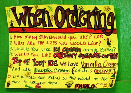
This sign is posted behind the cashier.
1. How many Shaved would you like (ice)?
2. What are the sizes you would like?
3. Would you like ice cream on the bottom?
4. Would you like our tasty creams on the top of your ice We have Vannilla Cream And also Haupia cream (which is coconut)
5. We do also sale extras so this would be the time to ask for them
Mahalo (thank you)

dsc_0353.jpg
The cutaway detail of the Halo Halo Shave Ice is pretty neat. Nice combination of 2D and 3D presentation of the details:
Haupia cream topping
cocohut
Shave Ice
Haupia cream topping
Halo Halo
Ice cream opsional [sic] with Halo Halo

Swiping Slot Blocked

dsc02875.jpg
The local Macy’s store has modified all their card reading boxes so that the card swiping slot is blocked. That t-shaped blob of plastic along the right side is where the slot used to be.

The software hasn’t changed, however, and while your purchases are being run up you are asked (as always) to swipe the card. I looked for quite a while, feeling stupid, trying to to figure out where the heck to put my card.

There was no place.

They also have not changed their staff training, so there was no mention of what to do or not do with the card.

Eventually, they take the card from you and swipe it themselves, and you return to the device to “sign” the purchase.

Series

About Steve