Posts tagged “experience”

Take pictures (of food that) lasts longer

burrata

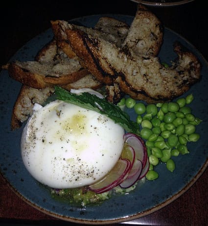
Insanely delicious burrata small plate, from Alden and Harlow in Cambridge, MA

On one hand this is just another article about the hype that social media more easily enables, but on the other hand, it draws the (perhaps spurious) conclusion that since so many diners are taking pictures of restaurant food (and posting the pictures online), that restaurants are designing food for photographic appeal first and for taste a noticeable second.

Cameras that can capture and transmit images in an instant are being used to photograph food that is meant to hang out indefinitely in suspended animation. Parceled out on a slate tile and pitilessly accessorized with leaves, crumbles, froths and sauces (set with emulsifiers so they never break down), even a charcoal-grilled steak would be as cold as a bologna sandwich. And this is what now passes for great, or at least significant, cooking. But great food is rarely static. As soon as it leaves the kitchen, it’s changing. In general, it’s getting worse. The soufflé is sinking. The arugula is wilting. The color of the steak excites us because it’s deeply browned, and we know that toasted, roasted, seared and caramelized surfaces mean deep flavors. But cameras hate brown food.

Again, I’ll suggest this is not necessarily true, but it serves to remind us of unintended consequences, and at the scale of social media, we are seeing more of this special type of unintended consequences, where we create with the consumption in mind. The media consumption used to be a consequence, but perhaps it’s becoming the primary design target. As consumers, we learn how to participate in experiences so that they can be documented and shared (and earn those addictive likes) and as producers, those that create those experiences, we are learning how to stage them so that they can be more easily shared and earn addictive likes (and valuable cash rewards as well). Public speaking in easily-tweetable soundbites or food-plating in easily-instagrammable bites; either way it all feeds the beast.

The Color of Money

money
A report from a University of Guelph study explains that

People are more likely to spend dirty, crumpled currency and hold on to new bills. [But] in social situations, people reach for new bills even when they have older higher-denomination currency on hand.

Researcher Theodore Noseworthy explains

We tend to regard currency as a means to consumption and not a product itself. It should not matter if it’s dirty or worn because it has the same value regardless. But money is a vehicle for social utility, and it’s subject to the same inferences and biases as the products it can buy.

This suggests some design opportunities for digital money. I recently tried Square’s new service that lets you email cash to anyone (US only). The user experience was so minimalist and utterly delightful – and such a change from the dirge of PayPal (even without the frequent frustrations). If I’m sending someone an experience as part of sending them money, the quality of that experience may be something to consider (also, it’s free; also it’s a good experience for me as the sender).

Ethnography of Elevator UX

Check out An uplifting experience – adopting ethnography to study elevator user experience (on Ethnography Matters). I love that someone has done (and shared) a study like this.

A few years ago a leading elevator design and manufacturing company gave me the task of examining how people experienced and interacted with elevators. The scope included everything from hall call buttons, to cabin interior design and perception of technical design. When given the brief, the artistic director noted country specific design features (or omissions) and even mentioned that there may be observable elevator habits I would want to take note of. Then, on our bidding a corporate-academic farewell she added that I might want to consider the psychology of the surrounding architectural environment. With that, I was left with a long list of to-do’s and only one method I could think of that would be capable of incorporating so many factors – ethnography.

I’m reminded of Elevator Pitch (PDF) our 2011 article in interactions that considered different types of elevator user experiences and mused about the implications for approaching design problems.

Out and About: Steve in Baltimore

During last week’s trip to Baltimore, I had just a little bit of time to explore. Here’s what I saw:

IMG_1272
I had a really delicious meal at The Food Market in the hip neighborhood of Hampden, but I did snort with laughter when they brought over what I thought was going to be a beet salad.

IMG_1276

IMG_1277

photo1
Have we hit Peak Experience (and not in the Maslovian sense) when donuts are reframed as experiences? Closing the loop on my last visit to the area, this was a total disappointment. Disappointing donuts and a weird experience. Fractured Prune was located in an Italian restaurant but I could not figure out where the donut counter was. It turned out to be shared with the restaurant. I had to ask two people once I was actually in this little restaurant where the donuts were. There’s no familiar visual cue of shelves of donuts, since all are made-to-order. I did have nice chat with a fellow patron who told me they were great donuts. I didn’t let him see me leave the half-eaten ones sitting in the bag on the picnic table outside. Not good.

photo2
Street art in Hampden.

ChittahChattah Quickies

Frozen Dead Guy Days, a Festival in Colorado, Stays Put [NYT] – Perhaps Burning Man is now the most famous of a group ritual that evolved to celebrate something other than what it originally intended. Excluding, of course, organized religion. Looking at the irony (or cynicism) that so clearly is at root of this shindig makes me wonder about how extensively meaning can shift over time.

It was probably not, in the end, an idea with huge franchise potential or a killer smartphone app in its future. After all, a gleefully macabre weekend celebration built around a frozen corpse – complete with coffin races, tours of the shed where the body is kept on ice and, of course, lots of beer – just might not be as fun beyond the skewed sensibility of Colorado’s hippie-tinged mountain belt. But now it’s official: Frozen Dead Guy Days are staying put in the small town of Nederland, about an hour northwest of Denver, as are the mortal remains of one Bredo Morstoel, a Norwegian man whose strange and unlikely saga in death – and long-term storage – inspired the whole thing. The Nederland Area Chamber of Commerce put the rights to the festival up for sale last June, saying it could no longer manage Frozen Dead Guy Days, which had grown rapidly through 10 years of icy, late-winter mayhem and was attracting upward of 20,000 revelers over the course of a weekend in a community of about 1,500.

Smell-designing Sheffield [Edible Geography] – A long and fascinating interview about smellwalks, smellscapes, and other funny words that are about exploring our sensory experiences in spaces. Brilliant! When is the Pacifica smellwalk happening?

There were a lot of people who said they didn’t like the smell of fish. But Doncaster is famous for its fish market, and when we went into the fish market on the walk, even those people who said that they didn’t like the smell of fish actually enjoyed it when they experienced it within the context of the market. They expected to smell fish there – it’s a fish market, so how else would it smell? – and it enhanced their experience of the market. In a vacuum, people say that they like and don’t like particular smells, but it turns out that they can enjoy all kinds of odours as long as they experience them in the right context. As designers, that’s quite an important point for us to note. It would be easy for us to say that because our surveys have said that people like smell A but they don’t like that smell B, therefore we’re going to design out smell B and introduce smell A everywhere. But people can enjoy a smell that they say they don’t like when it enhances their place experience.

Starbucks Frappuccino Bottles as Firebomber’s Tool [NYT] – Kind of a non-story when you go past the headline, but the notion of unintended uses for products is always fascinating. Sometimes that leads to innovation, sometimes that leads to a brand nightmare, I suppose sometimes it leads to both.

Mason jelly jars, whiskey quarts, wine and beer bottles – all have been among history’s vessels of choice for a homemade gasoline bomb. Now, a less likely vehicle has come forth: the dainty, 9.5-ounce glass container used by Starbucks to house its popular Frappuccino drinks. Investigators believe that in a rash of firebombings Sunday near the Queens-Nassau border, a Frappuccino bottle was the incendiary component of choice in most of the attacks.

Pumping For Thrills

The other day, my car on fumes, I stopped at a 76 station. While I was filling up, I noticed some amusing signs. One was a taxonomy of bugs, as seen post-windshield. The other suggested some stretches to do while you waited. Master shot and details, below.


I guess they’ve had this campaign for a while now, but as an infrequent 76 customer, this was my first time seeing it. The tone confuses me: I can’t tell if they are wry or serious. I guess, yeah, it would be good to stretch during a long drive. But why are the names of the exercise all smart-ass driving jokes? And it would be good to learn about the bugs around us, but smushed ones? It seems like something BoingBoing would link to, but not something a mainstream American corporation would post next to the pumps. I’m all for brands unstodgying themselves, but they aren’t taking a holistic approach to the experience (go figure). Other than seeing those signs, everything about my gas station experience was like every other time I’ve filled up at every other station. Except the buyers remorse when I found gas cheaper elsewhere an hour later. If you want to reframe your commodity as a destination, you have to think a little bigger than just swapping out the credit card ads for bug posters.

We make change. It’s what we do.

Here’s a snippet from What Was Facebook’s Best Redesign, Anyway? [Technologizer]

I had fun looking back at the fruitless nature of Facebook redesign backlash. No one is surprised anymore when a redesigned Facebook home page-such as the one that rolled out today-causes an outrage.

But that made me wonder: what design, exactly, do people want? Was there ever a single home page layout to which Facebook users, given the choice, would happily revert? In other words, have we cooked up in our minds some ideal vision of an “old Facebook” that never really existed?

I’d like to declare this as a National Week of Umbrage. Between Netflix and Facebook, it’s been a strange few days. And still, we have our share of “It’s just a [blank], get over it!” and (as in that post) “What do people WANT?” Sadly, most of it misses the point. While there are definitely features that suck (wait, I’ve got to manage two queues? wait, you’ve reordered stories from the friends I just recategorized according to what scheme again?) and of course features that are improved, this is really about how you manage change. This isn’t, ultimately, about features. Facebook is the social OS for many many people. Netflix is the entertainment OS for many many people. We invest countless hours in using the thing, including setting it up just the way we want. That’s our choice, in fact, it’s almost an imperative. I can organize my fridge and my sock drawer in a way that I find appealing, satisfying, efficient, or whatever. And no, I don’t have to be on the autism spectrum to do that and to find reward from doing that.

When things change, without warning, without rationale, without a clear sense of how things are different – and better – for me, without an easy way to adjust to the changes, then we’ve got a problem. Google Docs redesigned something or other the other day. Today I previewed the changes. They are vaguely dramatic, aesthetically. But my workflow hasn’t changed, and I will adjust. I didn’t find myself unable to find my docs, or having to do more work instead. I’d hardly hold up Google as some ideal user-centered culture, but they seem, in general, to roll out redesigns, and even business changes, without a lot of teeth-gnashing on our part.

The intimate relationships we have with these services are indeed emotional ones. When change is foisted surprisingly on you, it’s unsettling.

Change is inevitable, necessary, good. But I’d love to see some less-hamfisted rollouts, and I’d love to see these companies understand – at the very fiber of their being – how much we are connected to their products and how their brutish ways make us feel. It’s not the medium, it’s the lack of message.

ChittahChattah Quickies

Cross-sectional Chocolate [Edible Geography] – Here’s food science framed as both a structural design and experience design problem. See many delicious pictures at the original link.

Chocolate bar designers work with a limited repertoire of ingredients (nuts, crisped rice, chocolate, biscuit, coconut, nougat, and caramel), manipulated through technological innovation (enrobing, extruding, and moulding machines), to develop a wonderful variety of creamy, crunchy, tongue-coating creations.

Sometimes the design challenge is practical, as the Twix cross-section allows us to appreciate. The thin layer of chocolate between the shortbread finger and the caramel topping acts as architectural insulation, preventing water migrating from the caramel into the shortbread and softening it.

The Baby Ruth and 100 Grand bars demonstrate variations on the idea of a crispy/crunchy exterior surrounding a smooth interior, while the Oh Henry! and Snickers bars mix nuts with caramel above a smoother, denser layer of fudge or nougat, with the whole ensemble enrobed in a thin chocolate coating. The Lion bar combines both approaches, embedding a filled Kit-Kat-style wafer inside a 100 Grand exterior, turducken-style.

Mouth-feel, texture, taste, and even shareability are among the aspects of consumer experience that can be engineered through permutations of the basic chocolate bar template. The snap-off wafers of a Kit-Kat encourage more leisurely, social consumption, for example, while the interior chewiness of a Snickers creates a perception of satisfaction that the exterior crunch of a 100 Grand bar could never match.

ChittahChattah Quickies

  • [from steve_portigal] New book about recurring technological failures [Pasta&Vinegar] – [Nicolas Nova has written a lot of great articles, presentations, and blog posts about failure, technology, society, and design. Now he's got a book. Let's hope an English version appears before too long?] My new book about recurring technological failures has been released two weeks ago. It’s called “Les flops technologiques: comprendre les échecs pour innover” which obviously means that it’s written in French. Based on the analysis of several cases (the intelligent fridge, the visiophone and e-books), the book describes the notion of recurring technological flops, discusses the very notion of failures and their underlying reasons. It also addresses strategies and design tactics to take them into account.
  • [from steve_portigal] The Art of Garfinkling [Splunderousnoog] – [We tend to conceptualize experiments and research as dispassionate or disconnected endeavors, but there's so much that can happen when we as experiments or researchers risk our presumptions and comfort level in order to get deeper understanding. In describing ethnography, I often refer to the researcher as the "apparatus" who is embedded and gathers data through that experience.] Carry out a simple experiment. When you are on the bus or the train, ask a person to give up her seat. Make sure you're young and fit. To make it easier, ask someone who is as fit or fitter than you. It is a hard thing for most to do. There is emotional distress involved. The fear of opprobrium, the need to be liked, to be nice…This sort of experiment is known as a "breaching experiment". It involves violating social norms. A famous, pioneering exponent of breaching experiments was a chap called Harold Garfinkle. So much so that "breaching experiments" are known as "Garfinkling"!
  • [from steve_portigal] Jeter’s 3,000th Hit Will Bring About as Many Marketing Possibilities [NYTimes.com] – [Merchandising a celebration.] Tablespoonfuls of the dirt will be poured into capsules to dangle on key chains; ladled into disks to be framed with photographs of the hit (in what is called a dirt collage); and glued into the interlocking NY carved into commemorative bats…The selling of Jeter’s hit…is quite a list: T-shirts, caps, jerseys, bobbleheads, decals, cellphone skins, wall murals, patches, bats, balls, license plates and necklaces made by licensees…Jeter will share royalties with M.L.B. and the players’ union; Already, he has designated proceeds from the sale of a silicone bracelet to benefit his Turn 2 Foundation. Everything Jeter touches or wears as he pursues his 3,000th hit carries value. So will the bases he steps on. In deciding what to provide for sale, Jeter controls his cleats, wristbands, bats and batting gloves. The Yankees control what they provide to him, like his uniform, warm-up jackets, and caps, as well as the dirt, the bases and the pitching rubber.

ChittahChattah Quickies

  • [from steve_portigal] Who benefits when New York upgrades its ‘user experience’? [Capital New York] – [Somewhat rambling but interesting piece that – I think – compares the gentrification of the web to an app UX with the types of city changes New York is seeking to improve its user experience.] Try navigating most news sites and you’ll be dodging all kinds of digital equivalents to roadblocks, tourists and construction. Reading an article can sometimes require a mastery of mouse acrobatics, requiring you to steer from funny-looking links that, with just a graze over a photo, will awaken a sleeping giant ad that pop-ups up and takes over your screen, blocking the very words you were simply trying to read. Or a video will start playing, unprompted, somewhere in that digital box, and, although its sounds are blaring from your speakers, you can’t find it. You have to scroll and maneuver to figure out where the dang thing is and find that tiny pause button before your coworkers groan and tsk.
  • [from steve_portigal] VW Camper Van Tent [Firebox.com] – [File this one as another entry under things-that-look-like-other-things. While the design approach here is more of a gimmick, it reveals itself as a powerful way to play with meaning and irony.] If you love music, mud and Mother Nature you’re probably heading to a camp site at some point this summer. But why take shelter in some dull, conventional tent when you can recreate the Summer of Love in the hippie-tastic VW Camper Van Tent. Officially licensed, this stunning four-man (or lady, natch) tent is a luxe, full-size replica of the iconic 1965 VW Camper Van synonymous with 60s counterculture. It’s so evocative you can almost hear the Mamas and the Papas singing California Dreamin’ every time you feast your eyes on its beautifully breadloaf-ish form. Indeed we half expected Mama Cass to tumble out when we first saw this groovy Vee-Dub. You’ll be the envy of the campsite! [Thanks, Jeff Fox!]

Series

About Steve