Posts tagged “packaging”

Where Credit Is Due

card
Magnises is a new sort-of-credit-card that evokes an ultra-elite black card. It’s not actually a credit card, though. As they describe it

Each Magnises member carries our distinctive metal membership card, which extends and enhances their pre-existing credit or debit card, and provides perks, benefits, and access to numerous high-end brands. Upon admittance, Magnises will construct a card for each new member. Magnises will then extend the magnetic signature from the member’s personally owned credit or debit card onto their new Magnises card.

Yep, that’s right. You get a metal card that looks like a credit card but simply has the credit card data copied onto it – from the credit card you already own. While there are perks, no doubt, with this card, it is not actually the thing it denotes. It’s merely a gussied-up package for the quotidian plastic in your wallet (well, maybe not your wallet, if you are reading this it’s unlikely you are cool enough to qualify).

As a species, our ability to create meaning out of almost nothing – and then charge money for the performance of that meaning – is astonishing.

For more, see

Magnises Black Card Has Its Privileges (Well, Sort Of) [NYT]

New Soap in No Bottles

During a recent hotel stay I came across this familiar tag, hanging in the bathroom.

As hotel guests, we’re empowered to make the decision about whether to reuse our towels or get fresh ones. They’ve framed this as an environmental issue, which it is, but it’s also about customers improving the bottom line for the hotel. So it’s a wisely-framed message; I suspect it works reasonably well (although I wonder about housekeeping staff in this equation; if they are seeking tips then perhaps that’s why I see fresh towels as often as I not).

In the shower itself, I found this dispenser.

Here’s the message in detail

A similar dynamic; if you give up a little something, you save the environment. However, in this case, you don’t have a choice, and more importantly, the packaging has a significant impact upon the experience. That dispenser connotes generic, low-quality shower goo, not the delightful little cleansing treats found in hotels.

This is a design/experience/messaging challenge that they just ceded. The goodness of environmental contribution could be better conveyed (even that blue tag is better looking and more enthusiastically written than the dispenser copy). The dispenser could reward you in the interaction. The quality of ingredients, normally messaged by the packaging, could be explicitly demonstrated (an interesting, if not entirely successful example is Method on Virgin America).

Related: The rooms in Seattle’s Edgewater Hotel have lovely big bottles of shampoo ($25 if you take them) but they lose some of the appeal when you see these bottles used by housekeeping to refill ’em.

Observing Dublin (part 2 of 2)

More pictures from my trip to Dublin for tbe IxDA Student Design Challenge. Also see Part 1.


There is a chain called TJ Hughes in parts of Europe, so they swapped out the J for a K in order to prevent confusion.


KitKat deathmatch?


Most charming packaging, ever!


Dublin doors.


The classic, interpreted two ways.


Viking marketing.


Differentiation?


Damn right it hurts.


Local retail aesthetics.


Treasures in the trash.

ChittahChattah Quickies

Hollandia Produce Launches Squircle Packaging [The Packer] – I was thrilled to come across the term squircle the other day, in the context of this packaging redesign. Of course, Wikipedia has something to say about it and the name has found its way to content and design firms, too.

Hollandia Produce LLC is launching a clamshell redesign – called the Squircle – for its Living Butter Lettuce. The design incorporates features of both a square and a circle, optimizing space and enabling automated packaging systems. On the shipping side, it gives a 20% increase in units per pallet…Consumer and frequent-user focus group studies showed the new design maintains brand recognition while attracting first-time buyers.

Thirteen movie poster trends that are here to stay and what they say about their movies [Oh No They Didn’t!] – Compilations of visually similar, to put it gently, movie posters. In the way that the entertainment industry has created tropes within the content of the film that engage us in actively creating the plot at the same time as are following it, the marketing of film has established its own set of visual memes and cultural cues. Repetition and familiarity establish shorthand, and while we may decry the lack of originality, the predictability seems to work financially. Bonus from All This ChittahChattah years ago: Good ideas never go out of style.

Run For Your Life – Apparently all action heroes run through the same blue-lit, narrow alleyway when trying to escape/catch the bad guys. It’s also possible that graphic designers just re-use the same stock image of the running guy over and over again. The movies themselves are pretty similar to the Black/Orange ones except that all the explosions have been replaced with angst.

Hunk Gets Chunky: Personal Trainer Vows to Get Fat [ABC News] – While at one point in the article this is dismissed as a publicity stunt, the idea of producers experiencing what their consumers experience is compelling. From Black Like Me to Patricia Moore and now Fat Like Me. It seems unlikely that this trainer can replicate the motivational, cognitive, emotional, gustatory and many other issues that affect body image, diet, and exercise, but at least mechanically trying to lose weight as his clients are should be revelatory. I hope he does something with this experience.

The 32-year-old former underwear model has ballooned from about 180 pounds to 233 since last month. He has given himself until the end of March to get to his goal of 265 pounds, a weight he intends to keep for a few months. “A lot of my clients have been skipping classes,” he said of the motivation behind his burgeoning pudge. “I decided I really didn’t understand what they were feeling and their emotions.”

Dinosaur bones an untapped market for luxury set [SF Chronicle] – The recent story about the blinged-out iPad made with crushed dinosaur bones is obviously part of a larger trend towards dino luxe. I really love days when you can’t tell the real news from the fake news.

“Market value comes down to what a person is willing to shell out for a dinosaur,” says the 60-year-old dino dealer, who has been in the business since 1985, selling Jurassic ribs for $350 each, Cretaceous toes at $295 a digit and a 16-foot-long Camarasaurus tail for $20,000. Wall Street recognition will be fast and furious once he can supply the market with dinosaur genitalia, says Prandi…Hollywood stars Nicolas Cage and Leonardo DiCaprio in 2007 entered into a spirited bidding war at I.M. Chait auctioneers in Beverly Hills over who would go home with a 67 million-year-old T. rex skull. Cage’s $276,000 bid won the day. “Whether a Brontosaurus looks good in your salon is a matter of taste, Lajotte-Robaglia says, “but these customers are young wealthy people who grew up mesmerized by Spielberg’s ‘Jurassic Park’ and find the aesthetics of a dinosaur more interesting than a Picasso.” Prandi says confirming a dinosaur’s provenance is just as tricky as verifying the authenticity of a work by the Spanish master. “A lot of people call me up from all over the country and say, ‘I found a dinosaur in my backyard,’ but it turns out to be a rock that looks like a dinosaur,” Prandi says. Even so, the United States remains the world leader in mining luxury dinosaurs.

ChittahChattah Quickies

  • [from steve_portigal] Lending Coming Soon for Kindle [Kindle Forum] – [This announcement from Amazon produced a lot of skepticism on the important caveat – that lending will be dependent on the publishers. Nice move that allows Amazon to raise their eyebrows innocently, "Oh, sure, we're allowing people to share eBooks. It's those greedy publishers that won't let you do it. But don't look at us!"] Later this year, we will be introducing lending for Kindle, a new feature that lets you loan your Kindle books to other Kindle device or Kindle app users. Each book can be lent once for a loan period of 14-days and the lender cannot read the book during the loan period. Additionally, not all e-books will be lendable – this is solely up to the publisher or rights holder, who determines which titles are enabled for lending.
  • [from steve_portigal] Proposing a Taxonomy of Social Reading [Institute for the Future of the Book] – [Bob Stein opens the conversation on how we can further the dialog about what it means to be social in reading. The wiki-like format he's used allows for discussion but is pretty difficult to navigate. I've linked here to the overview page that summarizes the current entries in the taxonomy] In recent months the phrase “social reading” has been showing up in conversation and seems well on its way to being a both a useful and increasingly used meme. While I find this very exciting, as with any newly minted phrase, it’s often used to express quite different things…In order to advance our understanding of how reading (and writing) are changing as they begin to shift decisively into the digital era, it occurred to me that we need a taxonomy to make sense of a range of behaviors all of which fit within the current “social reading” rubric.
  • [from steve_portigal] Cross-examining your interview skills [Slideshare] – [Discovered through Google Alerts since it quotes me, but shared here because it's a great reference for a lot of fundamental interpersonal (and other) aspects of interviewing]
  • [from steve_portigal] Some crayons belong in kids’ mouths [Seattle Times Newspaper] – [Old news perhaps, but new news to me. A surprising brand name for a beverage!] In 2003, Seay bought the Crayons trademark for use with food and beverages from someone who had been tinkering with using it with juices on the East Coast. The crayons trademark is not the same as Crayola, a company that sells a popular brand of the colorful writing instruments known as crayons. Coincidentally, another local company — Advanced H2O on Mercer Island — uses the Crayola brand name for a bottled-water line called Crayola Color Coolerz.
  • [from steve_portigal] HP’s Slate specs slated by bloggers [Boing Boing] – [As Homer Simpson said, it's funny cuz it's true] it's just a pretty keyboardless netbook. Its most interesting characteristic is a bizarre slide-out tray that exists only to display the Windows 7 licensing information. It's like something from some kind of screwball comedy about awful product design: HP was apparently obliged to do this because it didn't want to mess up the exterior with this compulsory information panel.

The package is the brand. Now what?


Method soap in here, Virgin America, June, 2010

On a recent Virgin America flight, I saw they were featuring Method hand soap in the bathroom. But (as they have obviously realized) Method’s brand is more recognizable via the uniquely designed dispenser than the name, so the identifying sticker shows a picture of that shape. You don’t have the opportunity to use that container, but by interacting with the generic goo dispenser in the bathroom, perhaps you are supposed to associate somehow with the visual and tactile interaction with the iconic dispenser.

The Virgin America experience seems to be partly about aggregating a hip, design-y, youthful set of other brands for travelers to experience (e.g. BoingBoingTV), but I’m not sure this is a win for Method, or Virgin America. VA seems to have rethought so many traditional aspects of air travel (such as their fantastic safety video) but this compromise evokes the overcompensating-unhelpful-infographic-signage common in commercial aircraft interiors, where you can’t help but feel trapped in a world of call-outs (like the Ikea Catalog scene in Fight Club). And Method takes a straddle position, suggesting that their goo is just goo, if they are forced to offer a visual reminder of the container to help us connect with what is different – and better – about their product.

ChittahChattah Quickies

  • [from julienorvaisas] STRANGEco MR. SPRAY – Shepard Fairey [strangeco.com] – [I was not considering purchasing one of these original-artwork/advertising-appropriation figures in the latest limited edition by Mr. Fairey… until I read about the 4 points of articulation. $84.99] We're pleased to announce MR. SPRAY, a new limited edition vinyl figure designed by internationally renowned artist Shepard Fairey! Mr. Spray is an original character created by the artist in 2004 as a street-art appropriation of an advertising character design of the 1950s. Mr. Spray is the first original vinyl figure design by the artist in eleven years and will be released in mid-July 2010. Mr. Spray is a rotocast vinyl figure, 11 inches tall. 4 points of articulation and packaged with an OBEY mini stencil.
  • [from steve_portigal] Money in the Bank? No, Sandwich in a Can [NYTimes.com] – An SEC lawsuit says that Mr. Wright promised returns of up to 24% on real estate investments, but that he put the money instead into Candwich development and other equally untried ideas. Along with sales of canned sandwiches ­ Pepperoni Pizza Pocket and French Toast in a can ­ Mr. Wright’s companies, under the banner of Waterford Funding, also invested in a company selling rose petals printed with greeting card sentiments and another selling watches over the Internet. Meanwhile, the Candwich concept perseveres. The president of Mark One Foods, Mark Kirkland, who said he patented the idea of putting solid food in a beverage container with the slogan, “Quick & Tasty, Ready to Eat,” said Mr. Wright promised full financial backing for Candwich production that never really materialized even as investors did. He said he believed that canned sandwiches would ultimately sell, and hoped to go into production later this year. The shelf life of a Candwich is excellent, Mr. Kirkland said.
  • [from steve_portigal] Reading in a Whole New Way [Smithsonian Magazine] – [Kevin Kelly reflects on the history of reading and the changes new technology has brought to this essentially fundamental activity] The amount of time people spend reading has almost tripled since 1980. By 2008 more than a trillion pages were added to the World Wide Web, and that total grows by several billion a day. Each of these pages was written by somebody. Right now ordinary citizens compose 1.5 million blog posts per day. Using their thumbs instead of pens, young people in college or at work around the world collectively write 12 billion quips per day from their phones. More screens continue to swell the volume of reading and writing. But it is not book reading. Or newspaper reading. It is screen reading. Screens are always on, and, unlike with books we never stop staring at them. This new platform is very visual, and it is gradually merging words with moving images: words zip around, they float over images, serving as footnotes or annotations, linking to other words or images.

Making a sandwich should not be an ordeal

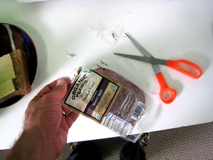
The package says “Easy Open.” To me, “easy open” doesn’t mean “requires simple hand tools.”

During lunchtime today, I spent two minutes, with audible grunts interspersed, trying to pry the plastic sheets of this roast beef packaging apart with my fingers. No luck. So I bit into the package, ripping several pieces off with my teeth. Still didn’t get to the roast beef. Finally resorted to scissors.

I’ve noticed that packaging-related glitches often seem more prevalent with organic and “heath” foods. Maybe it’s that many of these companies are smaller and less well-heeled than established Consumer Packaged Goods producers, and so are putting fewer resources into packaging design, materials, and production?

There are myriad examples of companies of all sizes going the direction of luxury or delight with their packaging (see related posts below). But on just a basic functional level – especially for a segment of the industry working for greater adoption – more attention to the non-comestible aspects of the customer experience would be great to consider.

Related posts:

Crock Addict
Packaging Surprise

ChittahChattah Quickies

  • After 40 years, Heinz revamps ketchup packets [msnbc.com] – The redesigned ketchup pack, unveiled Thursday by H.J. Heinz Co., is shaped like a shallow cup. The top can be peeled back for dipping, or the end can be torn off for squeezing. It holds three times as much ketchup as a traditional packet. "The packet has long been the bane of our consumers," said VP Dave Ciesinski. "The biggest complaint is there is no way to dip and eat it on-the-go." Heinz struggled for years to develop a container that lets diners dip or squeeze, and to produce it at a cost that is acceptable to its restaurant customers. Designers found that what worked at a table didn't work where many people use ketchup packets: in the car. So two years ago, Heinz bought the design team a used minivan to give their ideas real road tests. The team studied what each passenger needed. The driver wanted something could sit on the armrest. "We created the packet in 1968," he said. "Consumer complaints started around 1969."

Series

About Steve