Posts tagged “experience”

ChittahChattah Quickies

Packaging Surprise

sourcreamclosed
sourcreamopen

Daisy Sour Cream has supposedly been offering Fresh Thinking on their foil seals for several years, but I just noticed it, and was pleasantly surprised. They took an opportunity to create a front-of-house experience when I was expecting a back-of-house experience. They’ve used printing technology to enable a richer experience: they aren’t simply reinforcing their logo after you’ve already purchased; they are providing content that plays emotionally at the most emotional point of usage – when the product is first opened (I’d suggest the multisensory stimulus and associated anticipation is more emotional than eating it, even).

The foil seals on our containers do have a functional purpose – to keep our products their absolute freshest and safest for our consumers. But we wanted them to do more than that. So a few years ago, we created our “Fresh Thinking” foil seals, featuring uplifting, positive thoughts from Daisy. We hope you enjoy reading them as much as we do creating them.

Previously:

Crock Addict

I’ve developed a taste for expensive yogurt.

It started as a lark a few days ago, in a natural foods store near my home, when I saw Saint Benoit Yogurt for the first time. This single-serving yogurt comes in a miniaturized stoneware crock, colored and shaped like (what I imagine to be) a traditional European crock.

saint-benoit-yogurt-crock.jpg

I figured I’d throw down the $3.99 for a Saint Benoit once-it seemed luxurious, and worth doing for the experience.

But lo, the Palmetto Organic Grocery has just opened directly across the street from our office, and guess what they carry?

As it turns out, Saint Benoit only costs $2.49 if you return one of the used crocks. Compared to the usual $0.99 for many other organic yogurts, this price is still awfully high, but if the reusable crock and local, sustainable production are an ecological improvement over the usual disposable plastic container and cross-country transport, that’s one inducement to pony up.

The bottom line for me is sensory, though. There’s something about the “old world-like experience” of holding that little crock and hearing the spoon clink on its side that is proving to be quite seductive.

It’s a triumph of interface design.

Get our latest article: The Journey Is The Reward

riverpayment.jpg
My third interactions column, The Journey Is The Reward, has just been published. I offer some thoughts about the experience of the outsider, especially when we travel to other countries, and how that outsider experience can be so generative in understanding other frames of reference and cultural models.

Get a PDF of the article here. As the interactions website only has a teaser, we’d like to offer a copy of the article. Send an email to steve AT portigal DOT com and (if you haven’t given us this info before) tell us your name, organization, and title. We’ll send you a PDF.

Other articles

Why do people adapt to some new technologies and not to others?

Haven’t seen any posts about The Risk of Innovation: Will Anyone Embrace It? from the weekend NYT. Perhaps it’s because the thesis isn’t novel or well articulated? G. Pascal Zachary reminds us unnecessarily that some products are hard to use and that some products are released but fail miserably. He conflates technology and innovation, and ignores any notion of user experience or marketplace success from his implicit definition of innovation. And he reminds us that getting people to buy and use something new is the big question that all companies want an answer to.

These are good themes to be explored further. Zachary wasn’t given the time or the space to offer anything new on the topic, though, and I end up wondering just why the paper did this particular article anyway.

“The ultimate tech accessory”

img_gallery_02_big.jpg
These full page ads for Audéo have been running in magazines for the past few months.

The copy tell us that “hearing is inversely proportional to your life experience.” What an incredible reframe this is! Aging becomes experience, with a real vanity appeal (the more experience you’ve had, the more you are like this rock-n-roll dude, the more you have hearing loss). Hearing aid becomes tech accessory or even better personal communication assistant (both phrases that appear in the ad).

The cliche is that eyeglasses make you look smart; will a hearing aid (or personal audio monitoring system) make you look tough? Sure, if I was a traditional candidate for this product, I’d rather get something cool that reinforces a positive sense of self, but is the manufacturer Phonak going to be able to grow the market by getting new customers into on-board acoustic support?

Fruit 2.0

It’s great to see an awareness of user experience popping up in humble, low-tech places. Grabbing an apple yesterday, I discovered the small arrow pictured below at the top of the sticker, telling me exactly how to get the label off my fruit. Delightful. No apple under my fingernails on this one.

apple-sticker_sm.jpg
User Interface

And last week, I had another fruit-related experience that, while not as unequivocally positive, was still thought-provoking.

I poured myself a bowl of cereal-no raisins. Looked all through the plastic liner bag-no raisins. Figured I had defective cereal. Then I noticed a little yellow callout on the box-“Stay Fresh Fruit Pouch Inside Box.”

Sure enough, there it was at the bottom of the box-a silver foil pouch full of raisins. The experience promised by Health Valley on the pouch: eternally fresh, plump raisins and my choice as to the cereal/raisin ratio for each bowl.

custom-cereal_sm.jpg
Custom Cereal

While I still think I prefer having my cereal pre-mixed and ready-to-pour, I do appreciate the concept of this approach-the appeal to freshness and personal tailoring. Though I’d suggest that Health Valley do a better job calling attention to their packaging system, so that people don’t have to go through the same terrible moment of perceived raisinlessness that I did.

Breathe their air

Social Technologies is trying to do some of what we looked at last year with CultureVenture.

An interesting new report from Ernst & Young found that there continues to be enormous enthusiasm among investment firms around the world for initiatives and investments in the BRIC markets, “but that only about 29% of deals are completed because executives are not visiting the countries and learning about the local cultures,” according to a recent article in the New Yorker.

We urge our clients to educate themselves about and immerse themselves in the markets they are trying to understand. To help with this, Social Technologies will host a series of Futures Expeditions to Brazil, Russia, India, and China over the next two years.

They’ve taken a bigger risk by committing to the research before they’ve got the clients signed up, but they are also offering a one-size fits all solution. I am sure there will be learning, but I’d still prefer to offer (and participate in) a custom venture.

Learn Design Research Methods from Steve Portigal

On Tuesday nights from October 9 to November 13 I’ll be teaching a weekly two hour class, aimed at providing first-hand knowledge and training in core design research methods.

This course is part of the Involution Master Academy (an educational program for experienced professionals in design and related fields) in Sunnyvale, CA. Class size is being kept quite small to make sure that participants get significant hands-on time with instructors. Registration opens today, so sign up soon!

Full Description
This course will provide first-hand knowledge and training in core design research methods. At its root, design research emphasizes learning about people and using the insights gained to inform and inspire design. We will focus on exemplary models of what research is, what it looks like, its role in concept generation, and what it produces.

Students will develop their own design research philosophy, learn how to think about people, behavior, and culture, as well as the importance of being open to new perspectives. They will also learn tactical skills they can immediately put into practice: how to conduct observations and interviews, find research participants, and interpret and synthesize results as fodder for design and storytelling.

The schedule includes:

Week 1 – Introduction to Research
Week 2 – Methods and Research Planning
Week 3 – Problem Refinement, Interviewing & Fieldwork Planning
Week 4 – Analysis & Synthesis
Week 5 – Ideation
Week 6 – Presentation

Additional Involution Master Academy Courses:

Product Architecture Symposium
Instructor Andrei Herasimchuk
Saturday October 27, 2007
10:00 AM-6:00 PM

Strategic Influence by Design
Instructors Luke Wroblewski and Tom Chi
Saturday November 17, 2007
10:00 AM-6:00 PM

Rock and roll is a vicious game

guitarherocollage.jpg
“Is that for your kids?” asked the Sears dude as he handed me the box. “Uh, my kids?, heh heh, it’s for me!” I managed as I headed out of the online-order-pickup station. [Yeah, Sears.com actually has something in their store if their website says they do; unlike Circuit City that shows an item available when you look on their website but when you visit their store it’s not on the shelves and if you can find a human who’s willing to help you, all you’ll hear is that they don’t have it. You lost a customer, Circuit City!]

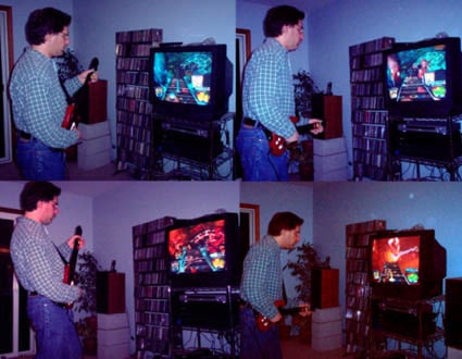
Just last week I saw leaked footage (since pulled down) of an upcoming video game called Rock Band where a group of people perform a song (using guitar controllers, a drum accessory, and a microphone) and it just gave me chills. I realized I needed to get Guitar Hero, the existing predecessor.

I grew up playing video games. As a kid, we’d find any bowling alley or arcade and spend hours pumping in quarters. I used to hang out a dry cleaners (!) after school, playing whatever game they had. I got an ATM card and moved my bank account just so I could go next door to get $5 at a time in this afterschool activity. So why was I not doing it still? I had a PSX for a while; it was amusing, but it never really fit.

But this – the idea of a game that was about performing…I’d been hearing about it for a long time; stumbling across the video and subsequent conversation with friends was the motivational tipping point for me.

Wow.

The game is fun. It’s really really fun. This is an innovation around the notion of what a video game can be. Musical and performing games have been appearing for many years, such as PaRappa the Rapper, and Dance Dance Revolution, or the various precursors of Guitar Hero that one could find in a Tokyo arcade 5 years ago.

The idea of the game isn’t new, but is definitely novel. You hold a guitar, with five different buttons where frets would be. Instead of strings, there is a strumming bar. On screen, notes come towards you on a fretboard. When the note gets to the bottom, press the corresponding button on the fretboard and strum, zapping the note. Each level is a different song and the notes that play (or don’t, if you miss) as you zap ’em make up the guitar parts of the song. You are essentially playing the song, with enough realism that you get a real charge out of it.

Some nice touches make it really work. There is a great tutorial that explains how to play and how to use the controller. No need to page through the tiny print in a book and figure out what the heck is going on; they’ve designed an explicit learning interface.

As well, there are various levels, to enable you to have some success. We played on Easy, and it was tough at first, then become somewhat less tough with practice. And more fun, the better we got. We dabbled with the Medium setting and it was more fun to play. This blew me away. Instead of simply increasing the challenge (more monsters, smarter monsters, faster moving monsters), the game gives back more. The more intricate the pattern of notes you are sent, the closer you are to “playing” the song. It’s more fun and more engaging.

There’s a nice mode where you can go through any of the songs at a variety of slower speeds and practice the guitar parts. The songs are broken down into intro/chorus 1/verse 1/bridge/solo etc. so you can really focus on what you are trying to learn.

This is the best game I’ve ever seen and it’s a really nice implementation of some fresh thinking about what video games can enable.

We were amused to see the game featured in the New York Times today (although they referred incorrect to Stevie Ray Vaughan’s “Texas Flood” as “Texas Blood.” Nice).
15guit1901.jpg

Finally, the SF Chron featured this image, full-size, on their real estate supplement.
re_gen_y15_034_rad.jpg

Kids? Sheesh. This is the perfect game for my generation, young Sears dude.

Radisson doesn’t quite get basic tech

Like the phone.

Last weekend I needed to set a wake-up call, and either introversion or bitter experience leads me to trust an automated service more than a human being, but even so, I always look on the phone for instructions on how to arrange for one.

p1000523.jpg
Right. Press the button and you’ll either end up in the automated system or you’ll be speaking to someone who can handle it. I press the button, but nothing. Press again, nothing. I try the other buttons and they all simply click. The phone has special function buttons but they are unprogrammed.

Okay, all is not lost. The room has another phone in it.
p1000525.jpg

But this phone has a different interface. Here we’re told to touch 77 (why is touch the verb, anyway?). Doing so brings me to the voice mail interface, which does not have any wake-up options.

Two phones, two different interfaces, both screwed up. I called 0 (or touched 0, if you prefer) and spoke to someone (shudder!) and it was handled.

It’s just a weird failure of attention-to-detail.

Time, he’s waiting in the wings


Originally uploaded by Victor Lombardi, who criticizes the addition of arrival data to the NYC subways, because that info shifts the experience into a waiting experience. It’s funny, because I had just spent 40 minutes at the San Francisco airport waiting for an arriving passenger, where they had no signage whatsoever about the different flights. I found it incredibly frustrating and tedious, since I couldn’t stop watching and couldn’t plan what I should do for the next 5, 10, 20, etc. minutes. I was musing to myself that more information – LOTS more information – makes waiting more tolerable. In-flight maps give you more information, allowing you to participate vicariously in the flight you are on (rather than passively as a butt-in-a-seat). Add in the good-vibes of transparency and it’s obvious…

And then Challis blogged the story about the post office removing clocks which hit the blogosphere with a predictable critique — the post office is playing Big Brother by removing info that would make us less satisfied with the experience. Challis would probably agree with my call for transparency and participation, but what would Victor think about the post office? Do the clocks shift the waiting time to something less pleasant?

Clearly, it depends on the person, their frame of mind, and the location. Lots of context to consider. But the contrasting examples seemed provocative.

I would have (seriously) rated the grade of toilet paper

In My Microsoft Google Yahoo Stories we get some comparisons of internship experiences at 3 big tech companies. I don’t recommend the article necessarily, only to provide context for this awesome chart.
newchart.png
I love how the deconstruction of the experiences (related in detailed narratives in the article) into these specific categories give a blunt and amusing summary of, well, the person relating it. What categories we create to represent something qualitative tells a lot about us and how we make sense of those experiences.

Counter-Experience

This weekend we checked out Palo Alto’s new restaurant, The Counter; a place that is having some buzz in the blogosphere (and their original Santa Monica place supposedly being mentioned on Oprah). The thrust seems to be highly customizable burgers. Kinda like The Fractured Prune’s version of donuts I blogged about recently.

DSC03150.JPG
I was surprised at how sedate and genteel the whole thing was, aesthetically. I was expecting much more of a cartoony-branded affair. This was nice.

DSC03151.JPG
DSC03149.JPG
DSC03148.JPG
DSC03152.JPG
Even the cash featured art more than heavily branded graphics. This worked against them a little bit – it was hard to figure out what to do, there was no hostess stand. Upon coming in, if no one is there to greet you, you see a stack of cilpboards with menus. Are these for us? I actually told the guy who came up “we have no idea what we are doing” – a comment I wouldn’t normally make (I’m not that insecure, but really, we couldn’t figure out the script. A bit more wayfinding signage, branded or not, would have helped.

Here’s the menu:
CounterGourmetBurgerMenu.jpg
There’s a lot of choices there! It’s surprising, exciting, and overwhelming. They could use a little help in form design here, again, asking you to wayfind through a series of decisions (although burger OR bowl needs some visual work to make the decision-fork a little clearer). But really, the impact of that massive set of choices (some with price premiums, some not) is pretty incredible.

They have mitigated that slightly with a set of pre-defined burgers, where they’ve chosen a few combinations, given them names (The Counter Burger) and saved you the trouble of figuring it out. But what I want is to make my own custom burger – the key experience here, it seems – but with some guidance: what goes with what? what tastes complement other tastes?

If you want to redo a room, you can consult a color wheel for info on complementary colors, you can find advice that might tell you to pick the carpet first and then select paint and fabric next [whatever the advice might be], that hot colors look good in a small room, and cool colors in a big room will make it feel more empty [again, or whatever – I’m making this up].

It’d be pretty amazing to have some help with this, if you want it. If you know what you want to eat, go for it, but if you need some help pairing up sauces and buns and so on, what can we do? Perhaps The Counter wants you to experiment and come back over and over again (we felt that urge, certainly), but what fun it would be to have some guidance!

We figured it out, eventually, with a mix of traditional (tomatoes) and curious (hard boiled eggs, english muffin) choices.

DSC03143.JPG
Appetizers: dill pickle chips, yet again proving that anything is good when breaded and fried. And a half-and-half appetizer of regular fries (poor) and sweet potato fries (good, but not the best I’d ever had).

DSC03147.JPGDSC03146.JPGDSC03145.JPGDSC03144.JPG
Burgers were unique, tasty, fun. Overall a good experience. We’re eager to go back and try something different next time. But $70 for four burgers, appetizers, a couple of beers and glasses of wine? Ouch.

They had just the right amount of new-restaurant inquiries from servers and managers asking us if everything was okay; good problem solving when something was missing (they ran in and got us a plate of the stuff we wanted).

Any Palomar is a pal o’ mine?

I blogged about my UXWeek hotel before I headed to DC and again after I arrived (when they have my reservation – expecting me to arrive one day later). Here’s some thoughts about the rest of the experience there.

image_110.jpg
The elevator had lovely but deadly ceiling lighting. There was no place you could stand (regardless of height or headwear) that would prevent these lights from shining uncomfortably into your eyes. You had to bob and weave to see the buttons for choosing a floor, and then shift around the space inside during your ride in order to minimize the just-outside-awareness annoyance (like when a bug flits near your skin and although you don’t consciously realize what it is you are still annoyed by it).

image_109.jpg
This sink in my bathroom drove me nuts. Only one control, to the right of the very large and prominent faucet. The control swivels between its current position, let’s call that 6 o’clock, and 90 degrees to the right – say, 3 o’clock. I never managed to get Hot or Cold out of the tap, though, so I never really figured it out. For the first set of uses, I just tilted the control back and got warm enough/cold enough water to do my washing. Then I saw it rotated right, only.

Meanwhile, every time I’d go to wash my hands I’d “miss” because I’d be aiming for the hot tap on the left of the faucet and then I’d get sort of confused with my eyes and my hands when crossing under that huge faucet. It sounds dumb when explained logically, but in terms of instinct, I could just not manage to use this sink easily.

One night I got up to get a drink directly from the faucet and smacked myself pretty hard in the forehead with the giant metal faucet. That’ll make going back to sleep fun.

I hated this sink, but only once I tried to use it.

image_108.jpg
Looking at the clock radio, I saw that familiar connector and realized hey, that’s for an iPod. I liked the visual branding of the connector; slightly obscure but not entirely so. It semi-subtlely announces what it’s capable of by showing those pins (and connectors are often relegated to the back of the house)

image_107.jpg
It was really nice to be able to listen to my own music while I was in my room; I made good use of this feature. Sort of a weird interface; I had to keep pressing buttons to get it to play but it was also simple enough I didn’t really mind. I probably blamed myself for not really trying to figure it out – if I had taken 3 minutes to study and learn that would have explained the use model well enough that each action would confidently produce a desired result. But meanwhile, I was getting music and that was good.

Otherwise, the hell just seemed like good ideas that no one really thought through. Lots of half measures that reminded you of the flavor of good service but not the actual experience of it. Every lunch buffet seemed to be missing some implement – gorgeous chunks of chocolate but nothing to cut them with (although maybe it was simply display chocolate we weren’t meant to eat – what a concept) or cold cuts and bread where the bread was rolls with raisins or chunks of baguette that weren’t sliced lengthwise.

The main restroom near the conference was staffed by a guy with bright yellow rubber gloves on. Was he a men’s room attendant? Or was he always in there cleaning? It was pretty unclear and it was of course uncomfortable – how were we supposed to be interacting? No script for that one.

Other people reported the bar and restaurant had lovely tables that seemed at the wrong height for the chairs (or the chairs being the wrong height for the tables). That seemed the theme here – nice looking stuff that was just hard enough to use to make you feel wrong or awkward.

Let’s hope they get this stuff sorted out; I fear they are so far off the mark, though, putting up layers of surfaces without trying them out, that it may never resolve.

Series

About Steve