Posts tagged “design”

Unfinished Business lecture: Culture, User Research & Design

I was recently in Toronto to speak at OCAD (Yes, we were in this awesome building) as part of the Unfinished Business lecture series. My talk looked at the notion of culture and it’s importance for user research, and design.

Culture is everywhere we look, and (perhaps more importantly) everywhere we don’t look. It informs our work, our purchases, our usage, our expectations, our comfort, and our communications. In this presentation, Steve will explore the ways we can experience, observe, and understand diverse cultures to foster successful collaborations, usable products, and desirable experiences.

Slides


Audio

I’ve split out the presentation itself from the Q&A, which was fun, challenging, and filled with big-picture type questions.

Presentation (1 hour, including a quick intro by host Michael Dila):

Q&A (40 minutes):

To download the presentation audio Right-Click and Save As… (Windows) or Ctrl-Click (Mac). For the Q&A audio, Right-Click and Save As… (Windows) or Ctrl-Click (Mac)

Note: In the talk (and the Q&A) I refer to my interactions article, Persona Non Grata. You can find that article here.

ChittahChattah Quickies

  • [from julienorvaisas] An iPhone App Helps the Blind Identify Currency [NYTimes.com] – [Feature Evolution: Clever use of built-in iPhone camera and speaker to provide a critical service to the blind.] For the millions of blind people living in the United States, paying for something in cash can pose major challenges because there is no difference between the size and shape of a $1 or $100 bill. To tackle this problem, many blind people set up systems to identify a bill’s value by folding the notes into different sizes and shapes, which then make them easily identifiable later. A new application, the LookTel Money Reader, available for $2 on the Apple iOS platform, hopes to help solve this problem by taking advantage of the devices camera to “read money” and speak the value of the currency out loud.
  • [from julienorvaisas] How Designer Marc Ecko Is Using Foursquare to Spank School Spankers | Fast Company – [App Evolution: Foursquare is being employed as an tool of activism – a check-in at a school gets you user-generated reports of the school's record of corporal punishment. An interesting evolution of the application, potentially turning regular users/consumers/players into citizen-heroes, broadcasting more than just location.] Beyond the Foursquare integration, there's a larger game element at play. "Think of Unlimited Justice as a game, where you're the hero. But, instead of saving some far away, imaginary land, you're doing good, right here, in America," Ecko says in his promotional YouTube video. Users of the service not only find out about school that practice spanking, they rack up points on a leader board as they watch videos, connect over social networks, and voice their discontent over the practice to leaders. "Go viral, spread the word, and build your credibility as the ultimate activist."
  • [from steve_portigal] Core77 Design Awards – [Bring distributed collaboration to the awards game, Core enters the game just as the game is changing. Well done!] Instead of bringing everyone to one location, we took a new approach to assembling the jury, distributing the field globally. No plane fuel, more legroom. Our Jury Captains are based in 13 cities spread around eight countries. Each will recruit four people from their area to form a locally-based multidisciplinary Jury Team. They get to do the judging in their own location, and we’ll provide the snacks. Once their results are finalized and validated, the teams will reconvene for a live web broadcast revealing their Winners, Runners-up and Notables, and the reasoning behind their choices. And they’ll do it all without jet lag.

ChittahChattah Quickies

  • [from steve_portigal] User-Led Innovation Can’t Create Breakthroughs; Just Ask Apple and Ikea [Co.Design] – [This old saw again! As if user insights and strong vision are incompatible? Shame on FastCo for this hyperbolic crap.] We asked friends on the Apple design team about user-centric design. “It’s all bullshit and hot air created to sell consulting projects and give insecure managers a false sense of security. We don't waste our time asking users, we build our brand through creating great products we believe people will love." IKEA designers don’t use user studies or user insights to create their products. “We tried and it didn’t work..”Of course, neither will say this publicly since both are extremely closed companies and would risk offending users (and the design community) by speaking out against user-centeredness. Since no one will speak up, the false value of the user-as-leader has spread. The best brands are guided by a clear vision for the world, a unique set of values, and a culture that makes them truly unique and that no user insights could ever change.

ChittahChattah Quickies

  • [from julienorvaisas] Plantronics and The Infamous Wall of Ears [SlashGear] – [The wall of ears is admirable in it's attempt at thoroughness, and it makes a disturbing visual impression in the bargain. Makes me wonder how they rely on it in the process – to give a "rough idea" of fit or to quantify fit and by association comfort? It's easy to see how it would give designers an idea of how well a headset fits in/onto the ear but cannot show how it actually feels to said ear.] This wall contains rubber molds of ears of every size, shape and form they could possibly throw together in order to cover as wide a range of ear shapes possible. Plantronics tests all new headset designs rigorously in order to put on the market the most comfortable headset for all shape and sized ears. Ears are notoriously difficult to create a mass market product for due to the level of inconsistency in human ear shapes. This wall is the “database” Plantronics has created in order to hit as many variables in headset design possible.

Steve interviewed in Digital Book World

I was interviewed for an article in Digital Book World. Anne Kostick and I spoke about the Reading Ahead project and what has or hasn’t changed since then. The whole article is online but here’s an excerpt:

We discussed what’s happened in the months since the project ended more than a year ago. Although the study gathered great feedback from individuals and professionals, he still doesn’t see a lot of people trying to really rethink what it means for “analog activity to become digital activity.”

Still, the primary goal of digital-book development should be creating good user experiences: creating things people can use that don’t disappoint on some social, physical, or conceptual level that the designers and manufacturers hadn’t known about or taken into account.

There exist, of course, basic principles, but Portigal notes that “we’re at that inflection point where we bring our analog expectations to digital. It’s hard to adopt new technology if it’s not done really well, and we don’t have a model for a digital reading experience.

“New behaviors are emerging as a result of digital experience,” he explained. We can handle operations that change-for example, that have preference settings-and there are actions that are moot now (for example, removing the jacket from a hardcover book before reading). But there’s so much potential for new functions and innovations; are readers ready for that? They lose something from not having the physical book, but don’t yet know how much they may have to gain.

Portigal suggests we tease and challenge the reader to learn more about what a digital reading experience can offer, and then let us know how they like or dislike a feature. Maybe readers will be able to navigate content based on reading expectations: What kinds of books do people read in bed? before sleeping? In transit? Readers may want to choose their content based on feeling, word length, density of prose, device and platform, for different situations and activities.

ChittahChattah Quickies

  • [from steve_portigal] A gadget’s life: From gee-whiz to junk [WaPo] – [An interactive graphic that shows the price-adjusted adoption curves of consumer electronics (TVs, phones, fax machines, mobile phones, printers, computers, modems, VCRs, camcorders, digital cameras, DVD players, boomboxes, radios, CD players, MP3 players). Via @Waxy]
  • [from julienorvaisas] Boredom Enthusiasts Discover the Pleasures of Understimulation [WSJ.com] – [Kindred spirits celebrate the benefits and glory of all-things boring! For the researcher not much actually qualifies as boring.] For seven hours, 20 speakers held forth on a range of seemingly dreary diversions, from "The Intangible Beauty of Car Park Roofs" and "Personal Reflections on the English Breakfast," to "The Draw in Test Match Cricket" and "My Relationship With Bus Routes." Meanwhile, some of the 200 audience members—each of whom had paid £15 (about $24) for a ticket—tried not to nod off. Karen Christopher of Chicago, who now lives in London, found at least one presentation so wearisome that she stopped paying attention. "I started thinking about Swedish police procedurals instead," she said. The organizers did their best to keep the audience alert. Many viewers brought coffee, and each received a goodie bag containing an energy bar. After a much-needed break, a drawing was held. Some of the winners got a DVD called "Helvetica," a 2007 documentary about typography.
  • [from steve_portigal] Verizon iPhone Won’t Fit Many Existing iPhone 4 Cases [Technologizer] – [Technology designers giveth, and they taketh away. The process of shopping for accessories just got more complex; Yes, you have an iPhone but what KIND of iPhone?] It appears the Verizon iPhone uses a slightly different antenna design that repositions the gaps between the phone’s multiple external antennas (found in the metal ring around the phone’s outer edge). Along with this change, the phone’s Ring/Silent switch has been moved ever-so-slightly closer to the bottom of the phone. While the difference between the switch positions may seem small, it’s enough that a protective iPhone case made for the original iPhone 4—the version sold by AT&T here in the U.S.—may not work with the Verizon iPhone 4. Specifically, if a case covers the edges of the phone, providing separate precision openings for the Ring/Silent switch and the volume buttons, there’s a good chance that the switch opening will be in the wrong location—in other words, the case will block access to the Ring/Silent switch.

Portigal Consulting year in review, 2010

2010 has been an amazing year for us. While we can’t talk about many of the incredible experiences we had doing fieldwork and working with clients, below are some of the highlights that we can share:

You can also see previous summaries from 2009 and 2008.

ChittahChattah Quickies

  • [from julienorvaisas] Steve Madden’s Comeback [Barrons.com] – [Steve Madden puts real-time rapid shoe prototypes in front of customers for instant feedback communicated through sales and interest. It's research that asks people to put their money where their mouth is, and provides significant financial efficiencies.] Madden is also responsible for what many think is the shoe merchant's biggest asset—its ability to quickly create cutting-edge footwear. After he and his team come up with a design for, say, new boots, a mini-factory at their headquarters can turn it into a trial product within hours, produce a limited number of the boots by the end of the day, and place them in a few of its own retail stores by week's end. The shoe merchant then gets feedback from the stores. If the footwear is a hit, it can be on retailers' shelves throughout the U.S. in six to eight weeks.
  • [from steve_portigal] TidyPSD – Get your PSDs organized! – [A fascinating example of a service. Upload a Photoshop (PSD) file to this site and they will organize it for you, grouping layers and renaming them in a coherent fashion. You can imagine digital professional organizing services that will clean up your files, organize MP3s or photos, but this is a very specific offer, akin to a professional organizer who sorts out your spice rack only.] It’s very difficult for coders to work with someone else’s PSD files if they’re not organized correctly. We help fix that problem by organizing your PSDs for you.

ChittahChattah Quickies

  • [from steve_portigal] LCARS Standards Development Board – [Library Computer Access/Retrieval System is the name of the operating system used by ship systems on Star Trek. As fan sites and other bits of consumer-developed tech emulate the look and feel of interfaces from Star Trek, this site is an effort to create a set of UI standards around colors, fonts, animation, sounds, and other interactive elements.]
  • [from steve_portigal] How Kanye makes his musical sausage [Kottke] – [If you've been enjoying our recent examples of inspiring or provocative thoughts on creativity from performing artists, here's another one] Interesting piece on how Kanye West's latest album, My Beautiful Dark Twisted Fantasy, got made. Lots of good creative process bits

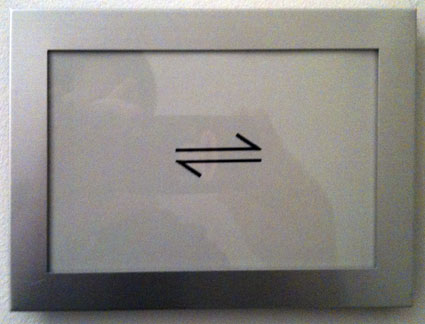
New symbols for new times


Medical marijuana dispensary, Sausalito, CA, November 2010

I was unable to find out about this symbol’s history or affiliation. Green Cross is a common term/symbol for medical pot, but seems tied to various local organizations (including a delivery service in San Francisco), while this specific graphic didn’t show up anywhere in my searches. Meanwhile, as new symbols and meanings emerge they can sometimes conflict: Green Cross is also an international organization, based in Switzerland whose mission “is to respond to the combined challenges of security, poverty and environmental degradation to ensure a sustainable and secure future.” When multiple groups appropriate and recontextualize an existing symbol (in this case the Red Cross) that collision is ever more likely.


Unisex bathroom sign, San Francisco, CA, August 2010

While this sign, seen in the Commonwealth restaurant, may actually be a branding icon for the restaurant (since it appears on their menu) and not a new symbol for men-plus-women, given its visual insinuation, and application (appearing on two adjacent doors, just where you’d expect to find the bathrooms), it begins to suggest a broader meaning. Unisex bathroom signs are typically denoted by the icons for men and women, together but the idea (intentional or not) that this usage has a gestalt not fully addressed by combining existing symbols is a powerful one.

What new symbols and new meanings are you seeing?

ChittahChattah Quickies

  • [from steve_portigal] Start-Ups Follow Twitter, and Become Neighbors [NYTimes.com] – [The supposed demand to be co-located in the same office building as Twitter, hoping for some f2f meatspace benefits from proximity to a virtual powerhouse] And so he snagged an office at 795 Folsom, Twitter’s headquarters in the SoMa neighborhood. There, he has been stalking executives on — where else? — Twitter, to see who is to visit Twitter’s offices. When he finds out, he pounces and “hijacks the meeting,” he said, by asking them to swing by his company, Klout. By doing that, he has met Robert Scoble, the influential technology blogger, and Steve Rubel, director of insights for the digital division of Edelman, the big public relations firm, and has spotted Kanye West in the lobby on his way to Twitter. Through elevator and lobby run-ins, he has also forged a close enough relationship with Twitter’s chief executive, Dick Costolo, that Mr. Costolo is helping Klout raise venture capital. “Now I have his cellphone, and I text him,” Mr. Fernandez said.
  • [from steve_portigal] User-centered Innovation in Stanford’s Entrepreneurial Design for Extreme Affordability class [SF Chronicle] – [The article mostly focuses on a specific innovative design – a low-cost incubator-type-solution for Nepal; but the most quotable bits were towards the end, where they discuss the operating framework of this class.] About to start its eighth year in January, the class has completed about 60 projects for 15 partner organizations in 10 countries. It brings together students from different academic backgrounds…They all have one goal in common: to design products for the poor and to treat them as customers rather than handing them our leftovers and castoffs. "We are trying to figure out what they want and need," said Jim Patell, the Stanford professor who leads the class. "It is not our job to tell them what they want."

ChittahChattah Quickies

  • [from steve_portigal] a new analog take on the book [Influxinsights] – [In our Reading Ahead project we encouraged designers and publishers to consider the possibilities for design in the traditional book, and not just focus on what digital can bring. So this was exciting to see!] These are reactions to a radical new book design from Visual Editions, a UK based publisher with a new take on the reading experience. The book is "Tree of Codes" and it's author Jonathan Safran Foer's experiment to cut-in, using die-cuts to his favorite book, "The Street of Crocodiles" by Bruno Schultz.

ChittahChattah Quickies

  • [from steve_portigal] book lovers never go to bed alone – [A Tumblr blog consisting only of photos of bookshelves, from homes and bookstores. Why? Because they can.]
  • [from steve_portigal] Ideal Bookshelf – [More examples of books as a identity system] This is an ongoing project called "Ideal Bookshelf". I paint sets of books as a form of portraiture: a person's favorites (of all time, within a genre or from a particular period in their lives); the ones that helped make them who they are today. We show off our books on shelves like merit badges (the ones not on our Kindle, at least), because we're proud of the ideas we've ingested to make us who we are, as we should be. The spine of a book is a sort of code for the giant cloud of ideas the author included within it. Just ten of them together on a sheet of paper tells the story of the mind that picked them in a way that is easily digestible but allows for endless study. We also display our books hoping to connect with others. When I paint someone else's bookshelf and they have the same book I do, it instantly makes me happy.
  • [from steve_portigal] Mr. Peanut’s New Look? Planters Went Old School [NYTimes.com] – Mr. Peanut is getting a voice as part of efforts to revitalize the character and brand for contemporary consumers. [Also] a new look, meant to give him a more authentic appearance by evoking designs of the character from the 30s & 40s. He is now brown, rather than yellow, and sports a gray flannel suit…Nostalgia is not what it used to be, particularly when it comes to younger consumers, so the goal is to be perceived not as old-fashioned but rather as old-school ­ from an earlier era and worthy of respect…Mr. Levine hastened to reassure fans that “he’s still Mr. Peanut, with the top hat and monocle and cane….We’re taking him back to his roots.” In addition to getting a voice, Mr. Peanut has a new sidekick. Mr. Peanut’s buddy is named Benson, shorter than Mr. Peanut ­ one nut in his shell rather than two. “Benson is quite enamored of Mr. Peanut,” Mr. Levine said, but they are, as the saying goes, just friends. Benson does not live in Mr. Peanut’s house, Mr. Wixom said.
  • [from steve_portigal] White poppies banned from P.E.I. market [CBC News] – [Disruption – whether innovative or not – starts with ideas. The poppy itself is not harmful or otherwise objectionable, but the idea it – arbitrarily, mind you – represents is transgressive enough that the establishment reacts as only the establishment can – by banning the representation of that idea. I assume, for further irony, that these are plastic poppies, not "real" poppies. The power of symbols!] The Charlottetown Farmers Market turned away people selling white poppies on Sunday for Remembrance Day. Volunteers with the Island Peace Committee had arranged to hand out the controversial poppies at the farmers market for the second consecutive week. Committee members say the alternative poppies stand for peace and are also to remember civilians who die in war. The white poppies have drawn an angry response from the Royal Canadian Legion, saying they detract from the original red poppy…For now, people will have to contact the Island Peace Committee directly to get a white poppy.

ChittahChattah Quickies

  • [from julienorvaisas] Awful elevator panel design [Boing Boing] – [Another entrant in what is becoming a theme on this blog: how-complicated-does-it-have-to-be-to-go-up-and-down?] Robyn Miller took this photo of a poorly designed elevator control panel.
  • [from julienorvaisas] David Hockney’s instant iPad art [BBC News] – [Now that's a convincing interface and experience.] "Who wouldn't want one? Picasso or Van Gogh would have snapped one up," the artist David Hockney tells me at the opening of his latest show in Paris called Fleurs Fraiches, or Fresh Flowers. "It's a real privilege to make these works of art through digital tools which mean you don't have the bother of water, paints, and the chore of clearing things away," he says. "You know sometimes I get so carried away, I wipe my fingers at the end thinking that I've got paint on them."
  • [from steve_portigal] Doonesbury Turns 40 [Rolling Stone] – [One of the most surprising bits in this Chip Kidd interview with Garry Trudeau. As consumers, we constantly make the mistake of conflating the artist with their art, the producer with their product. We know the material – sometimes very well – and so we really think we know the maker equally well. Trudeau reminds us, once again, that in least one critical way, we don't] I'm never happier than when I'm not working. The strip is a job ­ that's why I take money for it. It's a job I'm passionate about, but it's a job I totally leave in the studio when I walk out of here, unless I'm late and I have to work at home. I never think of the strip unless I'm compelled to.

Cupcake Take: Julie

We believe in the power of transparency at many different levels. We regularly advise our clients to leverage transparency as a design strategy. Over the years, our research repeatedly shows that people are more comfortable when they know where their stuff comes from, what’s in it, and who’s making it, and that this comfort leads to good things like loyalty, brand affinity, adoption.

Transparency around gadgets is getting some attention these days. Some of the spotlight has been focused on

While our shiny devices have made our individual worlds more transparent through features such as GPS, augmented reality and user reviews, the devices themselves still feel magical. Their origins and inner workings are utterly mysterious. As our relationships with these devices deepen, as a culture we are becoming more interested in what we’re consuming.

Take a look at how transparency feels in this much lower-tech analog: gourmet cupcakes. At a cupcake shop in San Diego, ingredients were featured rather than hidden because of a refrigerator malfunction. The backstage became front-and-center, as Steve talks about here.

As a customer, it felt great to have a window into the process, in a kind of “Stars: They’re Just Like Us!” way. Gourmet cupcakes are made of the same things we use at home! Wholesome! Recognizable! Comforting! Trustworthy. When I took a bite of the finished product my enjoyment was subtly enhanced by knowing what I was sinking my teeth into.

Transparency as a policy is risky in some cases, of course. Knowing more about my cupcake felt good; finding out about what’s inside my iPhone is not producing those same reassuring feelings!

Series

About Steve