NPR : The Art of the Interview, ESPN-Style

This NPR story looks at the “interview coach” at ESPN and their attempts to bring a high level of quality to their interviewing. Page links to the NPR program and an exemplary interview and critique.

Now, every single editorial employee at ESPN is expected to attend a three-day seminar, where they encounter a lanky, slightly awkward 58-year-old man with little flash. In his efforts to illustrate what he considers the “seven deadly sins of interviewing,” John Sawatsky methodically eviscerates the nation’s most prominent television journalists.

“I want to change the culture of the journalistic interview,” Sawatsky says. “We interview no better now than we did 30 years ago. In some ways, we interview worse.”

There’s a lot to be learned from journalists; not everything applies to other forms of interviewing (say, interviewing users) of course.

I haven’t listened to this yet; checking it out will be first up tomorrow.

[via kottke.org]

Any Palomar is a pal o’ mine?

I blogged about my UXWeek hotel before I headed to DC and again after I arrived (when they have my reservation – expecting me to arrive one day later). Here’s some thoughts about the rest of the experience there.

image_110.jpg
The elevator had lovely but deadly ceiling lighting. There was no place you could stand (regardless of height or headwear) that would prevent these lights from shining uncomfortably into your eyes. You had to bob and weave to see the buttons for choosing a floor, and then shift around the space inside during your ride in order to minimize the just-outside-awareness annoyance (like when a bug flits near your skin and although you don’t consciously realize what it is you are still annoyed by it).

image_109.jpg
This sink in my bathroom drove me nuts. Only one control, to the right of the very large and prominent faucet. The control swivels between its current position, let’s call that 6 o’clock, and 90 degrees to the right – say, 3 o’clock. I never managed to get Hot or Cold out of the tap, though, so I never really figured it out. For the first set of uses, I just tilted the control back and got warm enough/cold enough water to do my washing. Then I saw it rotated right, only.

Meanwhile, every time I’d go to wash my hands I’d “miss” because I’d be aiming for the hot tap on the left of the faucet and then I’d get sort of confused with my eyes and my hands when crossing under that huge faucet. It sounds dumb when explained logically, but in terms of instinct, I could just not manage to use this sink easily.

One night I got up to get a drink directly from the faucet and smacked myself pretty hard in the forehead with the giant metal faucet. That’ll make going back to sleep fun.

I hated this sink, but only once I tried to use it.

image_108.jpg
Looking at the clock radio, I saw that familiar connector and realized hey, that’s for an iPod. I liked the visual branding of the connector; slightly obscure but not entirely so. It semi-subtlely announces what it’s capable of by showing those pins (and connectors are often relegated to the back of the house)

image_107.jpg
It was really nice to be able to listen to my own music while I was in my room; I made good use of this feature. Sort of a weird interface; I had to keep pressing buttons to get it to play but it was also simple enough I didn’t really mind. I probably blamed myself for not really trying to figure it out – if I had taken 3 minutes to study and learn that would have explained the use model well enough that each action would confidently produce a desired result. But meanwhile, I was getting music and that was good.

Otherwise, the hell just seemed like good ideas that no one really thought through. Lots of half measures that reminded you of the flavor of good service but not the actual experience of it. Every lunch buffet seemed to be missing some implement – gorgeous chunks of chocolate but nothing to cut them with (although maybe it was simply display chocolate we weren’t meant to eat – what a concept) or cold cuts and bread where the bread was rolls with raisins or chunks of baguette that weren’t sliced lengthwise.

The main restroom near the conference was staffed by a guy with bright yellow rubber gloves on. Was he a men’s room attendant? Or was he always in there cleaning? It was pretty unclear and it was of course uncomfortable – how were we supposed to be interacting? No script for that one.

Other people reported the bar and restaurant had lovely tables that seemed at the wrong height for the chairs (or the chairs being the wrong height for the tables). That seemed the theme here – nice looking stuff that was just hard enough to use to make you feel wrong or awkward.

Let’s hope they get this stuff sorted out; I fear they are so far off the mark, though, putting up layers of surfaces without trying them out, that it may never resolve.

Fractured Prune, Coming Soon

image_93.jpg
Strange sign seen near the UXWeek hotel in D.C. Fractured Prune is a strange name for a donut shop (I mean shoppe). Their website explains how they named the chain after Prunella Shriek, a female athlete (sometimes injured) and landowner from the 1800s. But more interesting (as if the story of Prunella isn’t jaw-dropping in and of itself) is that “Here’s the fun part — you pick the toppings, glazes and sugars for your donuts!” from choices such as

* GLAZES
honey, banana, chocolate, maple, strawberry, raspberry, peanut butter, mocha, mint, cherry, lemon, orange, blueberry, mixed berry, caramel
* TOPPINGS
rainbow sprinkles, chocolate sprinkles, coconut, peanuts, Oreo cookie, mini chocolate chips, graham cracker crumbs
* SUGARS
powdered, granulated, cinnamon/sugar

and resulting in a wild array of interesting combinations:
peppermint_patty-1.jpg
Peppermint Patty
Mint / Mini Chips

blueberry_hill.jpg
Blueberry Hill
Blueberry / Powdered Sugar

trail_mix.jpg
Trail Mix
Banana / Nuts / Coconut / Jimmies

Who knew? I just saw a strange logo and an old deli being torn down. Looks like an interesting version of a familiar product, with customization as an easy but powerful tool for reinvention. I would bet it’s a pretty fun experience, too.

Netflix process

The New Yorker has a nifty-yet-brief piece of observational research on part of the Netflix process; incoming envelopes unloaded and outgoing ones loaded.

forty employees (“associates,” in Netflix parlance) are ready for work. The majority are women who were born in Africa and in Asia. At 6:30 A.M., they sit down in ergonomic chairs and begin the process known as “rental return.” An associate tears open an envelope that contains a sleeve enclosing a disk, tosses the empty envelope into a recycling bin, removes the DVD from its sleeve, checks the title on the DVD (when “Black Dog” arrives in a sleeve for “The Triangle,” the mismatched sleeve is discarded and “Black Dog” is re-sleeved), checks the condition of the sleeve (those with coffee stains or other evidence of having been used as coasters will also be replaced), checks the condition of the DVD (for scratches and cracks), and extracts customer notes (“THROW THIS DAMN DISK AWAY. IT DOES NOT WORK AFTER EPISODE 2, CHAPTER 4!”). Fingers flying and heads swivelling, the women each open between four hundred and fifty and eleven hundred and fifty returned rentals an hour.

Hitler’s Final Days

11282978_ed2f541ebd_m
Hitler Cafe
Originally uploaded by Poagao.

This MetaFilter thread has lots of the needed jokes but also many other examples in the US and elsewhere of dictator kitsch, or at least questionable political (in)sensitivity in the naming of restaurants.

And today we learn they are going to change the name of the restaurant.

I’m still facinated by the different cultural norms this exposed. In the West we’ve been laughing in confused outrage over how some cartoons could upset Muslins. But the paper yesterday had a quote from a student who said basically “Hitler was a bad man, but that doesn’t mean I can’t eat the food here.” It’s ludicrous until you stop for a minute – the connection we draw between eating at a place named after Hitler and belief or support for his actions is not necessarily a universal one. Any more than cartoon images in a Danish newspaper are understandably offensive to us.

Snakes cult

In considering the non-surprise over the non-blockbuster Snakes opening I wrote:

I guess a Rocky Horror cult particpation thing could have emerged (and still could; it’s early days, some of these films take on second and third and beyond lives), but it didn’t seem likely.

Hmm. Check out the Suspension of Disbelief Society who

have dedicated our lives to watching the worst movies possible using a combination of military-grade safety gear and near-lethal levels of intoxication to preserve our delicate brains from the horror.

and their enthusiastic Rocky Horror-esque participation in actually seeing the film.


Costumed partiers attend Snakes on a Plane

Originally uploaded by mikek.


Dictator Kitsch

John comments (I’m sorry – I can’t call you Niblettes and keep a straight face) about the Hitler restaurant and refers to “dictator kitsch” citing Che and Mao. Very good point.

Here’s a booth selling caricatures that we saw earlier this year in Hong Kong. It’s Osama, and Hitler.
dsc_0064-copy.jpg

Also in Hong Kong, we visited Gods of Desire as I described in this piece for Core77.

It’s a wonderful example of local design for local culture. GOD is a lifestyle store not unlike IKEA, selling a broad range of products for the home–furniture, linens, kitchenware, accessories, and the like. But many of the products take local Hong Kong culture and turn it into an icon of consumption. For example, there are t-shirts that offer nonsensical English slogans that are phonetically similar to an offensive Chinese phrase. For example: “Delay No More”–innocuous in English, but its Cantonese homonym is a crass and foul insult involving one’s mother. There are graphic prints of Hong Kong newspaper collages, or of Yaumati (the iconic building frontage from a Hong Kong neighborhood), both ubiquitously applied to notebooks, flip-flops, bags, aprons, boxer shorts, and beyond. Even Mao, a significant symbol of Hong Kong/Chinese history, appears as an ironic icon, co-opted and reclaimed for the culture of the current generation.

So while the Hitler thing in Mumbai is pretty hard to understand, I’m on board with John in terms of the precedents out there already.

Manipulating Social Realities With Technology

One stance is that technology is neither inherently good or bad, it’s what we do with it, as humans with the ability to choose and judge and reflect our own cultural norms, that’s where the morality comes in. Of course, there are any number of agents along the way to actual use. Those that package a technology in a way that instructs in its usage may persaude or encourage behaviors that are not “approved” of. We see the media blaming cell phones, texting, the Internet whenever possible – it’s a better headline than to blame a gun, or a parent, or a person. Where does the accountability lie?

An emerging special case is the set of technologies that we can use to misrepresent reality to others. The first that caught my eye (back in 2004) was SoundCover (company website is now defunct, but story is here), software that would play fake background noises over your mobile phone, to add credence to an excuse (i.e., “I’m stuck in traffic.”). A more recent mobile twist is the popularity dialer that will automatically call you at pre-arranged times so you can look popular, or fake an exit from a bad date, or whatever. Hacking social norms and faking reality through technology.

Those are both sort of high-schoolish in concept and implementation, but the super-geekery (and with it, super-powers) come in a couple of tools for digital photography. HP has some software built into their digital cameras that automatically slims the subjects of the photo, while some software in development in Israel will automatically beautify women’s faces. Tourist Remover carries less cultural baggage and lets you get the picture you never really got, by taking a few pictures of the same scene and putting together a composite without all those other pesky people.

HP’s entry is the most surprising, for a rather cautious organization, it seems pretty brazen. Every week is another indicator of our culture’s poor health (X-rays don’t work as well because people are too fat, toilet seats are being redesigned for fatter butts, etc. etc.), and of course our body image standard doesn’t change in the same direction. Is this technology for vanity? Or worse? Or is it any better than correcting red-eye? Or removing a blemish in Photoshop? Where do we cross the line from correcting photography to faking reality, and when is that line-crossing a problem?

[Thanks, JZC, for the HP tip]

Signs to Override Human Nature?

We see these in small retail all the time – handwritten signs exhorting the customer to follow some non-natural path of behavior in order to simplify the merchant-centered purchase process. Here’s a fun one, where the experience is pretty cool anyway, and the creativity and ineffectiveness of the signs is something to smile about, rather than grimace.
dsc_0354.jpg
The setting certainly helps. In the town of Waimea, on Kauai, on your way to getting a sweet and cold treat – shave ice.

dsc_0351.jpg
The cash register sits underneath the most awesomely diverse and interesting list of flavors. You approach the guy at the cash and of course you want to say how many you want, and what sizes, and (after having gaped open-mouthed at the display for a few minutes) the flavors

online pharmacy furosemide with best prices today in the USA

.

The signs attempt to warn you off from doing that, but it’s human nature. And with each person that tries to ask for a flavor, the cash guy tells them ‘I don’t care about flavors. I just need to know what size you want.”

They are so dogged with their insistence, but they’ve designed an experience where it’s entirely natural to ask for the flavors right then. Nope.

He’ll go and get the plain shave ice (with ice cream, if you want it) and then at another counter they take your flavor order. It may end up being the same guy working the other counter, or someone else. But they don’t care about flavors, until you get to the flavor counter.

It’s not so terrible that they go through the same thing over and over again, it’s just a great example of design and human nature and the ever-present sign which purports to fix the whole thing by simply warning people what not to do!

dsc_0352.jpg
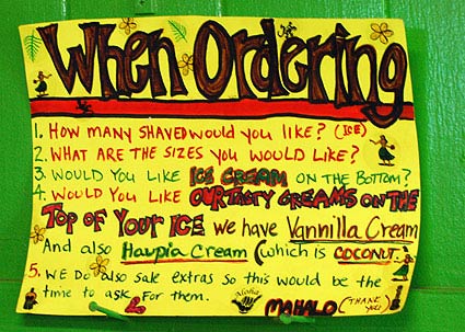
This sign is posted behind the cashier.
1. How many Shaved would you like (ice)?
2. What are the sizes you would like?
3. Would you like ice cream on the bottom?
4. Would you like our tasty creams on the top of your ice We have Vannilla Cream And also Haupia cream (which is coconut)
5. We do also sale extras so this would be the time to ask for them
Mahalo (thank you)

dsc_0353.jpg
The cutaway detail of the Halo Halo Shave Ice is pretty neat. Nice combination of 2D and 3D presentation of the details:
Haupia cream topping
cocohut
Shave Ice
Haupia cream topping
Halo Halo
Ice cream opsional [sic] with Halo Halo

Series

About Steve