Posts tagged “design”

Do you recall?

Some recent product recalls

Wild Planet Toys Inc. of San Francisco is recalling 273,000 Jet Streamers Water Blasters pool toys. When partially filled with water, the pool toy can stand upright on the pool floor with the rigid narrow end pointed upward, posing an impalement risk.

— LeapFrog Enterprises Inc. of Emeryville is recalling 186,000 Playground Activity Centers. A child’s arm can become caught in the activity center’s plastic tube.

— Olympus Imaging America Inc. of Center Valley, Pa., is recalling 1.2 million Olympus 35mm film cameras. A defect with the flash circuit in the cameras can cause it to smoke and overheat when the camera is turned on, posing a burn hazard.

— Syratech Corp. of East Boston, Mass., is recalling 10,000 frog, fish and duck lawn sprinklers. The plastic body of the lawn sprinkler can crack when placed under intense water pressure, and pieces of it can break off and be projected 5 to 10 feet in the air.

— Pier 1 Imports (U.S.) Inc. of Fort Worth, Texas, is recalling 4,300 Ming television stands. If a person leans on the stand’s drawer when open, the unit can tilt forward and cause a television on top to slide off, posing a risk of injury or death.

— Ballard Designs Inc. of Atlanta is recalling 775 candles and candle sets. The packaging or holder can ignite, posing a fire hazard.

— Agio International Co. Ltd. of Hong Kong is recalling 33,800 Garden Treasures steel dome fireplaces. Touch-up paint used on the fireplace’s exterior can ignite during use, posing a fire hazard.

— True Religion of Los Angeles is recalling 150 hooded fleece jackets. A drawstring is threaded through the hood, posing a strangulation hazard to children.

— Onward Manufacturing of Waterloo, Ontario, Mi-T-M Corp. of Peosta, Iowa, and Deere & Co. of Moline, Ill. are recalling 3,100 John Deere gas barbecue grills. Operating the grill in windy conditions can blow the flame under the control panel, causing the grill to overheat or cause flashbacks. Flames could damage the hose that supplies gas to the burner, causing an uncontrolled flame. Also, the grill’s control knobs could overheat, resulting in burns to hands.

— Deere & Co. of Moline, Ill., is recalling 16,000 John Deere X300 Select Series lawn tractors. A problem in the manufacturing process could cause damage to the circuit in the interlock module. If the module fails, the mower blades will be able to run with no operator on the tractor seat.

— Kindermusik International Inc. of Greensboro, N.C., is recalling 10,000 cage bells. If the bell inside the instrument is damaged during manufacturing, the bell can be pulled out of the instrument, posing a choking hazard.

— Triangle Tube/Phase III of Blackwood, N.J., is recalling 3,000 water heaters. The burner plate and flue hood seal on the water heaters can fail due to an improper seal, causing a leak of flue gases and deadly carbon monoxide.

— Gotham Architectural Lighting, a division of Acuity Lighting Group Inc. of Conyers, Ga., is recalling 4,700 lighting fixtures. The reflector/trim pieces may not be properly attached to each other. The lower portion of the reflector/trim assembly could detach and fall from the ceiling, striking people below.

Of course, being injured by a product you’ve purchased is not funny, but something about the tone of the descriptions is funny (if you find police blotter sections of local papers funny, then you’ll know what I mean here) in a Simpsonsesque fashion (or the famous German Forklift Safety Video).

And in blogosphere synchronicity, Niti’s last story in this post is a slightly more sober take on a product recall.

Designer Gods

Disclosure/disclaimer – I teach in the Industrial Design program at CCA, where Yves Behar is the co-chair.

This Wired article may not be the most egregious example, but it was the one that tipped things for me. It describes the work of fuseproject on the $100 laptop. But like many articles about fuseproject, and indeed many articles about design firms in general, it casts the firm as the manifestation of a single person’s talent, skllls, and vision. I don’t know how they work at fuseproject; I would imagine you’ve got to be pretty damn good to get a job there (given the reputation and output of the firm). This management of public image using Yves exclusively may be part of a deliberate attempt to build a brand around an individual, it may be ego, it may accurately represent how things work. I’m working hard not to make too many unfounded assumptions.

As soon as they accepted the challenge, Béhar and a handful of his 28 staffers began a stretch of late nights at the studio, sketching shapes on tracing paper. They reviewed 20 or 30 models that other designers had proposed at various points in the project. They gave special attention to Design Continuum’s original version, a boxy green laptop with a prominent power crank.

“There were too many parts flapping around, too many open places. It wasn’t realistic,” Béhar says. “It should be compact and sealed, like a suitcase. And it should really look and feel different. It shouldn’t look like something for business that’s been colored for kids.” (That’s more than an aesthetic concern: An unmistakable, childlike design will be the laptop’s only real defense against theft and resale.)

“My temptation as a designer was to explore a lot of options,” Béhar says. He looked into electronic ink displays, which run on very low power and could allow for smaller, lighter batteries. (The laptop must be light, since kids are meant to carry it everywhere.) He liked the idea of a soft keyboard, connected to the screen with something called a living hinge (think of the way a cap attaches to a shampoo bottle), which would be cheap and practically indestructible. But E Ink technology is not mature enough, and kids who have no desks at school would find a floppy hinge awkward to balance in their laps. Besides, the laptop was supposed to roll off an assembly line at Quanta, the world’s largest laptop manufacturer, by the end of 2006. He had to move quickly. “A lot of concept ideas I eliminated pretty early on,” Béhar says.

…
Figuring out how to protect everything from dust and moisture was harder. Béhar replaced the traditional keyboard on Design Continuum’s model with a sealed rubber one and built a sensor right into the palm rest to eliminate the seam between it and the trackpad found on a regular laptop. Other problems: The USB ports were exposed to the elements, and a pair of radio antennas had to stay outside the machine. (The Media Lab wanted the antennas to have a half-mile range for building a city- or village-wide mesh network, with each laptop acting as a node.) Solving one problem solved the other: Béhar turned the antennas into a pair of playful “ears”that swivel up for reception or down to cover the laptop’s naked ports.

“Everything on the laptop serves at least two purposes,” he says.

In March, Béhar’s team presented two models to the One Laptop per Child panel of researchers, engineers, and former Media Labbers. Members of the Design Continuum team also presented two versions. Only one design would survive to a final round of revisions. After Béhar showed off his work, he wandered out to the hall for a glass of water. Fifteen minutes later, he walked back into the room and was greeted with a round of applause.

At least there is an acknowledgement of this as a team effort in a couple of places. But the writer (and Yves himself) attributes decisions and actions to Behar alone.

Contrast this with a piece of Kevin Smith’s My Boring Ass Life

My apologies for the lack of updates, but we’ve been pretty fucking busy. Week 3 is wrapped, and tomorrow, we start our second to last week on the show. Both cast and crew continue to dazzle. I continue to dream about getting more sleep, as I spend all day on set, then lock myself in the editing room ’til usually two or three in the morning. I may be sleepy, but I’ve cut every frame of film we’ve shot already, resulting in one hour of the movie completely assembled. The simultaneous-to-shooting editorial has been tremendously helpful in allowing us to go back to scenes and shoot any missing pieces I didn’t know we’d need, or allow me to revisit scenes I feel need a bit more (or less) detail. If you’re ever gonna make a flick, cut it (yourself) while you’re shooting, kids; you won’t regret it.

We went an extra day last week, shooting on Saturday to get Lee on his “Earl”-free day. The Randal/Lance showdown is a real highlight of the flick, but the award for scene-of-the-week goes to Mewes. When you see the film, you’ll know what I mean.

If you’ve seen Smith interviewed (or giving those entertaining convention or college campus talks), he surprisingly uses “we” to refer to the filmmaking process. He will also use “I” regularly to talk about writing or other things he alone does, but he seems to have made a conscious choice to keep language collective and plural as much as possible.

It’s certainly apples and oranges and I think it’s too easy to draw ridiculously simplistic conclusions from the comparision here. I think the contrast is interesting, however, because it suggests that either way of presenting the creative head is not the only way it can or needs to be done.

[Additionally, I thought the Wired piece was blogworthy because it offers the rare-for-press snippy stuff that always goes around designer conferences around which firm screwed up this for that client and who came in and saved ’em. I always hear those stories but never see ’em in print.]

Any Palomar is a pal o’ mine?

I blogged about my UXWeek hotel before I headed to DC and again after I arrived (when they have my reservation – expecting me to arrive one day later). Here’s some thoughts about the rest of the experience there.

image_110.jpg
The elevator had lovely but deadly ceiling lighting. There was no place you could stand (regardless of height or headwear) that would prevent these lights from shining uncomfortably into your eyes. You had to bob and weave to see the buttons for choosing a floor, and then shift around the space inside during your ride in order to minimize the just-outside-awareness annoyance (like when a bug flits near your skin and although you don’t consciously realize what it is you are still annoyed by it).

image_109.jpg
This sink in my bathroom drove me nuts. Only one control, to the right of the very large and prominent faucet. The control swivels between its current position, let’s call that 6 o’clock, and 90 degrees to the right – say, 3 o’clock. I never managed to get Hot or Cold out of the tap, though, so I never really figured it out. For the first set of uses, I just tilted the control back and got warm enough/cold enough water to do my washing. Then I saw it rotated right, only.

Meanwhile, every time I’d go to wash my hands I’d “miss” because I’d be aiming for the hot tap on the left of the faucet and then I’d get sort of confused with my eyes and my hands when crossing under that huge faucet. It sounds dumb when explained logically, but in terms of instinct, I could just not manage to use this sink easily.

One night I got up to get a drink directly from the faucet and smacked myself pretty hard in the forehead with the giant metal faucet. That’ll make going back to sleep fun.

I hated this sink, but only once I tried to use it.

image_108.jpg
Looking at the clock radio, I saw that familiar connector and realized hey, that’s for an iPod. I liked the visual branding of the connector; slightly obscure but not entirely so. It semi-subtlely announces what it’s capable of by showing those pins (and connectors are often relegated to the back of the house)

image_107.jpg
It was really nice to be able to listen to my own music while I was in my room; I made good use of this feature. Sort of a weird interface; I had to keep pressing buttons to get it to play but it was also simple enough I didn’t really mind. I probably blamed myself for not really trying to figure it out – if I had taken 3 minutes to study and learn that would have explained the use model well enough that each action would confidently produce a desired result. But meanwhile, I was getting music and that was good.

Otherwise, the hell just seemed like good ideas that no one really thought through. Lots of half measures that reminded you of the flavor of good service but not the actual experience of it. Every lunch buffet seemed to be missing some implement – gorgeous chunks of chocolate but nothing to cut them with (although maybe it was simply display chocolate we weren’t meant to eat – what a concept) or cold cuts and bread where the bread was rolls with raisins or chunks of baguette that weren’t sliced lengthwise.

The main restroom near the conference was staffed by a guy with bright yellow rubber gloves on. Was he a men’s room attendant? Or was he always in there cleaning? It was pretty unclear and it was of course uncomfortable – how were we supposed to be interacting? No script for that one.

Other people reported the bar and restaurant had lovely tables that seemed at the wrong height for the chairs (or the chairs being the wrong height for the tables). That seemed the theme here – nice looking stuff that was just hard enough to use to make you feel wrong or awkward.

Let’s hope they get this stuff sorted out; I fear they are so far off the mark, though, putting up layers of surfaces without trying them out, that it may never resolve.

Signs to Override Human Nature?

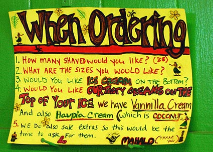
We see these in small retail all the time – handwritten signs exhorting the customer to follow some non-natural path of behavior in order to simplify the merchant-centered purchase process. Here’s a fun one, where the experience is pretty cool anyway, and the creativity and ineffectiveness of the signs is something to smile about, rather than grimace.
dsc_0354.jpg
The setting certainly helps. In the town of Waimea, on Kauai, on your way to getting a sweet and cold treat – shave ice.

dsc_0351.jpg
The cash register sits underneath the most awesomely diverse and interesting list of flavors. You approach the guy at the cash and of course you want to say how many you want, and what sizes, and (after having gaped open-mouthed at the display for a few minutes) the flavors

online pharmacy furosemide with best prices today in the USA

.

The signs attempt to warn you off from doing that, but it’s human nature. And with each person that tries to ask for a flavor, the cash guy tells them ‘I don’t care about flavors. I just need to know what size you want.”

They are so dogged with their insistence, but they’ve designed an experience where it’s entirely natural to ask for the flavors right then. Nope.

He’ll go and get the plain shave ice (with ice cream, if you want it) and then at another counter they take your flavor order. It may end up being the same guy working the other counter, or someone else. But they don’t care about flavors, until you get to the flavor counter.

It’s not so terrible that they go through the same thing over and over again, it’s just a great example of design and human nature and the ever-present sign which purports to fix the whole thing by simply warning people what not to do!

dsc_0352.jpg
This sign is posted behind the cashier.
1. How many Shaved would you like (ice)?
2. What are the sizes you would like?
3. Would you like ice cream on the bottom?
4. Would you like our tasty creams on the top of your ice We have Vannilla Cream And also Haupia cream (which is coconut)
5. We do also sale extras so this would be the time to ask for them
Mahalo (thank you)

dsc_0353.jpg
The cutaway detail of the Halo Halo Shave Ice is pretty neat. Nice combination of 2D and 3D presentation of the details:
Haupia cream topping
cocohut
Shave Ice
Haupia cream topping
Halo Halo
Ice cream opsional [sic] with Halo Halo

Walker on Poketo

Rob Walker’s Consumed takes a look at Poketo

The project that became Poketo began in 2003 with a show at a space called Build, in the Mission District, featuring work by six artists. This time, in addition to paintings, the exhibition included wallets. The physical objects were all the same (stitched-together vinyl and plastic, folding to 4 inches by 4 inches), but each artist printed his or her own design on a set of a dozen wallets, which were priced at $15 each. While it is not unusual for a well-known artist to dabble in consumer goods that are more accessible to a wider audience, the wallets essentially reversed that formulation. These consumer goods served as promotional items that might draw attention to the work of a lesser-known artist. “We wanted to expose our friends to the wider world,” Myung says. Wallets were a particularly good medium, in that they are carried around, not hung on a wall at home.

We bought two of these gorgeous wallets at WonderCon a couple of years ago. I got a lot of great comments for my interesting wallet, featuring a sci-fi cartoon scene with aliens and interplanetary landscapes.

Main_pic.gif
Not my wallet, but similar, by the same artist, Martin Ignatius Cendreda.

But it was a piece of crap. It was horribly designed, with insufficient holders for cards and an extraneous change purse (change purse? In a wallet?). And it didn’t last at all. I repaired it myself with clear packing tape many times. I was thrilled to have an ordinary item that was made special by its visual and artistic appeal, but why trade off basic functionality? Eventually, I gave up. I bought a recycled rubber wallet that is more subtle in its beauty (and its story), and I won’t go back to something that doesn’t work for me. I’d like to have seen Walker (or anyone else that reviews the work of these darlings) acknowledge that the product isn’t usable and doesn’t last.

Michael Bierut at UX Week

Michael gave one of the keynotes today at UXWeek. He is a great storyteller with a wonderful self-deprecating style (that somehow combines with an amusing cynicism about some of those around him; but yet he’s genuine in it all). His talk essentially focused on his learning moment(s) as a designer around being user-centered.

He took on a pro-bono project to rename/rebrand/create a logo/etc. for a project to redo decrepit libraries in NYC schools. In a post-modern fashion, he presented his deliverables for that client in a dry and critical tone, mocking his own “big ideas” in a way that made it clear he no longer sees them as big ideas any longer. It was an interesting line to skate, there is always bullshit and performance in trying to convince someone that a new idea (or a trite idea, brought in for the first time, etc.) is a valid one, and it’s easy to present the same idea as genius or crap depending on the tone of voice. Listen to some old Bob Newhart recordings for a concrete example (Tob-acco… er, what’s tob-acco, Walt? It’s a kind of leaf, huh?… and you bought eighty tonnes of it?!!… Let me get this straight, Walt… you’ve bought eighty tonnes of leaves?… This may come as a kind of a surprise to you Walt but… come fall in England, we’re kinda up to our…).

Bierut’s ideas were completely inappropriate and indicated how poorly he understood the problem. The client took him out to see the libraries, and he got it. Instantly, and hugely. And the design work that he and many others collaborated one was wonderful. Framed as a story about his own failures, it’s actually a story about success. But the framing is what makes the telling of the story so genius.

Bierut gave his client a new treatment for the library. In a funny PowerPoint build he went from
Library
to
Library!
to
L!brary
to
L!brary

He planned to deliver a full specification document indicating fonts and treatment and all the rest, but in the interim, the client took control over the logo and started using it whatever way they wanted. He realized that this was okay, and that the cultural (and indeed design) benefits outweighed any super-specification desire he might have projected on them.

One awesome and obvious (in hindsight) example of this dawning user-centered perspective was in how Michael and his team referred to these different libraries being designed. Before meeting the librarians, he referred to them by the architect (i.e., the Peter Arkle (sp!) library) but afterwards he learned that it was referred to as “Vince’s library” – a classic user research insight – different groups call things by different names, revealing their underlying use model!

Five things he learned
1. Innovation is overrated*
2. You get power by giving away power
3. The real opportunity may be outside your scope of work
4. Consistency does not equal sameness
5. Take care of the experience and the brand will take care of itself

The “innovation” comment was challenging and Ryan Freitas

asked about it. Bierut added that “innovation has never been a profound motivator for me…design has to work within conventions to work.” Seems like we’re approaching the I-word with some different things in mind. Bierut felt he started off being too “clever” – which I hear as new for new’s sake – and that wasn’t the right thing to do. I don’t think innovative means shocking, obviously new, different, and all that. I think innovation can be invisible and brilliant and seamless to adapt to, with that whiff of exhaled “ooh!” that happens afterwards. To a graphic designer, the word may mean something else.

Series

About Steve