Posts tagged “interface”

Simulacrap

In my recent column Persona Non Grata I point to some of the cultural problems inside organizations that personas can create, or mask. And what happens when your personas become your marketing?

We’ve recently been experimenting with search marketing on Yahoo, MSFT, and Google. Today I received a shiny booklet from Yahoo, with a note from Sharon Goodsense, Yahoo! Search Marketing Specialist (“and remember, we’re always here to help you.”)
good.jpg

And I’m referred to as Bashful Beginner.
bash.jpg

online pharmacy buy tretiva without prescription with best prices today in the USA

Yahoo’s search marketing management interface is so completely useless that all I ever do is click and click and click until I get some result; with no mental model being built that would help me next time. I have no idea what most of the information they are providing is about or how I can use it. So maybe this book will help me, but the first two pages are the most patronizing and fake thing I can imagine. I can’t believe they went to the trouble to come up with these fake characters to represent the company I’m doing business with; it’s offensive to take my money for a service, give me an unusable product, and then hand me a cartoon character who talks down to me; if I can’t call this person for help with my problems, because they don’t exist. It’s the least transparent thing a company should do. Yahoo got off the cluetrain a while ago, I guess.

Flying the sneaky skies

persuasive.jpg

While checking in online for a United Airlines flight, you may be offered the opportunity to upgrade to Economy Plus. It’s likely that most people decline upsells in many situations, though. The default would be to click “no thanks” and move on to completing the transaction. But United has done some tricky and manipulative interface design. The bright yellow arrow with bold text placed on the right is almost irresistible. E-commerce sites have trained us to envision a transaction moving from left to right (granted that they’ve landed on that model since it corresponds to how we read and other cultural factors); it’s very easy to click on the arrow and make a purchase you didn’t want. It takes cognitive work to search for the preferred option which is a lowly blue-underlined unbolded text link off to the left.

Why would United do this? Sure, they can trick a few people into mistakenly purchasing an upgrade. But at what cost to the brand? Even if they don’t fool you, you’ve had to work to avoid being fooled, and the trust (seemingly an important brand attribute for an airline) is dinged.

Grab a clue, web people @ United…this is no way to interface with customers.

The toilet flusher that comes with an explanatory memo

A few years ago I blogged about my first encounter with a dual-flush toilet

online pharmacy lariam for sale with best prices today in the USA

.

They are becoming more common, now.
flush.jpg
Uppercut, by Sloan, is an interesting, if incomplete design solution. It retrofits into existing toilets. The green handle suggests to the flusher that something is different here. The iconics on the barrel indicate, somewhat, what will happen in different flushing directions. But they’ve also seen fit to provide “attractive instructional placards to educate the user [there’s that phrase again] on proper operation” – UPfor #1 (Liquid Waste), DOWN for #2 (Solid Waste). The Sloan website also provides a customizable memo (.DOC) to help get the word out.

Any change of behavior, especially in such a habitual task, is going to be a challenge. Yet office memos about flushing the toilets belong with training meetings on using the new photocopier in the thundering hell of office life. It’d be interesting to investigate how all these cues (the memo, the green handle, the icon, the placard, the memo) work together (or not) to help people shift behavior (or not).

Any anecdotes to share about new office equipment, toilet memos, or so on? Leave a comment!

Fruit 2.0

It’s great to see an awareness of user experience popping up in humble, low-tech places. Grabbing an apple yesterday, I discovered the small arrow pictured below at the top of the sticker, telling me exactly how to get the label off my fruit. Delightful. No apple under my fingernails on this one.

apple-sticker_sm.jpg
User Interface

And last week, I had another fruit-related experience that, while not as unequivocally positive, was still thought-provoking.

I poured myself a bowl of cereal-no raisins. Looked all through the plastic liner bag-no raisins. Figured I had defective cereal. Then I noticed a little yellow callout on the box-“Stay Fresh Fruit Pouch Inside Box.”

Sure enough, there it was at the bottom of the box-a silver foil pouch full of raisins. The experience promised by Health Valley on the pouch: eternally fresh, plump raisins and my choice as to the cereal/raisin ratio for each bowl.

custom-cereal_sm.jpg
Custom Cereal

While I still think I prefer having my cereal pre-mixed and ready-to-pour, I do appreciate the concept of this approach-the appeal to freshness and personal tailoring. Though I’d suggest that Health Valley do a better job calling attention to their packaging system, so that people don’t have to go through the same terrible moment of perceived raisinlessness that I did.

How to flush?

whereflush.jpg

Another toilet picture, dedicated to Gene, who I influenced with my healthy interest in toilet interactions.

From my hotel room in Paris last month. How do you flush this one? Turns out that it’s the middle silver panel. Although there’s little visual indication, the panel is hinged behind just enough that it can be pushed along the bottom. There are almost-invisible letters on the bottom right corner. The left and right panels do nothing, by the way.

At first I thought that circle-in-a-square was some flush button, but it’s a deodorant puck.

Previously here and here.

Keep Your Hands Off My Power Supply

“Anti-Groping Appli” by games developer Takahashi

was released in late 2005 but has only recently climbed up popularity rankings, reaching No. 7 in this week’s top-10 cell phone applications list.

The application flashes increasingly threatening messages in bold print on the phone’s screen to show to the offender: “Excuse me, did you just grope me?” “Groping is a crime,” and finally, “Shall we head to the police?”

Users press an “Anger” icon in the program to progress to the next threat. A warning chime accompanies the messages.

The application, which can be downloaded for free on Web-enabled phones, is for women who want to scare away perverts with minimum hassle and without attracting attention.

In 2000 I made my first trip to Japan to help our client understand the role of mobile phones (“ketai”) in Japanese culture (in order to discover unmet opportunities for the company with their own customer base). We learned a great deal (both from participation and from observation!) about the indirect manner of communication (for example, the absence of “no”) and heard many stories about how the mobile, through its email capability, had enabled ways to circumvent this. People told us stories of negative feedback from a boss to an employee, or a relationship breakup taking place via the phone, and how that was acceptable.

If it’s culturally difficult to scream “Take your hands off me, you @#$%^$ freak!” on a subway train, then this application makes sense. It seems to acknowledge a need and a culturally-appropriate vector for responding to that need.

steveintokyo.jpg
Steve in Tokyo in 2000

Learned Behavio(u)r

One of the fun yet challenging aspects of spending two weeks in another country was stumbling over all the little things that I know how to do back home but didn’t work. I paid for a snack using pocket change, and eventually had to hold the pile of coins out to the counter dude so he could take the right amount. The coins say their value, in English, but in order to complete a transaction in the normal amount of time, you have to be familiar. It was an interesting feeling, to be such a foreigner.

At another point, I was riding the DLR (train) with my Oyster (smart card). A conductor comes along to swipe the card and there’s a small interaction where the passenger holds out the card and the conductor holds out the wand (yes, it was a wand, not the usual credit-card-swipey-slot thing). I wanted to put my card on top of his wand, but he wanted to put his wand on top of my card. I was just supposed to know the gesture. Sounds like a bit of a dominance issues, actually.

In using the self-check at Tesco (a grocery store), I realized the software was the same as what I’ve seen here at Home Depot, etc. but when it came time to pay, the voice prompt told me to insert my card into the chippenpin device. Turns out this was Chip-and-PIN, where credit cards and/or ATM cards have extra security via an embedded chip, and an associated PIN. These readers use a different swipe gesture, with the card going in the bottom of the keypad. Anyway, I stood there with my non-chipped credit card, putting it in and out of this bottom slot, to no avail. After I surrendered and paid cash, I realized there was the familiar vertical swipe slot along the bezel of the monitor, a different piece of hardware than the chippenpin.

And this one was subtle but confounding:
img_0226.jpg
This is the TV remote from my Paris hotel room but the London hotel had a similar issue. In my experience, the red power button turns the TV on and turns the TV off. But in both these hotel rooms (and maybe this was a hotel issue more than a Euro issue) the way to turn it was to press the channel buttons. Enter a channel and the TV would go on and display that channel. The power button was actually on “off” button. You can imagine me sitting in front of the TV with a remote and trying to turn it on, in vain, until frustrated random button press gave me the result I wanted.

I often look around at local transit and marvel at how much the cues and other information in those systems are designed for people who already know how to use them; but I was able to plan for and learn about transit enough to be come a fairly comfortable user. It was these small interactions without cues, and under time pressure, where I found myself bemusedly incompetent.

Easy as 1-2-3

I got a pamphlet from the EDD the other day, explaining their Telefile service. A joyful anthropomorphized telephone welcomes you from the front of the brochure:

edd1.jpg

Opening it up once reveals a basic three-step process:

edd2a.jpg
click to view full size

But after opening the next fold, all hell breaks loose (and you need to see it large to get the full impact of chaos):

edd3a.jpg
click to view full size

A site map of the phone interface is pretty much a guarantee of bad design, isn’t it?

Radisson doesn’t quite get basic tech

Like the phone.

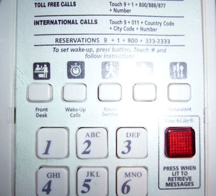
Last weekend I needed to set a wake-up call, and either introversion or bitter experience leads me to trust an automated service more than a human being, but even so, I always look on the phone for instructions on how to arrange for one.

p1000523.jpg
Right. Press the button and you’ll either end up in the automated system or you’ll be speaking to someone who can handle it. I press the button, but nothing. Press again, nothing. I try the other buttons and they all simply click. The phone has special function buttons but they are unprogrammed.

Okay, all is not lost. The room has another phone in it.
p1000525.jpg

But this phone has a different interface. Here we’re told to touch 77 (why is touch the verb, anyway?). Doing so brings me to the voice mail interface, which does not have any wake-up options.

Two phones, two different interfaces, both screwed up. I called 0 (or touched 0, if you prefer) and spoke to someone (shudder!) and it was handled.

It’s just a weird failure of attention-to-detail.

Series

About Steve