Posts tagged “design”

Rock and roll is a vicious game
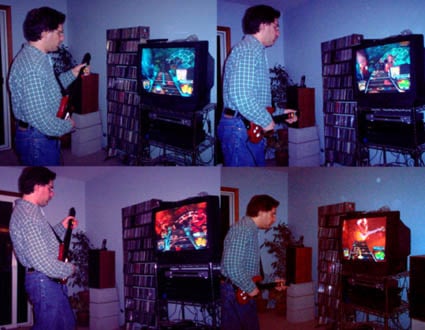
guitarherocollage.jpg
“Is that for your kids?” asked the Sears dude as he handed me the box. “Uh, my kids?, heh heh, it’s for me!” I managed as I headed out of the online-order-pickup station. [Yeah, Sears.com actually has something in their store if their website says they do; unlike Circuit City that shows an item available when you look on their website but when you visit their store it’s not on the shelves and if you can find a human who’s willing to help you, all you’ll hear is that they don’t have it. You lost a customer, Circuit City!]

Just last week I saw leaked footage (since pulled down) of an upcoming video game called Rock Band where a group of people perform a song (using guitar controllers, a drum accessory, and a microphone) and it just gave me chills. I realized I needed to get Guitar Hero, the existing predecessor.

I grew up playing video games. As a kid, we’d find any bowling alley or arcade and spend hours pumping in quarters. I used to hang out a dry cleaners (!) after school, playing whatever game they had. I got an ATM card and moved my bank account just so I could go next door to get $5 at a time in this afterschool activity. So why was I not doing it still? I had a PSX for a while; it was amusing, but it never really fit.

But this – the idea of a game that was about performing…I’d been hearing about it for a long time; stumbling across the video and subsequent conversation with friends was the motivational tipping point for me.

Wow.

The game is fun. It’s really really fun. This is an innovation around the notion of what a video game can be. Musical and performing games have been appearing for many years, such as PaRappa the Rapper, and Dance Dance Revolution, or the various precursors of Guitar Hero that one could find in a Tokyo arcade 5 years ago.

The idea of the game isn’t new, but is definitely novel. You hold a guitar, with five different buttons where frets would be. Instead of strings, there is a strumming bar. On screen, notes come towards you on a fretboard. When the note gets to the bottom, press the corresponding button on the fretboard and strum, zapping the note. Each level is a different song and the notes that play (or don’t, if you miss) as you zap ’em make up the guitar parts of the song. You are essentially playing the song, with enough realism that you get a real charge out of it.

Some nice touches make it really work. There is a great tutorial that explains how to play and how to use the controller. No need to page through the tiny print in a book and figure out what the heck is going on; they’ve designed an explicit learning interface.

As well, there are various levels, to enable you to have some success. We played on Easy, and it was tough at first, then become somewhat less tough with practice. And more fun, the better we got. We dabbled with the Medium setting and it was more fun to play. This blew me away. Instead of simply increasing the challenge (more monsters, smarter monsters, faster moving monsters), the game gives back more. The more intricate the pattern of notes you are sent, the closer you are to “playing” the song. It’s more fun and more engaging.

There’s a nice mode where you can go through any of the songs at a variety of slower speeds and practice the guitar parts. The songs are broken down into intro/chorus 1/verse 1/bridge/solo etc. so you can really focus on what you are trying to learn.

This is the best game I’ve ever seen and it’s a really nice implementation of some fresh thinking about what video games can enable.

We were amused to see the game featured in the New York Times today (although they referred incorrect to Stevie Ray Vaughan’s “Texas Flood” as “Texas Blood.” Nice).
15guit1901.jpg

Finally, the SF Chron featured this image, full-size, on their real estate supplement.
re_gen_y15_034_rad.jpg

Kids? Sheesh. This is the perfect game for my generation, young Sears dude.

Small Stories About Small Creative Consulting Firms

Given what we’re trying to figure out and plan for here at Portigal Consulting (essentially growth in all the ways one might define that), I enjoyed listening to two brief podcasts about starting and growing (design) consulting firms, one with Chris Fahey and another with Myk Lum. Both are in the category of here’s what I did which is very different than here’s what you should do. That’s not a criticism, of course. Anyone who is has been in similar situations will hear a number of head-nodding-in-recognition moments, and maybe find a few ideas for things to try.

buy finasteride online https://ioaikido.com.au/wp-content/uploads/2018/03/css/finasteride.html no prescription pharmacy

Dynamic Crowd Wisdom

The latest edition of Rob Walker’s Consumed is about Threadless, a darling-of-the-blogosphere site that sells user-submitted/user-chosen t-shirt designs.

The voting system is straightforward: users rate each submission on a 0-to-5 scale and offer comments that range from the constructive to the unprintable. Still, some submissions never make it to the voting stage, usually because they ignore format rules, raise copyright issues or, sometimes, are simply “awful.” (Kalmikoff says that eliminating ugly designs before a vote is an infrequent but sometimes necessary measure to “protect the experience” of Threadless voters.) While most winners have scores of 2.6 or higher, one recent batch included a design with a score of 2.0. That’s because the final decision about which T’s actually get made and sold has always involved a bit of nonpublic number crunching. For example, Threadless looks at how many 0s and 5s a design gets; designs that inspire passionate disagreement often get printed because they tend to sell, Kalmikoff says.

online pharmacy purchase revia no prescription with best prices today in the USA

Seems anything but straightforward! But that’s okay, I think it reveals several truths around wisdom of crowd stuff. Neat how the decision process is iterative and cumulative, as the community gets smarter and tries to game the system, and as Threadless gets smarter and tries to right the system. This sort of evolution is completely unacceptable in politics, say, but seems to be innovative when done by Threadless.

I love the blunt naivete of putting forward X choices and having people pick, and then the sophisticated noodling that comes out later as the community grows in sophisticate. It’s not unlike the elaborate hierarchy of individuals, monitoring, and other checks-and-balances created by Wikipedia, outlined by the NYT magazine last week. A simple idea and simple implementation becomes arcane and complex by inches. Is this entropy? Human nature? Evolution? Line extensions?

Easy as 1-2-3

I got a pamphlet from the EDD the other day, explaining their Telefile service. A joyful anthropomorphized telephone welcomes you from the front of the brochure:

edd1.jpg

Opening it up once reveals a basic three-step process:

edd2a.jpg
click to view full size

But after opening the next fold, all hell breaks loose (and you need to see it large to get the full impact of chaos):

edd3a.jpg
click to view full size

A site map of the phone interface is pretty much a guarantee of bad design, isn’t it?

Dan and Steve write: We express ourselves

ey07.jpg
Cool artwork at 111 Minna makes for an exciting backdrop for presentations

Steve and I recently attended an event hosted by Microsoft, called Express Yourself. It was a party/networking gathering focused around a “design contest” in which four prominent Bay Area software design firms presented the work they had done to “solve a real-world design problem” that Microsoft had posed a few days beforehand. As they promoted it:

Are you a User Experience Rockstar? Are you a Master UI Coder? Do you know how to work together? Want to network, drink and learn with 100 of your finest peers in San Francisco?

Please join Microsoft and four leading software design firms in the Bay Area as they compete head to head to solve a real-world design problem… Contestants will receive their design problem three days ahead, and the day of the party will compete to finish and present their solutions using Microsoft’s new Silverlight technology and Expression Suite of design tools. Attendees watch the solutions come to life, comment and party until the awards ceremony.

To begin with, it was a great party–a beautiful venue in downtown San Francisco, open bar, excellent food. Balancing a Martini glass in one hand and a half-spherical bowl of Pho and chopsticks in the other, I contemplated the usability of flatware.

The design problem Microsoft had posed to the firms was to create a “safe” social networking environment for a teenage girl. Microsoft had supplied the firms with personas representing the girl, her mother, and her “quasi-bad-ass” friend.

Update: the contest’s problem statement, rules, and evaluation criteria are now posted here.

The presentations all shared what seemed to us (and to many of the people in the audience around us, judging by an almost non-stop flow of derisive commentary) as a common and almost complete lack of thought or even lay-knowledge about the culture of users for whom this environment was being designed.

Update: details (including screenshots) of the different submissions, and the winner are posted on organizer Will Tschumy’s blog (7/2/07 and 7/3/07).

This apparent lack of consideration for the consumer/end user’s culture and needs/wants stirred a reaction and raised some questions for us.

Dan: None of these (contest entries) look like they’re for teenagers. I mean, it seems so obvious to me that the place you would start would be figuring out what the person you’re designing this thing for would find exciting.

Steve: The most exciting moment (leading to spontaneous applause) was for a interface widget that created this very Web2.0 mosaic of media, kind of like a tag cloud of images and movies. Completely unusable since you couldn’t see what was in the teeny pictures, and very adult in its visual. The audience applauded for something they would like.

In the presentations, I really wanted to see one of the teams consider a definition of what it meant to be safe. That is a very loaded word and it needed to be unpacked. Until you know what safe is, you can’t design for it.

Dan: If I was a kid, the last thing I would want would be any kind of web thing that my parents were involved in.

Steve: If any of these designs get published, I’d like to see someone compare them with Imbee, an actual site that that just launched, aiming to address this same need. Will those appeal to teens? Have they found a way to navigate the tension between “safe” and “parental involvement”?

I’m not being a research snob here. I understand the timeline didn’t support the teams doing their own research. But Microsoft supplied personas. Aren’t personas proxies for research? Or, are they, (as I’ve said before) simply user-centered bullshit. For all the power they are supposed to have with design teams to keep them focused on designing for the user, they didn’t help at all in this case.

Dan: People have all these tools, but they have no idea what needs to be built.

Steve: And maybe the focus of the event was purely on the building. But then Microsoft should have framed it differently. Distributing personas and judging solutions would suggest that it was about building the right thing. But Microsoft’s tool is to help you build better; perhaps their assumption was that the designers would bring the process and MSFT would bring the tool?

Dan: I wonder what Microsoft wanted to find out from doing this, and whether they found it out?

Steve: That’s a good question. I assume they were doing it more as a way to create a splash and be seen as a real player in the design community.

Dan: Then they should have done a challenge that was geared to the strength of the people they had competing. Plus, this was about using their software, right? So why focus on research results as the way to get people into the task? I think they went too far towards the front end of the “project.” They should have given more of a creative brief, and let people go at it.

To me, this whole thing really shows how a lot of people still don’t acknowledge (or don’t fully get) how much work has to be done to actually turn research into design decisions. I think this bodes really well for the work we do.

Steve: I’m relieved you think that. I felt the opposite, actually. I felt depressed about the opportunities for our approach. It’s kind of depressing that in 2007 the “top” software design firms are so locked into distinguishing themselves with shiny shiny and no thinky thinky. [Assuming these were in fact the top players in their firms and not the B Ark].

If making use of real tangible understandings of real users isn’t even on the table for a lot of these folks, then where do we find people to play with? To inform or collaborate with? Maybe that’s not even the point though. Maybe those designers should be working for us rather than the frequent reversal.

Dan: I totally agree-the needs and desires determine what will really work for people and be successful. Then the design should be executed within those constraints. Context, not content, is king, right?

Buying and Using Cars in India

A couple of little cultural tidbits about cars and car users in India. Param writes

the cup holder, that’s now there almost by default in the newer Indian cars, is hardly used for keeping coffee or any other drink for that matter. This is one of those classic examples of how you blindly re-use a concept from the West and include it in your design it in a different country. And what people actually end up using it for in India is, keeping some currency/change or keeping your mobile phone.

and USATODAY tells us that

the head of BMW Asia says the defining characteristic of Indian consumers is their desire to buy every available feature.

“What the Indian consumer wants is the latest technology, and in the premium car segment, they’re looking for a fully loaded car,” Linus Schmeckel says. “They don’t like to be seen as second-class consumers.”

Dan writes: Mini-Us

Monday night at the Computer History Museum, Robert Brunner, Jerry Manock and Bill Moggridge held a chat about Apple‘s design history. When¬†asked about the future of design, Jerry talked about reaching the limits of miniaturization. He held up his hands, spread his fingers, and pointed out that we¬†are already technologically able¬†to produce devices that are so small as to surpass¬†our physical ability to use them.

That comment¬†caused me to drift¬†off into a¬†little fantasy in which I imagined people being genetically engineered to be smaller and smaller, in order to be able to continue using increasingly miniaturized devices.¬†Luckily, I was able to¬†reality-check myself with an emergency dosage of¬†late 1970’s design.

Atari Game Console, 1979

Atari Game Console, 1979

We’re not in Kansas anymore

Dan and I have already mentioned (here and here) our stay at Chateau Avalon (an “Experience Hotel” – quick and easy ways to see times and past and locations distant, all without leaving Kansas City). Now a bit more about what was horribly wrong with my room. Let’s assume that most people who stay there fall within their intended demographic (couples, local, looking for a quick getaway), and let’s set aside issues of personal taste.

I was in the Colorado Frontier room.
bed.jpg
The bed is in the back, which is sort of another room.
tv.jpg
That room is extremely tight around the bed; one can barely get by, and I found the best way to open and close the drapes was to stand on the bed itself. No dresser, but a fairly big closet. Confusing light switches, with no light source that was reachable from the bed itself. And a massive TV that loomed above the bed rather threateningly. The literature promised satellite TV so I looked to see how to get beyond the usual hotel 15 channels, eventually calling the front desk. Those are the channels, it seemed. HBO was the satellite channel. I expressed some confusion and they explained that it’s a satellite channel “around here.” Okay.

workspace.jpg
The room had completely useless workspace. I didn’t want a thematic chair to sit on for editing PowerPoint decks, transferring video, managing cameras and media and chargers and so on. I wanted something comfortable, and I wanted a big enough table to get my stuff on. The only other flat surface for wallet, keys, etc. was the bedside table (already covered with hotel crap and rather difficult to reach unless you throw yourself on the bed like a beached whale).

shower2.jpg
The bathing facilities were smack in the middle of the main part of the room, and quite far from the water closet portion of things. Do you want to invite a colleague into your room when your tub (and inevitable tubby paraphernalia) is front stage?

The whirlpool spa was also a shower. But it was quite deep, so to get out meant tentatively raising a foot rather high and over the edge. What’s on the outside? Narrow stone steps. Umm, right? I’m lucky I didn’t break my neck getting out of that thing. There was no place to put a towel and no safe way to get out. Very irksome. Part of the stone stairs went down only to the level of the porch floor while others went a few inches further to the level of the main floor.

wc.jpg
My (least) favorite design failure. The bathroom was as wide as the door. The sink was to the right and the toilet was to the left. To reach the toilet, one must step into the bathroom and to the right, then inhale and push the door past. A person of girth would absolutely not be able to do it. I could not do it without the edge of the door dragging across me roughly.

There was a lot of energy put into the design choices, but it’s the most shallow form of appearance versus usable I’ve ever encountered. Perhaps the owner of the hotel should be forced to stay in each room and try getting things done, other than savoring luxuriant chocolate (or cranium-filling cinnamon rolls) and heavenly rose petals. Say, going to bed, getting up, washing, using the toilet, etc. Activities of daily living type of stuff…

Series

About Steve