Posts tagged “retail”

Freaky new logo

Of course they’ve already discussed this on the graphic design/branding website Speak Up (where I nicked this image) but last weekend we saw (in Pacific Grove, CA, of all places) a new Baskin-Robbins logo on a storefront.
brold_new1.jpg

Yikes! It looks even worse on the outside of a store!

Grocery store rating system for food nutrition

upt_1star.gif
upt_2stars.gif
upt_3stars.gif
stars_moreless.gif
The Hannaford grocery chain has developed their own ratings system for the nutritional value of grocery products. From this story

A New England supermarket chain has developed a 1-to-3 star nutritional rating system that flunks most of the foods consumers think are good for them.

After plugging 27,000 products into its system, the Hannaford Brothers chain found that 77 percent of the foods failed to receive even one good nutrition star, The New York Times reports.

Hannaford said many of the processed foods advertised as being healthy failed to gain a star because they contained too much sodium, sugar or fat.

Most fruits and vegetables earned the highest rating of three stars along with salmon and high-fiber cereals.

Making its debut in September, Hannaford’s rating system puts the chain in the awkward position of judging the very products it’s trying to sell. In fact, most of Hannaford’s own store brands failed to get any stars, the Times said.

“We are saying there are no bad foods,” Hannaford spokeswoman Caren Epstein told the newspaper. “This is a good, better and best system.”

Hannaford’s nutritionists acknowledge their system is more stringent than the guidelines used by the Food and Drug Administration.

A couple of things of note here. First, the subjectivity of any measuring and rating system means that establishing standards will always be tough. The challenge to non-nutritionists to understand the complexity of ingredients, preparation, nutrition, etc. is enormous. I would suggest it’s impossible. Do multiple layers of ratings systems help or hinder? And related, is the second issue, where a retailer (a food retailer, even) is assessing the quality of the products they are selling. If a product is packaged and branded as being healthy, but it’s label is in opposition to how many stars it receives, will there be pressure on Hannaford to back down? It seems that this is healthy for consumers (so to speak) but may be a retailing nightmare. I hope they stick to their guns, but I wonder if other channels would be so bold. The online world has brought us a lot of customer reviews that obviously can be quite critical, but does that work in a bricks+mortar setting when the negative assessment comes from the bricks+mortar itself?

Thank you, come again, now get out

Edited from the New York Times. Wasn’t the mall the ultimate in egalitarianism? And even something approximating user-friendliness? So here’s a “trend” to create mystery and exclusivity in order to drive the right customer to increased loyalty.

In malls across the country, the floor-to-ceiling glass storefront – a tradition of transparency in retailing that dates back at least 100 years – is beginning to give way to elaborate walls that make it impossible to see inside.

The outside of Ruehl No. 925, a new chain from Abercrombie & Fitch, is a brick facade that mimics the front of a townhouse. The exterior of its corporate sibling, a clothing store called Hollister, resembles a beach shack, its windows covered by wooden shutters. And the entrance to Martin & Osa, a new retailer from American Eagle Outfitters, is a long wooden wall with a thin strip of dark blue glass.

As retail companies race to open new chains that serve ever-smaller slices of the population – Abercrombie & Fitch has four different stores, each for approximately a decade of life – they are using storefronts cloaked in wood and brick to ward off those who do not belong inside (and whose presence might diminish the shopping experience of those who do).

Retail executives say that by drawing the curtain over their storefronts, they can stand out in mall corridors crowded with glass-encased competitors. The modern mall, said Michele Martin, the head women’s clothing designer at Martin & Osa, “is too transparent, too naked. It’s just a sea of clothing.”

Intrigued by a store they cannot see into, consumers walk in to solve the mystery and stay to shop, executives said.

…

“It has this cool apartment vibe,” said Ms. Palotta. “Instead of being in Bergen County in the middle of New Jersey, we are on a street in New York, and that is where we want to be anyway – living in New York City.”
…
Then came the glass-shattering Abercrombie & Fitch. In 2000, the chain began experimenting with an opaque exterior when it introduced Hollister, a clothing store geared toward high school students.

The outside of the store evokes a California surf shack whose residents have shuttered the windows and hidden the front door to keep out the riffraff.

Or, as Tom Lennox, the director of communication at Abercrombie & Fitch put it: “You can feel yourself on the beach with the sunlight shining through.” (The sunlight being, in this case, the fluorescent mall lights.)

Hollister proved an immediate success, so Abercrombie & Fitch extended the darkened storefront to its namesake stores, placing heavy wooden shades over the existing glass windows.

Finally, there was Ruehl, by far the starkest-looking storefront in the American mall: a brick wall, rising up behind cast-iron gates and guarded at all times by an employee – or, a “model,” as Abercrombie aptly calls its young workers.

Andrew McQuilkin, vice president of design at FRCH Design Worldwide, which designs stores for dozens of retailers from Target to Tiffany’s, said the Abercrombie storefronts amount to a barrier.

“They are sending a message early in the conversation that says you belong or you don’t belong.”

All of which Abercrombie & Fitch freely admits. “We are not targeting middle-aged men,” said Mr. Lennox, the communications director. “To have them flee the store, that is fine with us.”

Slow Down, Merchants

It’s a gorgeous sunny day on the California coast. Halloween seems far off. Thanksgiving even further. Yet today we received our first (of many, no doubt) Crate and Barrel xmas catalog? The grocery store is featuring egg nog (as well as other nogs). I don’t know if I can handle multiple streams of holiday pressures.

The little touches that mean so much

dsc03176.JPG
dsc03175.JPG
We did an unplanned meal shopping thing at Safeway the other day – went in for that night’s meal, thinking “let’s get some fish, and maybe some vegetables.” We check out the fish and choose Dover Sole, relatively bland. We think about some spices and I go off to the spice aisle for something from Zatarains or whoever has that silhouetted dancing chef (anyone?), but then we see this pretty cool display right in front of our noses (there’s so much crap on display in these stores that I guess we tend to look past it when possible) – a variety of spices and marinades.

The fish-prepping man was incredibly nice, very genial, and asked lots of questions as he prepared our food (“how spicy do you like it?”, etc.). We could get the spices on the fish, or on the side. He pointed out another flavor they had but didn’t have room for in the display. We went from ingredients to meal with an enjoyable and custom bit of service (yeah, you can buy flavored/spiced fish and chicken, already done, but this was done at that moment, just for us).

Of course, there were no ingredients on these containers and if you’ve ever read the packages on marinades and flavoring spices you’ve probably noticed the ridiculous amount of salt they contain. We usually comparison shop at length until we find something that is not going to drown us in NaCl. Well, as you can imagine, the fish was spicy and really really really really salty. Each bit was like someone held your tongue with a pair of tongs and held a container of free-running salt above your head for a full minute.

Interestingly, I don’t blame Safeway for that. I take responsibility – caveat emptor – for purchasing a likely-to-be-salty product without finding out more. I compliment Safeway for providing a value-added experience (with the quality of the service – the human – really making it work). I guess we won’t do that next time, and will take the prep burden back on ourselves.

also: I thought the design of the marinade dispensers was kinda cool, allowing you to measure and presumably prevent overpouring.

You talkin’ to me?


“To our valued customers:
In cooperation with the
recent FDA warning we
have pulled all fresh
spinach.”

This is a terrible sign. The grocer in this AP photo has simply attempted to cover their ass for not stocking the produce we might be searching for. There’s no helpful information about the FDA warning – we’re supposed to know about it. There’s an opportunity here to help people and remind them not to each spinach for the duration of this situation.

And what the hell does it mean to “have pulled” spinach? This is not how people communicate, this is how merchandisers talk.

I realize this is a reactive sign and not a lot of time was spent in composing it (although it’s not hand-written, it’s somewhat professional looking, so there was some measure of care), but the jargon and self-referential tone is disappointing.

I experienced something similar in a recent email

Mr. Portigal,

Sorry, you are having problems with your Salter Electronic Scale Model 929. The people of Taylor Precision Products take great pride in producing quality products. Salter Model 929 has a ten years warranty. Please return the scale to Taylor. Taylor does not require a receipt or the original box. Please enclose a brief note with your name, return address, explanation of problem. Kindly put the note inside a box with
the scale, return to the following:

[blah]

Once your scale is received it will be replaced with a new Salter Model 929. Taylor than will mail the new scale back to the consumer. Turn around time of two to three weeks. I do hope this information proves to
be helpful to you.

How, in the course of a couple of short paragraphs, did “Mr. Portigal” morph into “the consumer”? Suddenly they are talking about me, not to me. What?

Not to grossly oversimply, but could it be that organizations spend too much time thinking about themselves, and not the people that they serve? The colloquial term is “drinking the Kool-Aid” and many companies, small and large, turn that into an asset that attracts and retains employees (“a strong culture”) but also presumably excites customers. But there’s a heavy black line on an org chart somewhere that splits the internal dialogs from the external ones, and the strong culture builds in shorthands and buzzwords that alienate and exclude the people on the outside – the ones that those companies are in business to serve.

The business press (and even worse, the blogosphere) is filled with enthusiastic writing about infectious passionate customer/marketing/blah but things are far far messier than any of those authors would want you to believe.

Sneaky Sign

dsc03158.jpg

Marin Oriental Rug House, slightly dodging the cliche that all such establishments are always “going out of business” – they offer the shopper the chance to shop at going out of business PRICES. Going out of business is no longer a state of being, it’s an attribute.

Nice.

I was fooled when I drove by and took this picture (while making a left-hand turn, even); it wasn’t til looking at the picture later that I see their little dodge.

Fractured Prune, Coming Soon

image_93.jpg
Strange sign seen near the UXWeek hotel in D.C. Fractured Prune is a strange name for a donut shop (I mean shoppe). Their website explains how they named the chain after Prunella Shriek, a female athlete (sometimes injured) and landowner from the 1800s. But more interesting (as if the story of Prunella isn’t jaw-dropping in and of itself) is that “Here’s the fun part — you pick the toppings, glazes and sugars for your donuts!” from choices such as

* GLAZES
honey, banana, chocolate, maple, strawberry, raspberry, peanut butter, mocha, mint, cherry, lemon, orange, blueberry, mixed berry, caramel
* TOPPINGS
rainbow sprinkles, chocolate sprinkles, coconut, peanuts, Oreo cookie, mini chocolate chips, graham cracker crumbs
* SUGARS
powdered, granulated, cinnamon/sugar

and resulting in a wild array of interesting combinations:
peppermint_patty-1.jpg
Peppermint Patty
Mint / Mini Chips

blueberry_hill.jpg
Blueberry Hill
Blueberry / Powdered Sugar

trail_mix.jpg
Trail Mix
Banana / Nuts / Coconut / Jimmies

Who knew? I just saw a strange logo and an old deli being torn down. Looks like an interesting version of a familiar product, with customization as an easy but powerful tool for reinvention. I would bet it’s a pretty fun experience, too.

Signs to Override Human Nature?

We see these in small retail all the time – handwritten signs exhorting the customer to follow some non-natural path of behavior in order to simplify the merchant-centered purchase process. Here’s a fun one, where the experience is pretty cool anyway, and the creativity and ineffectiveness of the signs is something to smile about, rather than grimace.
dsc_0354.jpg
The setting certainly helps. In the town of Waimea, on Kauai, on your way to getting a sweet and cold treat – shave ice.

dsc_0351.jpg
The cash register sits underneath the most awesomely diverse and interesting list of flavors. You approach the guy at the cash and of course you want to say how many you want, and what sizes, and (after having gaped open-mouthed at the display for a few minutes) the flavors

online pharmacy furosemide with best prices today in the USA

.

The signs attempt to warn you off from doing that, but it’s human nature. And with each person that tries to ask for a flavor, the cash guy tells them ‘I don’t care about flavors. I just need to know what size you want.”

They are so dogged with their insistence, but they’ve designed an experience where it’s entirely natural to ask for the flavors right then. Nope.

He’ll go and get the plain shave ice (with ice cream, if you want it) and then at another counter they take your flavor order. It may end up being the same guy working the other counter, or someone else. But they don’t care about flavors, until you get to the flavor counter.

It’s not so terrible that they go through the same thing over and over again, it’s just a great example of design and human nature and the ever-present sign which purports to fix the whole thing by simply warning people what not to do!

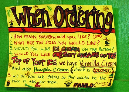
dsc_0352.jpg
This sign is posted behind the cashier.
1. How many Shaved would you like (ice)?
2. What are the sizes you would like?
3. Would you like ice cream on the bottom?
4. Would you like our tasty creams on the top of your ice We have Vannilla Cream And also Haupia cream (which is coconut)
5. We do also sale extras so this would be the time to ask for them
Mahalo (thank you)

dsc_0353.jpg
The cutaway detail of the Halo Halo Shave Ice is pretty neat. Nice combination of 2D and 3D presentation of the details:
Haupia cream topping
cocohut
Shave Ice
Haupia cream topping
Halo Halo
Ice cream opsional [sic] with Halo Halo

Helping you to shop, at Staples

I was at Staples recently and saw an interesting display; a standalone kiosk that dispensed a variety of shopping lists suggesting what school supplies would be needed for diferent grades Let’s forget for a moment that it’s July and they’re selling back-to-school, this was an interesting idea.

Staples 2.jpgStaples.jpg

I know grocery stores, for example, have toyed with getting shopping lists into customer’s hands in order to presumably help them buy more, but this occasional purchase seems more appropriate. The bottom of the sheets offer handy suggestions on parenting, which Staples frames as “Organizational Tip” – example: “You can’t make the bus come later or stop them from “forgetting” their homework. What you can help with is getting, and keeping, them organized. Binders, notebooks with pockets, folders, and accordion files are all great organizational tools.”

Of course, that’s the solution!

Yeah, I’m a bit cynical, but I think the idea is basically a good one. They have a long way to go if they want to be your kids-management partner (or your workflow management partner, or any other sort of partner based on the types of tools they are selling); they are no Steelcase/Herman-Miller, but the little signs are intriguing.

Also, I saw a funny binder comparison widget that Sara should blog about. On the wall of binders, there is a small device that is intended to help you decide between the Durable binders and the Heavy Duty binders. It’s a small card with the binder rings on either side, with a comparison chart highlighting the different features. But the humor comes from their inability to be direct and point to one version as better than the other. Instead of the Good-Better-Best cliche, they’ve gone for an even more confusing Pretty Darn Great and Really Great. I don’t remember the exact verbage, but one binder might feature Stay-Tite lock rings and the other would feature Sup-R-Secure D-rings. You had to go back to the price point on the individual binders and infer which was actually “better” than the other. Their little display (unlke Sara, I don’t shop with a camera on hand and wasn’t prepared to capture it) is cleanly designed and suggests transparency and helpfulness but it’s really an awful piece of propaganda.

Series

About Steve