The Experience Before The Out-of-the-box Experience

This package design created a nice frisson of anticipation. (Okay I just wanted to use the word frisson in a post).
This package design created a nice frisson of anticipation. (Okay I just wanted to use the word frisson in a post).


I run into these Kettle Chips any time I’m in a fancy/yuppie/specialty kind of food store. I admit to not having paid attention closely over the years, but I remember them appearing as a brand of authentic old-timey traditional (i.e., “quality”) chips, and it seems that all of a sudden they’ve been coming out with crazier and crazier flavors.
This would be a good Consumed piece, don’t you think? How did the brand offering evolve to what it is now? Their website outlines their commitment to adventurous flavors, all natural, and more on the type of ingredients and preparation process. Much of that is typical for a food company, but the flavors is an interesting twist. I’m reminded of Method, who have built a story around cleaning products that are safe, not animal-tested, effective, smell good, and are packaged to look good. You can pick one or two of those (i.e., beautiful packaging) as a hook and identify with that, rather than have the whole story be important. It’s surprising to see a gourmet/quality story with unusual flavors, it’s surprising to see a safe cleanser with a gorgeous package that you can leave out. But beyond surprise is a sense that these might be the real attractors, while all that other stuff is just fine, of course.
Meanwhile, thinking about flavors reminded me of the awesome social commentary found in this riff from the Kids in the Hall:
In the beginning, there was Miracle Whip. One kind of cheese, and fish came in sticks. Bread was white, and milk was homo [there is a carton of “homo milk”]. Our condiments were mustard, relish, and ketchup. Our spices were salt, pepper, and paprika. These were our sacraments. [closes fridge]
Garlic was ethnic. Mysterious. Something out of the Arabian Nights. And then one day it happened. Food exploded. People, yeah, people put down their Alan’s Apple Juice and share of pudding, picked up a bowl of tofu, slathered it with President’s Choice spicy Thai sauce, yeah, and washed it all down with a mango-guava seltzer.
You know, there are so many new products nowadays and I confess half of them I can’t identify. I guess it’s like that with people too. You know I can’t tell a pita bread from a cactus pear or a Korean from a Filipino. I feel left behind. I do. I’m not *modern*.
I’m embarrassed to buy water in a bottle unless it’s for the iron. And I still believe– call me square but I still believe that tangerines are just for Christmas. You know what? I think it all started with marble cheese. I do! Yep. Well, think about it ’cause right after they introduced that, they came up with salt and vinegar chips. Then it was sour cream ‘n’ onion, homestyle, before you know it chips were being sold in a tuuube. Where will it all end?
I’ve uploaded some new pictures to the Museum of Foreign Grocery Products


I’ve got quite a few more to do.
I’m a believer in the power of authenticity (as well as the greater power of inauthenticity). Fake blogs (aka flogs) were a bit of a scandal recently. Predictions for 2007 are focusing on this as well.
Companies not acting in an authentic and honest way will be subject to the wrath of the newfound consumer voice.
The buzzword for 2007 will be authenticity and it will become a driving force for businesses.
But what is authentic? What is inauthentic? The eye of the beholder makes the final determination.
Here’s a story: we were doing in-home interviews last month, getting reactions to product packages in order to understand the important visual elements and cues (in order to inform an upcoming redesign). One package had a label with a jagged edge, meant to suggest torn paper. It didn’t look like real torn paper, it looked like a manufactured torn edge. Some people really liked it, but one person called it as unacceptably fake. He pointed to another packaging label that he had purchased, as this one had a more realistic-looking torn edge, where the paper was frayed and small threads and fibers were visible.
He was very clear that both of these edge treatments were done by machine; that no paper was torn by hand. The vernacular of the jagged paper was completely unacceptable. The more realistic (as he imagined it) frayed edge was the right way to do it.
It’s a bit of a post-modern take on authenticity, where it’s more of aesthetic that supports suspension-of-disbelief, rather than some extremely absolutely True and Real version. What does the way it looks let me comfortably accept into my reality?
How do you know what is authentic? How do you know that what you are creating or selling is authentic?
The Internet is amazing. I was having an IM conversation with a colleague today and sharing cool packaging stories. I tried to describe the magic packaging (keeps the seaweed separate from the rice, yet you can open it up without having to unwap the whole thing) for onigiri (rice balls) and he suggests there is probably a video somewhere. Indeed, within 30 seconds I found two. The packaging – as you will see – is amazing, but the availability of any sort of content you can imagine is also amazing.
Reading Chinese shopkeeper can no longer sell Mao condoms we see that there were other condom packages that were not acceptable, so this may simply be a clever headline play rather than the truth of the story (even though it’s Reuters, do we believe them when there are details clearly left out?). But potentially a counter to the Dictator Kitsch we’ve discusseed here.
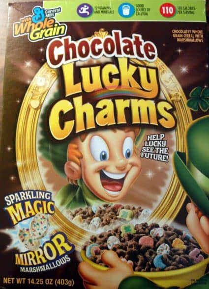
Yeah, dude. Keep eating sugar cereal like this and you’re going to have a serious diabetes problem. You already look like you’re suffering from ADD. You (or your guardian) might want to have a doctor check that out.
I recently ordered a few curtain rod brackets from Amazon. I was just shy of $25, the magic number for free shipping, so I made use of Amazon Filler, a site that finds items, in ascending order of price, to get you to that needed total for free shipping.
For me, it was dental floss.
A few days later, Amazon tells me that they are going to ship the items separately to speed up service! I guess this makes sense in terms of their infrastructure – wherever the floss is kept, it’s probably far enough from curtain brackets that if they were to get the two items together and then ship to me it would be costlier or more time-consuming that simply sending the items directly to me from each of their origins.
But still – it leads to this strange out of the box experience:

The boxes arrived on the same day; one was sent earlier, but they both got here at the same time. It doesn’t appear to the recipient that it made any difference!

Here’s the two boxes opened, with their various packagings.

And unpacked, all the crapola strewn about.

Our actual items in one box.

And our dental floss tiny in its massive box. So I saved some money on shipping, but cost Amazon (and the environment) another box and inner packaging and all that shipping effort and fuel. Was this a good outcome for me? For Amazon? For all of us? Many factors to balance and I’m uncertain.

Nice packaging detail. One might not notice the orange-section texture in the screw-top right away; makes for a nice surprise. I was strangely excited to discover this: a detail where none existed previously, a playfully gratuitous bit of decoration, a subtle feature that I felt the rush of discovery when encountering.
Here’s a package design where form deceptively implies function. The deliberateness of it all is just a little bit evil.
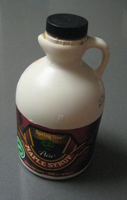
Here’s a jug of maple syrup. It’s made of plastic, but the color might make you think of a ceramic jug. It’s got a jaunty handle, and for your pouring convenience, a spout.

Whoops. That’s not a spout. That’s just a jutting piece of the form below the opening but that is definitely separated from the hole. It’s the shape of a spout.

And look what happens when you use it. A big freaking mess. Every time.
The evil irony is that the jug form makes it even harder to pour (given the small finger handle and the wide heavy base) without dripping.
A spout – an important function in a pouring package – is an aesthetic detail, the suggestion of spout-ness, without the inclusion of any actual spout. So they had the presence to consider the value of a spout, but made that decision while at the same time choosing a non-spout form factor.
This is a bad thing.
Upate: Dan Reich writes (that’s hard to say out loud): Here (pic1 pic2) is a product that managed to get it right. Despite its obvious similarities to your example, note that Trader Joe’s syrup does not feature a bogus spout bulge, but when the top is opened, a reasonably useful spout is thoughtfully provided.

We opened a bottle of wine the other night, and the interesting wording on the cork prompted some conversation. The cork (above; click to enlarge) was covered with WHOOH WHOOH WHOOH and with one odd COUGH.
What is that about?
Check out the brand of the wine:

Smoking Loon. WHOOH WHOOH COUGH.
It was a nice little detail to carry the brand of the wine (which we were obviously not paying much attention to – I think the decision was basically white) into a fun surprise. Great packaging design.

Jolt has relaunched with new packaging and new flavors
Kind of a duh article about how difficult packaging is to open, but perhaps a small element of zeitgeist.
Mona Doyle recently filmed people attempting to open bags of pre-cut lettuce. The tape plays like a bit from the television show “America’s Funniest Home Videos.” Everybody uses force and torque that would otherwise be reserved for the gym. Either the bag opens suddenly and sprays lettuce all over the floor, or defeat is conceded and scissors or knives are employed.
When Doyle, whose Philadelphia company does research about food and beverage packaging, showed the tape to an audience of produce packers, they chuckled. But Doyle says that belligerent packaging is making consumers spitting mad. They use words “hate” and “difficult” to describe products that seem to be welded shut.
…
Doyle has no solid statistics on injuries caused by our hassles with packaging, but they do exist in England. One study there shows that ‘wrap rage,’ as it is called by the Brits, has been the cause of more than 60,000 injuries. These often occur when consumers resort to knives and scissors to deal with stubborn packages, according to a 2003 report in the Daily Telegraph.
(That said, here’s a paradox: Hard-to-open bags don’t seem to be stopping us from buying pre-cut lettuce, considered the biggest marketing phenomenon in the history of produce. Sales of the convenience item are soaring. The Produce Marketing Association reports that sales hit $2.6 billion in 1994, then $8.8 billion in 2003. The numbers are expected to zip up to $10.5 billion in 2005. Obviously, cutting our own lettuce into bite-size pieces irritates us even more than cutting open a bag.)
Doyle says American consumers’ demands for ease and convenience have evolved over decades and, once given an easier way, we demand even easier ways. In plain language, we are spoiled.
Bottom Feeder is a gonzo food review blog. They find interesting grocery products, taste ’em, and write ’em up. Something I’ve been doing, too (Tofu2Go, Tiger Power, Grapple, and Bumblebee Entre Style Tuna.

Campbell’s Seeds (in Japan) is produced by a third party, Tokyo-based World Flower Service. Inside is a choice of seeds to grow miniature tomatoes, miniature pumpkins or green peas. The idea of a more labor-intensive Campbell’s came to mind from an interior design magazine that showed the can immortalized by Andy Warhol being used to grow herbs in the kitchen.