Vernacular design – where form ignores function
Here’s a package design where form deceptively implies function. The deliberateness of it all is just a little bit evil.

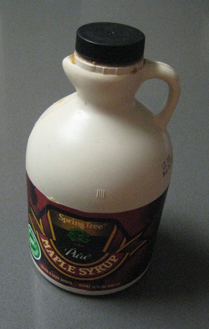
Here’s a jug of maple syrup. It’s made of plastic, but the color might make you think of a ceramic jug. It’s got a jaunty handle, and for your pouring convenience, a spout.

Whoops. That’s not a spout. That’s just a jutting piece of the form below the opening but that is definitely separated from the hole. It’s the shape of a spout.

And look what happens when you use it. A big freaking mess. Every time.
The evil irony is that the jug form makes it even harder to pour (given the small finger handle and the wide heavy base) without dripping.
A spout – an important function in a pouring package – is an aesthetic detail, the suggestion of spout-ness, without the inclusion of any actual spout. So they had the presence to consider the value of a spout, but made that decision while at the same time choosing a non-spout form factor.
This is a bad thing.
Upate: Dan Reich writes (that’s hard to say out loud): Here (pic1 pic2) is a product that managed to get it right. Despite its obvious similarities to your example, note that Trader Joe’s syrup does not feature a bogus spout bulge, but when the top is opened, a reasonably useful spout is thoughtfully provided.