Posts tagged “mapping”

Son of Survey Madness

We’ve posted any number of survey design critiques over the years, and here’s the latest, a close read of a question and the cues associated with different responses.

In response to the prompt How closely do you agree or disagree with this statement: “We saw business strengthening in the Spring, but it seems to be stagnant or falling off again. We thought we had seen the bottom, but now we are not sure.” we’re asked to move a slider between Agree Completely and Disagree Completely.
smiley
frowny

As we move the slider, the expression on the little green character changes, supposedly to provide an additional cue to ensure that our response is accurate.

But when we agree (a positive emotion), the guy is frowning. Because we are agreeing with a negative in which case we making a negative observation? So we feel negative? But the green dude isn’t mapping our feeling about the situation, he’s mapped to our response – our degree of agreement. We can feel positive about agreeing, even if the thing we agreeing about is negative (haven’t you ever exclaimed enthusiastically at someone that expresses a similar frustration to you? That’s being positive about a negative). The mapping here is wrong.

It’s further complicated by the indirectness of the prompt – that situation you are agreeing or disagreeing with – describing a situation going from positive to uncertain. How much do you agree or disagree with: something was positive but now it’s negative? In fact, besides being indirect and somewhat abstract, it’s also a compound question. You might agree that things were positive, or you might now. You might agree that things have gone downhill, or you might not. The question is asking you to agree ONLY to the cause where i) things were positive and ii) things have gone downhill. If you don’t agree with both of those, then what do you do? And since you can indicate the strength of agreement/disagreement, how will people interpret the question? I would suggest not very reliably!

Ironically, this is a survey aimed at providers of market research services, who should absolutely know better.

ChittahChattah Quickies

  • Design Research Methods for Experience Design – Triading is a method that allows a researcher to uncover dimensions of a design space that are pertinent to its target audience. In triading, researchers present three different concepts or ideas to participants and ask them to identify how two of them are different from the third. Participants describe, in their own terms, the dimensions or attributes that differentiate the concepts. Participants follow this process iteratively—identifying additional attributes they feel distinguish two of the concepts from the third until they can’t think of any other distinguishing factors.

    The benefit of this process is that it uncovers dimensions of a particular domain that are important to the target audience rather than the researcher or designer. For example, participants may describe differences in groups as “warm” versus cold” or business-like” versus fun.” Designers can then use the most relevant or common dimensions as inspiration for further design and exploration.

  • Mapping Oakland – Mapping Oakland is a research project aimed at mapping people’s perceptions of neighborhoods and urban space within the City of Oakland. Mental maps have been used in geography to understand individual perceptions of space and place for sometime. The method has proven useful in helping geographers understand how people perceive elements within the landscape for navigational purposes and to understand the cultural value of spaces. This web site provides citizens throughout Oakland access to a survey that measures how people perceive and use public open space in the City of Oakland.
  • How ethnic groups change Oakland neighborhoods – When Robert Lemon, a UC Berkeley landscape architecture grad student, was a community planner in Columbus, Ohio, he noticed that despite the car-oriented landscape, residents of the city's Latino community, for the most part, liked to get around on foot and bicycle and, as a result, were bending the neighborhood to their collective will. Taco trucks and open-air produce markets popped up in vacant parking lots on one of the city's main shopping thoroughfares. The bicycle was a key mode of transportation even though there weren't dedicated bike lanes, and colorful murals appeared on the walls of large buildings. The neighborhood had the feel of small-town Oaxaca, the Mexican state from which many of the city's Latinos hailed.

    In California, he found similar changes occurring in Oakland's Fruitvale and Chinatown neighborhoods. He is conducting a formal survey as part of a fellowship & has gone through Oakland's diverse neighborhoods, walking up and down the streets asking questions.

Mental Models

Last weekend we took in a cheesy exhibit about Da Vinci. I was struck by this image.
da-vinci-and-the-brain.gif
Da Vinci is suggesting a physical connection between the eyes and the brain; that the eyes are almost external-facing brain organs. I don’t know anatomy (beyond what’s on the outside) so I don’t know if this is accurate, presumably it was based on some dissection work. But the representation suggestions a mental model of how things work up there; the windows to the soul are linked right into the house of the soul.

Most of us have come across the hipster-geek phrenology heads at one point or another.
phrenologicalchart.jpg
phrenology.gif

Interesting to consider this image, then.
brainvessels.jpg
which connotes a scientific accuracy, tied to machines, computers, technology and of course, objectivity. How will these images be interpreted in 300 years? Will they be just as quaint and amusing as the other ones seem to us?

This page takes a thorough and scholarly approach about the history of representations of mental mapping, plus they have some more cool pictures!

What is a map?

Here’s a detail from a flyer from a local Coastside restaurant

Note the schematic indicating their location. There’s a lot of local knowledge required to interpret that. Which direction is north? Are each of those towns equal distance from each other? Are they equal size? Are there stop signs located at those locations?

(Answers: right, not really, not hardly, no way)

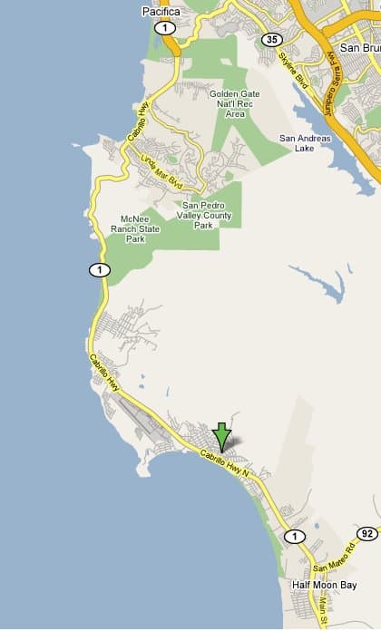
Here, then, is a more familiar map, from Google.

El Granada doesn’t even merit text on their map, but they do a get a green arrow!

I guess I must be dumb.

flickr now lets you add location information (“geotagging”) to your pictures. This raged through the blogosphere over the past few days (e.g. here ) with all the usual fawing over how great it is and how easy to use it is.

It’s not easy to use. People need to refine their definition pretty dramatically or we need to stop paying attention to sophisticated blogger/RIA/Web 2.0 types telling us what is easy or what isn’t. The feature started me with a map of the world. I wanted to find a location in Washington, D.C. Every time you zoom in, it recenters somewhere, and it’s pretty hard to get it to center on the part of the world you want. Not to mention the map itself is a horizontally scrolling box that seems to repeat itself, as if you could put some pictures in one part of the planet and then on another copy of the planet you could repeat the same process with other pictures. What the hell is going on?

People like to say “drag and drop” as if that is obviously going to be a trivial task – so I’ll hand you an icon that is about 1.5″ x 1.5″ and give you an entire planet that is about 6″ x 6″. You try to precisely drop that icon on that planet.

I eventually got it, but was pretty fed up after a few pictures and (let’s not even talk about why this is something we’d want to do – I haven’t got there yet, I just wanted to try it!) didn’t bother to continue. If my picture is tagged “washington d.c.” maybe the interface could try starting me off with a map of Washington?

I’m mostly posting this for contrariness; my experience was counter to what I’m seeing gushing forth elsewhere.

I heart flickr, I don’t think that everything they do is automatically perfect and “easy to use” however.

Series

About Steve